Jazzing up straightforward model shots using Photoshop and Illustrator is a time-honoured technique – creatives have been doing it since the software was invented.
Some vector interventions and lighting effects can transform the most run-of-the-mill photo into something verging on a work of art. However, doing this well takes flair, skill, and lots of practice.
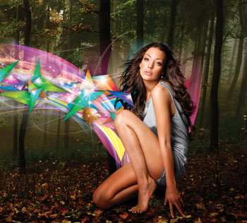
In this tutorial, leading illustrator Neil Duerden shows how he got stuck into creating one of his stylish images, starting from a basic model shot. He shares his tips on tricky cut-outs, seamless compositing, and blending of vector images so that they complement, rather than clash with, your composition.
Related Stories:
How to create amazing surreal images in Photoshop
How to create stunning retro art with Photoshop and Illustrator
Duerden says that he feels that the key to success in this discipline is going with an instinctual flow, saying: “Get into this on a passionate level: you can’t go wrong. You want this to become your baby, something you will be proud to show your loved ones and blow their minds.”

Step 1
This is the most important stage. The image you choose will define the illustration’s look and feel. I picked a high-end model shot from iStockphoto as the quality of their shots is great at this price point. You can get this photo from bit.ly/c1kggk. You can decide whether to create a static look or dynamic movement at this stage, too.
Step 2
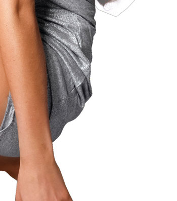
Now we need to clip the image out from the background: this is time-consuming, but it’s important to get the details right. To remove the background, duplicate the background layer (Cmd/Ctrl + J), select the duplicate layer, create a path, make this path into an active selection, then hit Delete. You can speed this process up by using third-party masking software, which is well worth investing in if you’re often doing cut-outs.

Step 3
Choosing a background for this piece is critical to the overall feel – you could choose anything from an urban landscape to a warehouse conversion, and each would mean you ended up in a wildly different creative place.
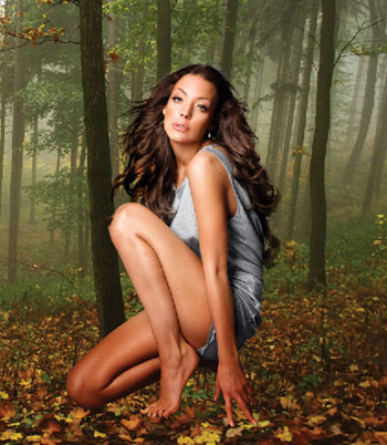
The woodland image I’ve used here is a free download from Stock.xchng – you can download it from bit.ly/cmdQa6. Paste this onto a new layer behind the floating girl layer. Position the girl to fit with composition of your chosen shot as naturally as possible.
Step 4
We’re going to make the model interact with the background. Duplicate the girl layer, set the blending mode to Multiply and then using the Eraser tool (E) delete sections to help the shadows fit into the piece. If you delete too much you can always undo, so don’t be timid at this stage.
Step 5
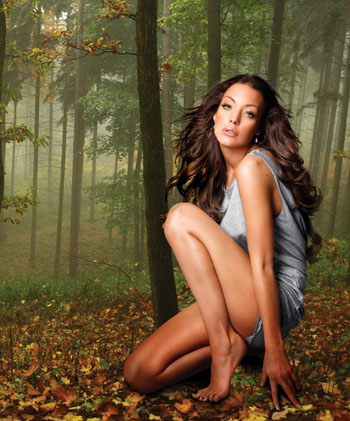
Next, paint in a shadow below to help root her in the image and prevent her from like she’s floating in space. Use quite a large brush (B) to get an even distribution and then delete parts of this to get the distribution right. Then set this layer to Multiply and change the opacity until it looks correct.

Step 6
We’re onto the fun bit now: save the image as a .PSD and open it in Illustrator. Draw your basic vectors around the girl – these can be whatever fits into your idea of what this piece will be. Here, we’re going down a generic geometrical system that works well with most backgrounds.

Step 7
Copy these vector shapes from Illustrator and paste them into your master Photoshop document, setting the layer’s blending mode to Screen, at both normal and varying opacities. Play around at this stage – enjoy what you’re doing and allow the piece to build itself. There’s no right or wrong way to do this – you’re in control.

Step 8
Repeat step 7, building up a composition that suits what you’re trying to achieve. Keep some of the objects at full opacity and some at reduced opacity to give the piece some life and depth. You want to look at adding subtle details to draw the viewer into the guts of the piece when they give it a closer inspection.
Step 9
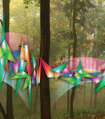
Duplicate the background and clip out some vital sections of the woodland to bring them to the front of your image stream. This will give the flow more depth and interaction. It will also tie the front and back of the image together more accutely and help form a more coherent image.

Step 10
Now you have a clear sense of where your flow is going, draw some more complex vectors in Illustrator and paste them into the Photoshop document, moving them around in the depth of the layers to see where they fit best. Again, this is useful for tying the foreground and background together.

Step 11
We’re now going to inject some dynamism and movement into this. Start to add light balls along the flow to help with the energy of the illustration. Then add more complex lighting systems on different layers to help distinguish the flow. There are some light dots on the cover CD (and in the Zip file opposite) to help you out.

Step 12
Now step back and take another look at your illustration. Decide what feeling it gives you – do you associate it with any scenes, does it make you think of music, love, travel, or happiness? Find items you associate with whatever you decide, and paste them into the looser sections of the composition. It’s up to you whether you decide to put loads of elements in, or just a few key devices to get your required look.
Step 13
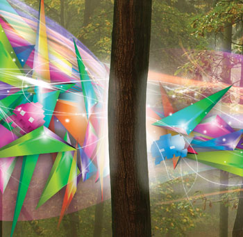
Now look at the details: how will the light affect the tree, and other items in the image? Using layers above each of the chosen details, paint lightly where you feel it needs it and reduce the opacity to make it look more natural. Do this until you feel it looks right – either over the top so that the flow seems dazzlingly bright, or much more subtly.

Step 14
Nearly done. Finally, darken the background in places behind the flow to make the foreground elements stand out more clearly. Take a good long look, make any final adjustments, then flatten your image.


