In the end, you have to try it for yourself. The world is full of people who formed fierce opinions about the Apple iPad not only before they’d used one but before they knew anything for sure about it. But this gizmo is something new. And if you think you can come to any conclusions about it by thinking of it as either a giant iPhone or a netbook with the keyboard chopped off, you’re wrong.
I woke up at 5am on Saturday, drove to my neighborhood Apple Store, and ended up near the front of the queue of first-day iPad buyers.
I was out the door with a unit in hand at 9:15am, and spent the rest of Saturday (and Sunday morning) with it in hand, exploring the built-in apps, downloading a gaggle of third-party ones, and generally trying to form more definitive impressions than I was able to get during my brief hands-on time with an iPad at January’s launch event.
This isn’t a comprehensive review-I’m not going to bemoan the lack of Flash, multitasking, and a camera, or repeat any impressions that you can come to without spending time by yourself with an iPad. I’m just going to tell you eleven significant things I know about the thing that I didn’t know-at least for sure-on Friday night.
The Good
It really is a new type of device. We’ve called portable computers “notebooks” for a quarter century, but the iPad is the first one I’ve used that truly feels like a notebook. The basic interface is so damn good, and the performance is so zippy, that it disappears in your hands-to steal a phrase from Amazon CEO Jeff Bezos that he’d probably prefer I didn’t apply to the iPad.
And even though we’ve read on computers (portable and otherwise) for decades, computers have never been very satisfactory reading devices. The iPad’s booklike form factor, beautiful screen, touch interface, instant-on ability, and general simplicity make me think it’s going to be superb for reading Web pages, e-books, and digital magazines-at least if you stay out of direct sunlight.
Steve Jobs said that the iPad was “way better” than a netbook for browsing the Web, and if he was talking about readingthe Web, he has a strong case.

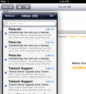
Popovers are kind of brilliant. The “the iPad is nothing new” theory ignores the fact that large swaths of its user interface bear little resemblance to either iPhone or to desktop operating systems such as OS X. My favorite new idea is the Popover, a sort of hybrid drop-down menu/dialog box/window. (For instance, they show up when you use the Mail app in portrait mode-your Inbox is a Popover, so you can see all your messages without leaving the message you’ve got open).
I think they’re one of the most significant interface ideas since windows and menus-and I don’t see why they wouldn’t work equally well on a traditional mouse-driven desktop.
The battery keeps going. I havent done any formal benchmarking-in part because the battery meter was at 89 percent when the iPad came out of the box, and I didn’t bother to charge it until late Saturday night, when it was still at 20 percent. Looks like Apple’s ten-hour claim isn’t an act of fantasy. A ten-hour iPad will still need to be fueled at night, but it’ll be able to survive most workdays and even long plane flights without needing a recharge.
The keyboard is surprisingly tolerable. When I first used an iPhone, I quite literally couldn’t type two characters in a row without at least one typo. But the iPad keyboard is a radically different beast. No, the keys don’t travel-but they’re only slightly smaller the ones on my 15? MacBook Pro, so they feel like big, inviting targets rather than the iPhone’s microkeys. I’m not saying there’s no learning curve-I keep pressing “B” when I’m aiming for the space bar.
And on-screen keyboards still fill a large chunk of the display, leaving less room for whatever you’re trying to type. But I already miss plastic keys less than I expected to.
The iPad App Store is already jam-packed with interesting stuff. And not just iPhone apps that will work on the iPad in either teeny-tiny or double-sized mode. I suspect that no new platform has ever arrived with as many applications as the iPad, from Twitterific to Dragon Dictation to Instapaper toSugarSync to ABC to The New York Times to TIME to Autodesk’s outstanding Sketchbook Pro and beyond. As with the iPhone, apps are already the best thing about the iPad-even though the initial batch is rough around the edges. (More about that momentarily.)
Apple’s $40 case is surprisingly nifty. Beyond its protective benefits and the way it can prop up the iPad like a photoframe, it also lets you put the gizmo at a gentle slope that’s excellent for typing. (I wanna try it out on my next plane flight-even if the guy in front of me suddenly reclines as far as possible, I should be fine.)

The Bad (or at Least the Imperfect)
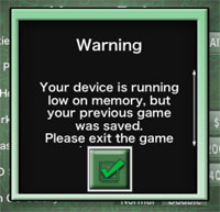
It’s got bugs, bugs, bugs. Almost all the ones I’ve encountered seem to relate to third-party apps rather than the system software, but I keep encountering them. Several iPhone apps exhibited weird problems, such as certain regions of the screen seemingly being dead spots. (Monopoly even confronted me with something I’ve never seen on an iPhone-a low-memory error.) The TIME magazine app was confused about how much screen it had to work with until I reset the iPad. The ABC app keeps crashing.
I choose to assume that most of this stuff stems from developers having little or no access to actual iPad hardware until this weekend, and hope that means that it’ll be reasonably easy to fix.
You might have trouble charging it. When early iPadders across America started plugging their new gadgets into their computers-especially non-PCs-via USB cables, many found that they got a “Not Charging” message. It turns out that it’s an issue relating to the amount of power output by the USB ports in question, and Apple says that the iPad will charge if you leave it shut off. It shouldn’t come as a complete stunner, given that the iPad is a much more powerful, demanding device than the typical ones that we charge via USB.
But Apple should explain this in the section of its site where it says the iPad can be charged by USB. And it seems like it could replace the “Not Charging” message with an alert recommending that you shut your iPad off.
Forget about Flash, some non-Flash sites have issues. I was hoping that the iPad’s version of Mobile Safari, with its ample resolution, would run Web apps more like OS X Safari than like iPhone Safari. Which it does, but only some of the time.
Google put together a nice iPad version of Gmail, but the version of Google Docs you get is disappointing — except for the spreadsheet, it’s view — only, like the iPhone one. I also can’t edit in Zoho, or in the rich-text editor part of WordPress. I’m sure lots of sites will tweak themselves for maximum iPad friendliness, but it would be nice if we didn’t have to wait for that.
I’m not sure if anyone’s nailed magazines and newspapers yet. As a print fan (and former dead-tree guy myself), I’m excited by the potential of periodicals on the iPad — and impressed that a number of publishers were ready on day one. But everything I’ve checkout out so far has felt limited and/or fundamentally experimental.
The New York Times’ Editors Choice app is a user-interface gem, and free, but it offers only a handful of stories. I’m still getting used to TIME’s interface, which makes you scroll down to see most of the content. I already know I don’t like GQ’s approach, which inexplicably separates the photos from the words, and hides captions by default. And I’m having trouble getting Popular Science to work, period.
Another thing about magazines and papers on the iPad: It’s such a delightful device for reading the Web that the bar is extremely high for content that’s delivered in other forms. I kinda think that publishers who want us to pay for content in downloadable form may need to yank the free versions from their Web sites.
Even though the keyboard’s not bad, typing is an interesting challenge. On a desktop or laptop, the keyboard’s convenient to your fingers and the screen is at eye level — as long as you can touch-type, you’re good. On an iPhone or other smartphone, the keys and display area are so compact that it’s easy to glance at both at the same time. But the iPad’s intermediate size and all-in-one design is different — so far, I’m having trouble typing and looking at what I’m typing at the same time.
With any luck, I’ll get confident enough that I won’t feel like I need to stare at the keys as I type.
And that’s what I’ve learned so far. Bottom line: It’s remarkable, but also rough around the edges — which was a safe bet all along.
Lots more thoughts to come, including answers to a bunch of questions you submitted here and on Twitter.


