Weekend at Bernie’s 2; Basic Instinct 2; Caddyshack 2; Grease 2; all terrible movies that prove a principle that sequels are generally terrible.
But the BlackBerry Storm 2 (Storm 9550) thankfully doesn’t fall into this category.
It is more akin to good movie sequels such as Terminator 2, Aliens or Star Wars: The Empire Strikes Back.
Like all really smart sequel makers, Research in Motion (RIM) identified all the good things the original had going for it. It didn’t seek to reinvent the wheel, but instead made elegant and thoughtful improvements to the device.
They should be well received.
I was an admitted defender of the first Storm, released around this time last year. No doubt the device received some harsh criticism for its lack of WiFi and sloppy touch screen accuracy.
But I still found Four reasons why the BlackBerry Storm doesn’t suck.
If you did think the first Storm sucked, the sequel definitely sucks less. If you thought it was a pretty good first attempt at a touch screen device by RIM, then you’ll like this one even better.
1. More sleek design

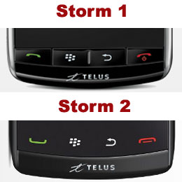
The original Storm had its touch screen sheen rudely interrupted by the four hard buttons located along the bottom. Storm 2 has changed that for a more uniform look.
The four BlackBerry buttons (Call, Application Menu, Escape, and End) are still at the bottom of the device, but now seamlessly integrated into the touch screen. Behind the glass that covers the front, the newly styled buttons offer a more uniform and pleasing design.
2. The keyboard no longer sucks

Apple’s iPhone has a lot going for it, but its lack of hard keyboard is often criticized.. No matter how adept you are at using the touch screen keyboard, it makes for a slower and more error-prone experience.
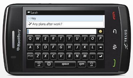
RIM has tried to solve this touch screen keyboard problem with its SurePress technology. Basically, it’s easier to type with physical keys because they provide haptic feedback, your fingers feel them being pressed, and your brain is assured that you’ve accomplished your stroke.
SurePress makes the entire screen of the device a large button. With every press of a key, you push in the screen and it delivers a perceptible click. It helps you know when you’ve engaged a button, and avoid accidental presses.
The problem with the original Storm’s SurePress design was that the hinge for this button was in the centre of the screen. That meant that you would be pressing down at an angle with each click and sometimes the accuracy was affected.
Storm 2 has the hinges in each of the screen’s four corners. Now when you press down, each click is nice and even. The result is improved accuracy.
3. WiFi included
Another drawback of the Storm was its lack of WiFi. While its 3G speeds on the Telus Mobility EVDO network are still good, many consider WiFi a must-have feature of smartphones nowadays.
The original Storm and several other CDMA/EVDO devices didn’t include WiFi for some time. But that brief period of smartphone history seems to be over now. Storm 2 supports WiFi.
Once you add a network, you’ll automatically connect when you come within range.
4. More accurate text selection
The original Storm had no good way to select specific text or drop your cursor in a particular place. Your only option was to tap and pray.
Storm 2 attempts to fix that with a multi-touch feature. Tap the screen with two fingers and two text bookends come up around the words you’ve selected. You can then drag either end to adjust your selection. A magnifier shows exactly where your cursor sits.
It’s still not as easy as selecting text with the BlackBerry trackball. The selection markers seem oversensitive and can be difficult to move into position.
But at least it makes text selection possible.
5. More on-board memory
Simply put, there’s more space for your stuff.
Storm 2 boasts twice the on-board storage and Flash memory of the original device. Since it’s a fairly media-centric phone, the more storage the better.
Of course, serious media connoisseurs will take advantage of the expandable microSD storage. Find it hidden behind the battery cover.
Storm 2 Specs at a glance
- Size and weight: 112.5 mm tall, 62.2 mm wide, 13.95 mm deep and 160 grams
- Display: 3.25” at 480×360 pixels and over 65,000 colours
- Camera: 3.2 megapixels, 2x digital zoom, flash and auto-focus
- Connectivity: WiFi, BlueTooth, GSM, HSPA, CDMA
- Battery life: 270 hours standby, 5.5 hours talk time
- Memory: 256 megs flash memory, 2 GB on-board storage
Follow Brian Jackson on Twitter.


