A video editor is still seen as a specialist tool, but the capacity and desire to make and edit videos these days is pretty widespread.
You might want to pull video from your point-and-shoot camera, from a DSLR, from your iPhone or other smartphone, from your iPad, or from some kind of dedicated video camera. You might even want to take some still photos and put them into motion. And you might share them any number of places: on a blog, on sites like Facebook or YouTube, or pass them around to family and friends.
The need to do so extends from amateurs to people who aren’t videographers but are called upon to fake it in professions that increasingly demand video.
The problem is, none of this necessarily means that professional-level video software is your best choice, either because of its complexity or price. Adobe Premiere Elements 10 is not radically changed from the predecessor we reviewed, Adobe Premiere Elements 9, the first release of that tool on the Mac. But the demand for video editing and sharing has only grown. Furthermore, Apple’s Final Cut Pro X has undergone a ground-up overhaul; with the elimination of Express and a reconceived interface, it’s arguably a rival for mid-range tools like Premiere Elements, and its new interface could be either good or bad news, depending on your taste and needs.

Related Stories
– Adobe’s Elements 10 zooms in on mobility, social networking
– Photoshop Elements 10 focus on creativity and simplicity
– Watchdog wants CRTC to tackle SMS short codes
…
That means Premiere Elements is worth a second look, not only for what’s changed in the tool, but in relation to your own demands.
As before-and as with the Mac stalwart Photoshop Elements-Adobe Premiere Elements 10 contains the facilities of its professional siblings in a package Adobe has tried to make friendly to more casual users. The basic interface is simple: you choose tasks from tabs for managing your media, adding effects, transitions, and titles, and producing discs and sharing finished videos.
Adobe tools for the rest of us?
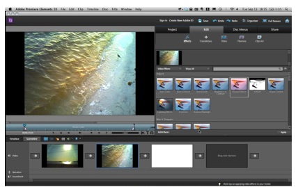
Many newcomers to video editing will find the multiple tracks of a timeline, the basic interface metaphor for arranging video clips, to be the most confusing feature. In Premiere Elements, by default you see videos instead arranged as though on a storyboard in a feature called the Sceneline: boxes represent different clips and the arrows between them, the transitions.
It’s even more basic than the interface in Apple’s iMovie. But uniquely, Premiere Elements lets you dig down for more control if you like. A monitor in the upper left-hand corner of the screen lets you adjust in and out points. If you prefer a conventional timeline view, you can also switch from the Sceneline to the Timeline simply by clicking on a tab. In fact, that perhaps best sums up Premiere Elements’ design approach in general: you’ll see a shortcut first, but can quickly switch to a pro-style workflow with a click.

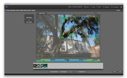
iPhoto has long had the Ken Burns Effect; but if you’re really in love with pan and zoom-and putting photos into motion-Premiere Elements 10’s motion controls give you extensive options for keyframing effects.
Native AVCHD editing remains a huge draw, allowing you to bring in video from equipment like DSLRs and get straight to editing without the lengthy process of transcoding (converting) to an intermediate format. That alone means Premiere Elements 10 could be worth consideration, depending on what format you’re shooting. Premiere Elements can work directly with AVCHD files with or without the camera connected; Final Cut Pro X can work with AVCHD media without transcoding, unlike previous releases, but only if you import directly from the camera.
In the golden age of the slide projector, interminable friends-and-family slideshows were often the butt of jokes. But since many video cameras also double as still cameras, odds are when you document an event, you wind up with a mix of images and videos. And there’s no reason those have to be as dull as the old-time carousels of slides.
Photos to movies
iPhoto has long offered the Ken Burns Effect, sweeping pans and zooms across still photos popularized by the documentary The Civil War. Apple’s approach is dead-simple, and it is possible to auto-generate effects using Premiere Elements 10’s InstantMovie feature, though the process feels clunkier.
Where Premiere Elements 10 shines is in its ability to go beyond autopilot effects and let you pan and zoom with more direct control. You can draw paths across your image so that the effect zooms where you want, when you want, and holds for however long you choose. The feature is easy to use, and it’s surprising to see sophisticated keyframing functionality (animation that interpolates between points) in what’s positioned as an entry-level tool. For livening up photos on YouTube, it’s terrific. The only deficiency is that paths are linear, both in direction and timing.

Premiere Elements 10, as in previous versions, forgoes the fancier editing and media management features in its Pro sibling for simplified timeline and photo and video organization. But that simplicity belies some fairly sophisticated options for effects, color adjustment, motion transitions, and other features.
Adobe hopes you’ll integrate your video editing workflow with a media management workflow in the bundled Organizer, which shares metadata with the companion product Photoshop Elements. If you do, you get some extra features. New Organizer tools automatically identify people and even things, for instance. You can manually apply the same tags to video, and then find all the images and video of, say, one specific person. But if you prefer to use Premiere Elements 10 with a different photo organizer, you can do that, too; you can even drag images directly from iPhoto into the Project tab in Premiere Elements. (What you can’t do is navigate your iPhoto Library from within the software directly, though drag-and-drop support more or less makes that moot.)
Colour correction
From a real timeline with powerful editing to effects, everywhere you look in Premiere Elements, a pro–style feature is lurking behind the beginner interface. Whether you find that annoying or desirable depends on your needs. For those who do want to graduate to more advanced features, though, they’re very often available. The new Three-way Colour Corrector is a perfect example.
The Three-Way Colour Corrector here really is the tool you’d normally get in Premiere Pro, not Premiere Elements. You can adjust colour ranges graphically across a colour wheel, with various sophisticated options for adjusting the magnitude of the effect. Apart from some explanatory text, this is a bit like finding a working laser miter saw in a kids’ toy set, but that can be a good thing: it gives you immense power over colour correction in video without having to shell out for the pricier Premiere Pro, provided you invest some time learning to properly use it. (A helpful grayscale overlay provides visual feedback on which parts of the image are impacted by midtone, highlight, and shadow adjustments.)
For easier colour correction, there’s also a new AutoTone & Vibrance feature. What sets this tool apart from usual “automagical” colour correctors is that it’s already set up to do the thing you most often need to do: make humans look like their flesh is the right colour. It works as advertised with most media, and for quick corrections is a boon.
Sharing
Sharing options are also expanded in this release. You can now burn HD video onto standard DVDs, which you can play on a Blu-ray player. (Length is shorter than it would be on Blu-ray, but unless you’re aiming for James Cameron-worthy lengths for your movies, that should be okay.)
Online sharing is expanded, too. You can send files to YouTube straight from the Organizer, and Facebook sharing is an easy affair.
You can also export directly to AVCHD for an end-to-end workflow in this high-quality format. Export is powerful and reasonably straightforward, though neither as broad or advanced as what you’d get with Apple’s Compressor.
Dr. Jeckyl and Fluffy the Bear?
Premiere Elements 10 is a tool with a bit of a split personality. On one hand, you can drop some media on it, know nothing about editing, pull up a preset, and automatically generate content. There’s even an automatic soundtrack generation feature now available on the Mac, previously only on Windows. The music sounds good, though the InstantMovie content is likely to clash with most user aesthetics. (That’s being diplomatic. Most of it just looks garish. Adobe wants you to add on a “Plus” online service for more, but why not some more vanilla templates?)
On the other hand, Premiere Elements can behave like a streamlined version of Premiere Pro, complete with a very robust set of image and video effects similar to what you’d see in Adobe’s Photoshop and Lightroom, and a full-featured timeline with native AVCHD editing.
That’s not necessarily a bad thing. Premiere Elements’ interface is nowhere near as polished as Apple’s Final Cut Pro X, with some design-by-committee inconsistencies and little annoyances like an animated transition in the clip window that takes way too long to play out. But that interface, apart from some quirks, can also offer some powerful features and behaves more traditionally once you switch to the “advanced” view.
Performance lags are sometimes noticeable: Apple’s Final Cut Pro X and iMovie can handle some complex projects without rendering, whereas Premiere Elements often has you reaching for the render key to see your work. (Worse, in the beginner-centric Sceneline, it’s often not clear to the user that you need to do so.) Fortunately, renders were snappy on my 2010 MacBook Pro, and I found I made quick work of some editing jobs. In fact, I didn’t necessarily miss Premiere Pro when working on simpler jobs.
Buying Advice
If you just want a simple editing tool to cut up videos and you’re happy with iMovie, it remains a good choice. If you’d like more control over photos, Premiere Elements 10 starts to be a contender: the new pan and zoom works well, and image tagging could be a boon if you’re willing to invest time in a new management tool.
But if what you really want is a powerful editor that gives you room to grow- without paying too high a cost in either dollars or complexity-Premiere Elements really shows its colours. Yes, Adobe seems to hope this is something you’ll use to make more interesting video slideshows of your Facebook friends. But what they’ve come up with is a powerful editor with extensive colour controls and native AVCHD editing, with quick ways of getting videos online or in HD on disc. That starts to make Premiere Elements a competitor for Apple’s pricier Final Cut Pro X, with-for better and for worse-a more conventional interface. For all its quirks, Premiere Elements is something unique in creative tools: an entry-level version that doesn’t constantly have you hitting walls. And for some users, that’ll make it a bargain.
[Peter Kirn is a media artist and technologist, editor of the creative tech blogs Create Digital Music and Create Digital Motion and is currently conducting research in audiovisual interfaces in Berlin.]


