Adobe Premiere Pro CS6‘s aesthetic and workflow improvements over the previous version are immediately obvious at first glance.
Whereas Premiere Pro CS5’s most notable features—64-bit processing and the Mercury Playback Engine—were under the hood, the CS6 interface has undergone a comprehensive redesign that not only transforms the overall look and feel of the program, but facilitates a more efficient editing workflow. The new release is also designed to integrate two newcomers to the Creative Suite: Adobe Prelude for ingesting and logging file-based media, and Adobe SpeedGrade, a color correction and grading tool. Premiere Pro’s companion DVD authoring program, Encore, is now a 64-bit application.
Playable, resizable icon views
Premiere Pro’s Project panel has always let you view and organize assets in list form or as large icons. CS6 includes several enhancements designed to take full advantage of icon view’s visually oriented approach to organizing clips.
In previous versions, icon view’s video thumbnails were static; playback was possible only in a separate preview area of the Project panel. CS6’s icon view lets you scrub video playback (without audio) by moving the mouse pointer over a thumbnail image. This feature, called hover scrub, provides a much better reminder of a clip’s contents, and obviates the need for the separate preview area. If inadvertent scrubbing becomes a distraction, you can disable Hover Scrub in the Project panel’s menu.
You can also control a thumbnail’s video and audio playback by selecting it and using standard J-K-L keyboard shortcuts. You can even set a clip’s In and Out points by using the standard shortcuts, I and O. Consequently, it’s often more convenient to edit a clip right in the Project panel.
In previous versions, rearranging clips in icon view meant dragging and dropping thumbnails in a fixed grid that didn’t automatically remove gaps between thumbnails or reflow them according to the size of the panel. CS6’s icon view dynamically shifts the thumbnails as you reorder them or resize the panel. A new slider lets you resize the thumbnails themselves. These features make working with icons much easier, and make storyboard style organization and editing not just more feasible but more attractive.
Except for setting In and Out points, the same icon view features are also present in the Media Browser panel, where you can browse and preview assets before importing them.
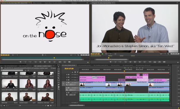
Premiere Pro CS6’s new interface design helps boost productivity.
Monitor panel improvements
Cutting raw footage into a finished sequence is the central activity of any non-linear editor. Accordingly, the displays for the source and edited video are the interface’s most prominent feature—and the most conspicuous change in Premiere Pro CS6. Before CS6, the layout of the various playback and editing controls squandered as much space as they consumed. Some controls felt obsolete, while others were made redundant by speedier keyboard equivalents. Even so, none could be moved or removed from the panel.
Premiere Pro CS6 replaces the inelegant layout of playback and editing controls found in previous versions with a more streamlined arrangement that you can customize and even hide. Using the new Button Editor, a user can choose which buttons to include under each monitor and, just as importantly, which to omit. You can even specify their placement.
Editors who’ve mastered keyboard-based editing can use a display option to hide the controls altogether. This way, they can allocate more screen space—and more of their attention—to the video image. Another display option omits timecode numbers by default, further minimizing distractions.
Overall, the streamlined interface promotes a more fluid editing experience.
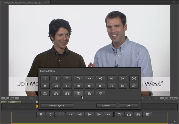
Using the new Button Editor, you can choose which buttons to include in each monitor and which to omit.
Enhanced markers
Depending on the type of video output you have planned, you can use markers to specify DVD chapters, Web links, Flash cue points, or to contain comments. But apart from these specialized functions, markers accomplish a core editing task: they identify important frames in a clip or sequence. Yet using markers has never been a straightforward process.
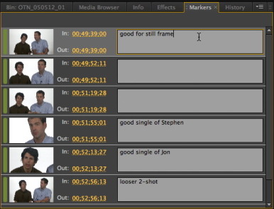
In Premiere Pro CS6, editors can set markers with a simple keyboard shortcut and the color and placement of marker icons make them easier to spot.
In Premiere Pro CS6, editors can set markers with a simple default keyboard shortcut: M. The color and placement of marker icons make them easier to spot than in previous versions. In CS6, markers appear above a time ruler—rather than inside it, where they had been too crowded and too easy to move inadvertently. (However, setting the first marker does cause the panel to resize slightly, which can be briefly distracting.)
Adding comments to a marker can be extremely useful. However, the potential value of marker comments had been limited by the fact they were usually hidden and difficult to peruse. Hovering the mouse over a marker in the timeline reveals its comment in a tool tip, but finding which marker contained a useful comment was a game of hide-and-seek. CS6’s new Markers panel lists a selected clip or sequence’s markers with their thumbnail icons and comments. Selecting a marker in the panel cues the current time to the corresponding frame. So instead of inspecting individual markers for comments, you can scan the comments and easily find the frame to which it refers.
Enhanced editing procedures
It’s at the fine-cutting stage of editing that Premiere Pro CS6 shows some of its most welcome improvements. Previous versions invoked trimming mode as a separate floating window, which was both inelegant and inconsistent with the interface. CS6’s trimming mode feels more integrated, temporarily replacing the image in the program monitor with a display of the frames on either side of the cut. Instead of an overwhelming set of controls and data, only those necessary for the task at hand are present. However, a button that applies the default transition seemed out of place, given the otherwise simplified interface.
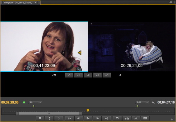
In CS6, the trimming mode temporarily replaces the image in the program monitor with a display of the frames on either side of the cut.
Most impressively, CS6’s trimming mode shows off Premiere Pro’s improved playback performance. Performing an edit no longer interrupts the playback of the cut. And in addition to trimming by increments, you can use the standard J-K-L keyboard controls to perform the type of edit you specify.
Timeline editing has also improved. In CS6, clicking (using an established keyboard modifier, if necessary) an In point, Out point, or edit point highlights it with a corresponding editing icon. Once highlighted, you can trim the clips using the same keyboard shortcuts you’d use in trimming mode. J-K-L trimming isn’t possible in the timeline, but you can enter trimming mode by double-clicking the editing icon.
When the timeline is zoomed-out, it can be tricky to click where you want. And although it’s possible to hide opacity and volume controls in the timeline, it still feels a bit too easy to grab and adjust them unintentionally.
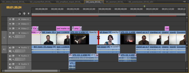
In both trimming mode and in a Timeline, it’s easier to perform different types of edits without a trip to the Tools panel.
Better audio meters and mixer
Premiere Pro’s master audio meters have always been lackluster; they provided only a crude indication of the output levels, and didn’t scale according to the size of its panel. In CS6, Premiere Pro’s master meters are more precise, scaling according to how you resize the panel. The panel also lets you orient the meters horizontally or solo a channel. Unfortunately, the meters don’t respond when previewing an audio effect in the Effect Controls panel, which could make adjustments more difficult.
Premiere Pro CS6 also incorporates several subtle changes to its Audio Mixer. Its controls have a cleaner look and, like the master meters, scale up and down according to the size of the panel. You can choose whether peak indicators are dynamic or static, display valleys, and change the meters’ dynamic range. These improvements are small, but demonstrate that Adobe’s effort to streamline the interface was wide-ranging.
New effects, same titler
Premiere Pro CS6 makes its Three-Way Color Correction effect more intuitive, introduces a Rolling Shutter Repair effect, and borrows After Effects’ Warp Stabilizer effect. But it’s the ability to apply an effect to selected clips by simply double-clicking—rather than dragging and dropping—that will make the biggest difference in an editor’s daily routine. The same is true for the addition of adjustment layers that can impart the effects they contain to underlying clips.
The Effect Controls panel would benefit from the makeover received by the more central editing features. And the Titler, while completely serviceable, has been ignored for a few revisions of the software, as well.
Performance
Not all of Premiere Pro CS6’s features are on the surface. Adobe’s Mercury Playback Engine technology now takes advantage of GPUs found in certain MacBook Pro configurations. And even without GPU assistance, there’s a noticeable improvement in video performance. As in trimming mode, most interactions won’t interrupt video playback. Laptop editors will also appreciate how Premiere Pro CS6’s interface responds to trackpad gestures.
Integration
Adobe continues to strengthen the ties among the members of the Creative Suite. To help manage an ever-growing list of included and custom presets, the Adobe Media Encoder incorporates a new Preset Browser panel. The new CS6 also carries over CS5.5’s improved integration with Adobe Story, as well as a round-trip audio sweetening workflow with Adobe Audition.
The included Encore DVD authoring software has finally joined the ranks of the other members of the Creative Suite, now becoming 64-bit native. So like its brethren, Encore is no longer hobbled by the RAM limitations of a 32-bit program. The already full-featured authoring software gets a handful of other welcome feature enhancements. Encore CS6 can author discs with 8-bit color highlight buttons, unlimited slideshows, and upper-field first video formats. Web DVDs created in Encore more completely replicate their Blu-ray counterparts by supporting features like multi-page and pop-up menus. But these improvements are overshadowed by Encore’s 64-bit enabled performance and stability boost.
Exit OnLocation
Premiere Pro CS6’s entourage now includes two new programs, Prelude and SpeedGrade, available as separate programs or as part of the Production Premium, Master Collection, or Creative Cloud.
SpeedGrade, a new program dedicated to color correction and grading, offers primary and secondary correction layers, as well as numerous film-style filter presets.
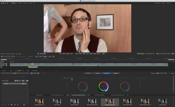
The new Adobe SpeedGrade, in a separate package, offers pro-level color correction and grading.
Adobe Prelude is designed to assist with ingesting and logging file-based media. Prelude lets you ingest full or partial media files and, if necessary, transcode them into an intermediate editing format. It’s also a logging tool that enables you to attach temporal markers, comments, and tags as metadata that can follow the media throughout post-production.
With the advent of Prelude, Adobe has opted to discontinue OnLocation, which provided production monitoring and measurement tools via a connected laptop. It also allowed tape based cameras to capture directly to disk, and provided logging features. But with the predominance of file-based media, Adobe has understandably shifted its attention to Prelude. Those who appreciated the traditional video measurement tools that OnLocation provided or who still use tape-based media will have to rely on CS5.
Buying advice
With the introduction of Prelude and SpeedGrade—not to mention the advent of the Creative Cloud—it’s tempting to define Premiere Pro CS6 in terms of a larger video workflow. But although its place in the Creative Suite (or Cloud) is an important consideration, it shouldn’t bury the lead: Premiere Pro CS6 stands on its own merits. CS6 extends the performance gains of CS5 to a wider range of users, particularly mobile editors with the proper laptop configuration. But what makes CS6 a worthy upgrade is its focus on enhancing its raison d’être: more fluent video editing.


