Arm chair movie makers who own an iPad have been limited to iMovie for video editing their masterpieces since it was launched alongside the iPad 2 last year – until now.
Avid, a software company known for its professional video editing suite on PC, has launched Avid Studio for iPad. This new piece of the video editor’s arsenal is available in the App Store now, and we put it through the paces.

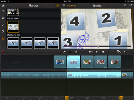
Avid comes with montage templates to spice up your videos.
Opening the app
Avid Studio opens to display a list of your projects along a film reel, even though this video editing clearly has nothing to do with film, or the type of projector featured in the background of this splash screen. But the menu is simple enough, allowing you to quickly dive into your project or start a new one by clicking the + button.
You can also rename your projects, export them to your video library or share them, and delete them from this menu.
Managing media assets
Once you’re in a project, you’ll see the top part of your screen is dedicated to managing the different assets that will make up your final product. Most of the time, you’ll be working with video files here. These are the videos you’d normally see in the “Photos” app on your iPad.
Tapping the video file brings up a preview in the top right section of the screen. Video playback works as you’d expect it to, and you can expand the view to be full screen. Along a timeline on the bottom of the video, you drag two yellow arrow markers to set the “in” for where your clip beings and the “out” for where it should end. Then you just drag the video from the preview window to the storyboard to work with it on your timeline. More on how that works later.
Avid also lets you use your other media assets in your project. You can drop a photo onto your timeline, or import music from your library. Avid packages a healthy selection of sound effects that you can find in the music section (tap the music note). This opens up a lot of fun potential, such as adding in the “hand saw wood slow” effect dubbed over a video of an unsuspecting napper. That’s some loud snoring! Sound effects could also be useful to enhance graphical elements.
Avid offers an array of different “montage” templates to choose from. These combine multiple video or picture elements into one scene. Sometimes the elements are combined into an illustrated animation, or sometimes they are just overlaid with a picture-in-a-picture style.

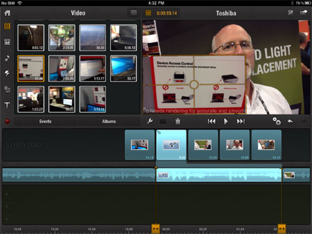
Avid Studio allows you to composite images and video.
Avid also allows users to create their own picture-in-a-picture effects on an ad-hoc basis. Just drag a video clip or photo element over an existing element on your timeline, and it’ll appear superimposed over top of it. From there, you can reposition the image or resize it, even to occlude the footage in the background completely.
Here is where Avid offers an important video editing function that iMovie does not. Video editors often want to hide mistakes, or just less interesting footage, with other visual material they’ve captured. But they don’t want to necessarily replace the audio of the original asset. So instead they insert “B-roll” footage over top of the original video track.
It’s common for desktop video editors to present multiple video tracks so this can be done easily. While Avid doesn’t have true multi-track function for video, at least it has this work around.
Avid also offers some titles to place in your project – some animated, and some static. These didn’t impress me greatly, mostly looking like word art from Office ’95. It certainly pales in comparison to the slick, theme-based titles that iMovie offers.
Working the timeline
Once you drop anything onto your storyboard, your video preview window automatically changes over to display what’s on your editing timeline. You can switch it back by tapping a button right at the top centre of your screen.
The storyboard organizes your timeline into sequential clips. It acts as a shortcut to zoom in to that area on your timeline, allowing for more fine-tuned editing. You can also zoom in and out on the timeline using the pinch and zoom gestures that tablet users are now well-accustomed with.
An orange line shows your exact position on the timeline, and tapping the razor icon gives you options to create a cut along that line. You can either cut through all the tracks at once, or choose to cut only one track at a time (just the video, or just the audio for example).

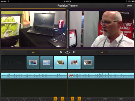
Shave off one frame at a time with precision trimmer.
You can make your clips longer or shorter by tapping them on the timeline, then dragging the orange icons that mark both the start and end of the clip to the left or right. If you really want to be exact, tap on this double-arrowed icon to bring up the precision trimmer. This will open a new display that allows you to add or trim one frame at a time, showing the resulting exit from the previous clip and entry to the next clip in sequence.
Double tapping an element will bring up a properties dialogue box for it. You can change the aspect ratio, volume, and add a fade.
You have three audio tracks to play with for music and sound effects. Unfortunately there is no mechanism for recording a voiceover onto your timeline, as there is with iMovie. This seems to be a major oversight for Avid’s app, as voice overs are needed to create many different kinds of videos – especially when you’re a reporter.
You can record video directly onto the timeline by pressing the red dot button (like the record button on a VCR) in the upper left-hand corner. Technically, you could record your voiceover this way and then overlay your video clips on top of that. But then you’d be left without any sound for these clips, and the process would be fairly clunky. You’re required to render your timeline in order to preview it after any compositing.
Rendering your product
Once you’ve finished your editing, you can flip back to the home screen to export the whole project as a single video file.
You can export it as a video file to your library, e-mail it directly, or upload it to Facebook or YouTube. There’s also an option to export the project to a file compatible with the full desktop version of Avid. I could imagine many video editors would like to use this app to prepare basic story boards, then export to their desktop to brush up on the finer details and add in flashier graphics.
Overall impression
Avid has done a good job of packaging a lot of video editing functionality into a user interface that works well on the iPad. But it comes short in a couple of areas that stop it from being everything it could be for serious video editors.
The strong points include its ease of use for managing media elements and manipulating them on the timeline. There is compositing capability, which is a big plus, and some good montage and basic title templates.
The negatives include the rendering time required for compositing items in order to preview them. There’s also no voiceover recording feature, which iMovie offers. The titles don’t come in theme packages as they do in iMovie, and are too plain overall.
For the $4.99 price tag, this is an app worth having for video editors. But you’ll probably find yourself using it more in conjunction with iMovie than exclusively on its own. If you use Avid on your PC, then it’s a no-brainer.


 Brian Jackson is the Associate Editor at ITBusiness.ca. Follow him on