Features like Bing’s Visual Search and Google Fast Flip, which is designed to replicate the experience of flipping through the pages of a newspaper or magazine, are supposed to be improving the traditional search engine.
Searching with images is meant to help us find what we want faster. But I think these tools are doing more harm than good; all I see is a mess of useless features that bring more confusion into the search process — not less.
Bing 2.0

Microsoft employees were given a sneak peak at the new Bing features last week, and many of them were tweeting wildly about what Bing had in store for the public.
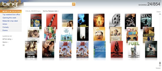
Yesterday, the rest of us were introduced to Bing’s Visual Search. Powered by Microsoft’s video plug-in, Silverlight, Visual Search is supposed to help you “winnow your search down fast.” But all I found was a frustrating mess of images that, more often than not, meant almost nothing to me.
I tried Microsoft’s Visual Search test page, which is primed with search categories that would benefit from a visual search engine. For my test, I used the movies category, which initially called up a selection of more than 800 movies.
The centre of the page displays movie images, while the left side of the page lists several links that could help cut my search down by pointing me to which movies are in theaters, which are the top box office performers, and which fall into categories like action and comedy.
I can see how Visual Search would be a quick way to find out what’s playing on the big screen this week or to see which movies are coming soon, but the larger categories like action, comedy, and drama were ridiculous. I mean, really, how often are you going to scroll through an A-Z list of thousands of action movies? I’m guessing not very often.
But let’s say you found the image you were looking for, and now you want to learn more about that particular movie.
So you click on the image, and guess where Bing takes you? That’s right: a list of boring blue links interspersed with a few images and video thumbnails. So Bing doesn’t go beyond the list of blue links with Visual Search; it just adds a few more steps to get you there.
Google Fast Flip

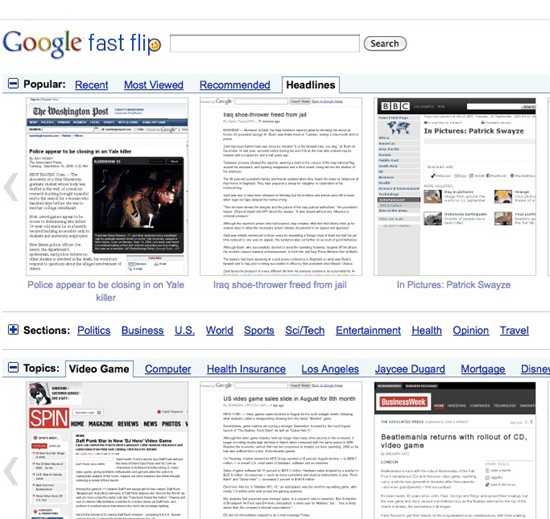
Fast Flip is a Google News add-on that is an attempt to imitate the experience of flipping through a magazine. Google said it wanted to design a “way to flip through articles really fast without unnatural delays, just as we can in print.”
To a certain degree Google is on the right track. The Fast Flip pages load quickly and you get a visual snapshot of what the more popular news Web site looks like in relative real time.
However, I found it hard to read the headlines in Fast Flip, and many of the visuals the service provided were just snapshots of lines and lines of text.
If you want to read what a page says, you can click on a snapshot to magnify it, read parts of the text from that site and then scroll through the rest of the Web snapshots as well. This effect is closer to that magazine feel Google was going for, but I found it confining since I was unable to get a broad look at all the news of the day the way I can with Google News.

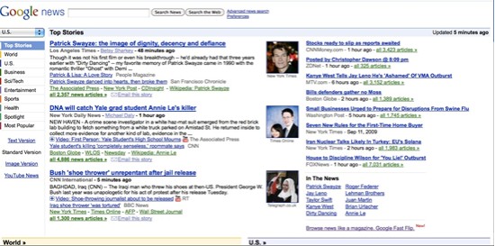
From Google News, I can click on all the headlines I want across a much broader range of categories, and I may even click on some of the photos if they’re engaging enough. Fast Flip, on the other hand, was basically useless.
The Web snapshots left me feeling disconnected from what I was looking at, and didn’t encourage me to dig deeper the way a list of headlines does.
In Favour of the Blue Link
Look, I know I’m going to get charged with being a Luddite or technophobe for what I’m about to say, but let’s face it: blue links just work. They’re not sexy or exciting, but blue links get the job done and they do it well.
Over the years, I’ve tried all the search enhancements that companies have offered, from Ask’s sneak previews to all-visual search engines. Yet after every search trial I always come back to Google, because it works. Those basic blue links may be boring, but they help me find what I want.
Now don’t get me wrong, visual search can come in handy–like when you’re looking for an image. But when you’re searching the Web, would you rather have a flashy-looking search page … or one that does the job?
I like the blue links, because they mean something. You can read a bit of text or a headline, and almost always understand what’s being said. Not so with a photograph. Images have impact, because they can be arresting and dramatic, but they’re rarely informative.
I need to know what information a Web page contains, not what it looks like. Images in search results are nice as an addition to links, but they are by no means a replacement. When it comes to search, an image just isn’t worth a thousand words. Give me my good ol’ blue links any day.


