For browser fans, this is the best of times. The five most popular Web browsers — Microsoft Internet Explorer, Mozilla Firefox, Apple Safari, Google Chrome and Opera — have released significant new versions this year.
Although Internet Explorer retains the lion’s share of browser use, its competitors are gradually gaining favor. It’s been a very long time since the browser market has been this unsettled and open to competition.
The good news for users is that every one of these top five browsers is exceedingly feature-rich, increasingly fast and easier than ever to use. The bad news is that it’s become very hard to decide which to use.
That’s why we decided to put the newest versions of the top browsers through their paces. Although Safari is available for Windows, and Opera and a beta version of Chrome are available for the Mac, we focused on the most popular configurations: Internet Explorer, Firefox, Chrome and Opera for Windows, and Safari and Firefox for the Mac.
We delved deep into their features, considered their speed and ease of use, and recommended what type of user each browser is most suited for. Finally, we chose overall winners for the Mac and Windows platforms.
What we’ve concluded has nothing to do with market share, and everything to do with which are the flat-out best, and why. So check out our reviews and recommendations, and let us know whether you agree.
Firefox 3.5 (Windows)
Of all the browsers, Firefox offers the best balance among speed, features, usability and extensibility. Because of this, it has been slowly eating away at the substantial lead enjoyed by Internet Explorer on Windows. Like Opera, Firefox is available for Windows, the Mac and Linux, so it is ideal for people or companies who use multiple platforms.
In my experience, Firefox doesn’t feel as fast as Chrome or Opera, although it seems speedier than Internet Explorer. In Computerworld tests using the SunSpider benchmark suite, Firefox fell in the middle of the pack for JavaScript rendering.

Firefox 3.5 offers a great combination of performance, features and extras.
Firefox may no longer be the browser to always introduce new features first (Safari, for example, introduced private browsing), but when it does include them, they always seem to be well thought-out and nicely implemented.
What may be the browser’s greatest strength, though, is not its feature set as much as its massive ecosystem of free add-ons — thousands of them, in every category imaginable. That, even more than the browser itself, is what sets it apart from its competitors.
Browser features
As with Internet Explorer, Firefox has all the features you want in a modern browser. There’s anti-phishing, a pop-up killer, very good cookie handling, private browsing (a.k.a. “porn mode,” which allows you to surf the Internet without leaving behind any trace of the sites that you have visited), excellent tab handling and more.
Firefox doesn’t have much of a built-in RSS reader; its Live Bookmarks feature for handling RSS feeds is not particularly usable. However, add-ons solve the problem — look for the excellent RSS reader called Sage.
What’s most impressive about Firefox’s features is not so much as what is there — it offers fairly standard fare for browsers these days — as the depth of those features and how they can be customized. Here’s just one example: When clearing your browsing history and traces, you get control over which elements you want to clear, including your browsing and search history, form and search history, cookies, cache, site preferences and logons. And you can clear them based on time: all of them, those you’ve visited today, or those you’ve visited in the last four hours, two hours or one hour.

Firefox gives you control over which browsing history elements you want to clear.
Similarly, dig deeply enough and you’ll find out that Firefox lets you block images from being loaded on specific sites to speed up Web browsing. You can also turn off JavaScript and Java on specific Web sites.
The anti-phishing filter, like that in Internet Explorer 8, protects not only against phishing attacks but also warns you away from sites known to attack your PC. There’s also a built-in spell checker.
Firefox also offers multimedia support (by supporting the HTML 5 audio and video elements) that lets you watch video and listen to music directly in a Web page without having to launch any plug-ins. The video is displayed by Firefox itself, and includes audio and video controls. You can also download the video and audio and save it on your PC. There’s a catch, though: The Web page has to use HTML 5, and few do right now. So it may or may not become important in the future.
Interface and extras
Firefox’s interface is about as simple as it gets: address bar, search box and menu across the top, browser area below. The look and feel is both good and bad — good because of its familiarity, bad because the browser is beginning to look dated. Mozilla is making plans for a redesign, but its possible solution is running into some controversy.
Mozilla has said that upcoming versions of Firefox will do away with the menus, and instead use buttons as a way to access menus and features. Initially, Firefox had said it was planning on using a “ribbon” interface, which many people interpreted to mean the ribbon like the one used in Microsoft Office 2007 and 2010. Ribbon detractors were not pleased, and Mozilla quickly clarified that it was not planning to copy the ribbon interface.
In version 3.5, you get all the usual tab handling features, including the ability to undo tabs you’ve already closed. Particularly nice is the ability to see a list of closed tabs or windows and then choose which to open. (Select History –> Recently Closed Tabs or History –> Recently Closed Windows.) This works only for the current browsing session; the history does not carry over from session to session.
You can also tear off a tab and launch it into a separate window, or drag a tab from one browser window into another to combine them. One nice touch is that when you drag a tab to reposition it among other tabs, a thumbnail of the tab displays as you move it.
As with Internet Explorer and Chrome, the address bar, which Mozilla calls the Awesome Bar, does double-duty as a place to type URLs and a way to search the Web along with your history and bookmarks.
The bottom line
When it comes to balancing performance, features and extras, Firefox beats all other browsers, particularly because of the vast number of add-ons available for it. More than anything, that’s what sets it apart. If you’re the kind of person who like to fiddle and tweak your browser, and add extra capabilities, Firefox simply can’t be beat.
— Preston Gralla
Google Chrome 3 (Windows)
If you’re the kind of person who favors minimalist art, svelte-looking Scandinavian furniture and speed for the sake of it, then Google Chrome may well be for you. It’s a stripped-down browser with one main reason for being: speed. If you’re a “just-the-fact’s-ma’am” type who wants to browse the Web at warp speed, this is the one to get.
On the other hand, if you like features such as a built-in RSS reader or add-ons to extend the browser’s capabilities, this won’t be the app for you. Chrome may already be on version 3.0, but its interface has the look and feel of a very early browser that is still a work in progress.
Browser features
Even before the release of version 3.0 in September, Chrome was fast, and the new version ups the ante even more. Computerworld tests of five Windows browsers found that “Chrome renders JavaScript more than nine times faster than Microsoft’s Internet Explorer 8 (IE8), is over five times faster than Opera Software’s Opera 10, two-and-a-half times faster than Firefox 3.5 and 30% faster than Safari 4.0.”
That being said, there is more to Chrome than raw speed. There’s a useful if not overly powerful bookmarks manager, a pop-up blocker and “Incognito mode,” which is another term for private browsing.
Chrome also has a nerd-friendly Task Manager, similar to Windows’ Task Manager, that provides detailed information about Chrome’s current status on your PC, including each separate process being used by Chrome, memory use and CPU use. It also shows which processes are accessing the Internet, along with access speed. You can even use it to free up RAM or your CPU by killing any processes you don’t want running.
Apart from that, though, don’t look for many features, because you won’t find them. Unlike Firefox, there is no eco-system for add-ons. It doesn’t have the type of nifty features such as Web Slices that Internet Explorer sports. And it doesn’t come close to the massive feature set you’ll find in Opera.
Interface and extras
Chrome follows the same design principle as does the Google home page: Less is more. There’s an address bar, which Google calls the Omnibox, and two icons on the right for customizing Chrome — and that’s it.

Google Chrome 3 is fast and lightweight.
The Omnibox does double-duty as a search box and address bar. On the plus side is its simplicity: You don’t need to remember to type search terms in a separate search box. Type in a search term and your default search engine does a search. That’s it.
The Omnibox’s default search engine is (surprise!) Google. There are ways to search via other search engines from the Omnibox, but it takes a little bit of work — more work than it does in competing browsers when you want to use something other than the default search engine. I’ll leave it up to you to decide whether this is intentional or not.
The page that appears when you launch a new tab is useful; it shows thumbnails of pages you’ve visited most recently, as well as a list of tabs you’ve recently closed. You can change the layout of the page, and you can display the sites as a list or as thumbnails. But the page isn’t as customizable as Opera’s new tab page.
Chrome shines when it comes to tab handling. You can “tear off” tabs into their own browser instances, and combine several browser instances into one, with each instance becoming its own tab. You can also easily close tabs in groups, re-open closed tabs and duplicate tabs. There’s also support for the use of themes so you can “skin” the way that Chrome looks.
Chrome’s Task Manager provides detailed information about its processes.
One of Chrome’s less well known features may be its more important from Google’s point of view: what Google calls application windows. An application window is a Chrome mode designed for Web-based applications such as Gmail. When you’re in a Web-based application using Chrome, you can create a desktop shortcut that will launch the application in a browser window with no browser controls, so that it looks like a desktop application.
Clearly, this feature is built for a world in which many applications are cloud-based — like Google’s. I’ve found the feature somewhat confusing, because different Web-based applications behave differently in it. Sometimes new documents open up in a new application window, and sometimes in a normal Chrome window, complete with the normal browser interface. It still needs work.
I have also experienced some compatibility issues with Chrome. In the blog I write for Computerworld (powered by Drupal), Chrome cannot handle all of the features required for writing the blog. When a pop-up appears for inserting a link, the pop-up doesn’t display all of the features needed to insert the link. Internet Explorer, Firefox and Opera all work with the system with no problems.
The bottom line
If you care more than anything about speed, Google Chrome is for you. In addition, because it’s so fast and lightweight, those who have slow laptops that have trouble handling other browsers will find it useful. But if a rich feature set is more up your alley, you’ll want any of the competing browsers instead.
— Preston Gralla
Internet Explorer 8 (Windows)
Like Microsoft itself, Internet Explorer endures constant criticism, yet it remains the world’s dominant browser. According to Net Applications, in September 2009, all versions of IE had 66% share of the market, versus 24% for Firefox, 4% for Safari, 3% for Chrome, and 2% for Opera.
IE8 is a mixed bag of a browser. It’s slower than the competition, yet its host of innovative features will make up for its slowness with many users. In the past, Internet Explorer lagged behind the competition when it came to browser features — for example, Microsoft doggedly refused for years to add tabbed browsing. But those times are long gone, because Internet Explorer 8 is packed with features.
Browser features
If you were to put together a checklist of the most important features a modern browser requires, you’d find that IE8 has just about all of them covered. Its tab-handling capabilities are exemplary, it includes private browsing, it has an excellent anti-phishing tool and pop-up blocker, and its search box is as good and as customizable as any browser’s. Its built-in RSS reader is by far the best of any browser.
Its security and privacy tools are excellent as well, including protection against cross-site scripting attacks. Its anti-phishing tool not only protects against phishing attacks, but warns you when you’re about to visit a site known to harbor malware. The browser’s InPrivate Filtering can prevent Web sites from sharing information about your browsing habits without your knowledge.
IE’s cookie-handling capabilities are especially noteworthy. In the past, browsers took an all-or-nothing approach to cookie deletion — keep them all or kill them all. But IE8 lets you delete cookies and temporary Internet files from all sites except those that you have on your Favorites list.
Although the browser is now up to version 8, Internet Explorer 6 and 7 are still in widespread use, and many Web sites are built for older versions of the browser. (According to Net Applications, there are still more IE6 users than any other version.) To get around problems caused when you try to browse such sites with IE8, IE8 includes a feature called Compatibility View, which automatically changes the way the browser handles the site and displays it properly in Internet Explorer 8.
Internet Explorer 8 has a straightforward interface, solid security and some nice extras.
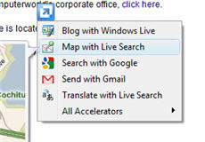
Internet Explorer 8 also includes two features designed to deliver information and services from Web pages directly into the browser, without you having to go out and visit those pages — Accelerators and Web Slices. The more useful of these features, Accelerators, is something like a mini-mashup that delivers information from another Web site, such as map information, directly to your current browser page.
So, for example, when you are on a Web page that has a street address on it, you can highlight the address, and then choose one of the map accelerators — from, say, Google Maps or Microsoft Live Search — and you will see a map of the address displayed in either a flyaway pop-up or another tab, depending on how the specific accelerator works. You can interact with the map on the pop-up in the same way as you would if you were on the provider’s site.
Web Slices deliver changing information from another site into your browser — for example, the progress of an eBay auction. They live in your address bar. Click them, and you’ll see a portion of the other Web page — the “slice” — with the information that has changed.
As useful as Accelerators and Web Slices are, there is a significant problem with them — there simply aren’t very many available, aside from some written by Microsoft itself. So as useful as they are in theory, in practice they’re not of much use.
That brings up what is probably Internet Explorer 8’s biggest shortcoming — compared to Firefox, which can be tricked out and pumped up by thousands of add-ons, there are very few add-ons written for IE.
Interface and extras
Internet Explorer 8’s interface is simple and straightforward, although because there are no apparent menus, it can take some getting used to. The Page, Safety and Tools icons on the top right of the screen allow you to customize how the browser works, and icons give you access to the RSS reader and to Favorites. For those who miss menus, you can display them by pressing the Alt button.
IE8 includes innovative features such as Accelerators.
Tab handling is excellent. A small but noteworthy feature is that, when you open a tab from an existing page — for example, by clicking a link on it and opening that link in a new tab — the new tab opens just to the right of the originating one, and both tabs are given the same color. This groups and color-codes related tabs for easy perusal. You can also easily move and rearrange tabs, reopen closed tabs and so on.
The address bar does double-duty as a place to type URLs and a place to search the Web, as well as previously visited Web sites, Favorites and RSS feeds. And the search box to the right of the Address Bar is nifty as well — when you choose a search engine, that search engine can customize the results displayed there. When you search The New York Times from the search box, for example, you’ll see full headlines matching your search results, as well as pictures.
The bottom line
Internet Explorer 8 includes some very useful and innovative features such as Accelerators, a straightforward interface, solid security, good tab handling and some very nice extras. That’s all to the good. But because there are so few add-ons written for it, you can’t do much to extend the browser’s capabilities. If you’re looking to expand your browser’s power, you’ll do better with Firefox.
— Preston Gralla
Opera 10 (Windows)
With all the publicity surrounding Chrome, Firefox and Internet Explorer, Opera has become the browser that time forgot. Its share of the browser market has been bumping along at about 2%, according to research firm Net Applications, with no apparent sign of changing.
That low market share, though, has nothing to do with the browser’s capabilities, which are substantial and in some ways superior to other browsers. Opera has a host of advanced features you won’t find elsewhere, and is fast to boot. Version 10 managed to add several new features, while further increasing the speed of this already speedy browser.
Opera runs on Windows, Mac OS X, Linux and a wide variety of mobile devices.
Browser features
Opera is a do-it-all browser that has just about any function you can name. It includes a pop-up blocker, tabbed browsing, a good bookmark manager, a download manager, a cookie manager … name a popular feature and you can be pretty sure that Opera has it.
The usual features are just the beginning, though. Dig down a bit and you’ll find some exceptionally useful tools that other browsers would do well to emulate.
Those who use browsers on more than one computer or more than one platform, for example, will welcome Opera Link — a way to synchronize your bookmarks, history list and more among all of your computers.
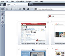
Opera’s Speed Dial is similar to Safari’s Top Sites feature, but is more configurable. Whenever you open a new tab, you’ll see a list of your most-visited sites displayed as thumbnails. You can have between 4 and 24 of the thumbnails displayed, and you can also add and remove sites on the list.
In addition, unlike competing browsers, Opera includes a robust e-mail client that supports IMAP as well as POP3, and has a spam filter and a way to create rules for handling incoming mail.
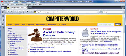
Opera 10 is packed with features.
People who essentially live in their browsers will want to try out Opera’s Notes feature which, as the name implies, lets you jot down notes. You’ll be able to create multiple folders to organize them, and you can also search through your notes. There’s e-mail integration as well, so that you can send any note via Opera’s built-in e-mail client or an e-mail client of your choosing.
Bloggers and Facebook fans will appreciate Opera’s inline spell checker. And if you’ve ever been frustrated by a slow connection — for example, at a Wi-Fi hot spot in a café — you’ll want to try out Opera’s Turbo Mode, which the company says compresses Web pages by as much as 80% as a way to speed up browsing. I found that at a slow hot spot, browsing was indeed improved; but that improvement came at a price, because the images on Web pages were noticeably degraded due to the compression.
Opera is notable not just for the breadth of its features, but for each individual feature’s depth as well. For example, its download manager lets you pause and resume downloads, and gives important information about each download, including its speed and progress. Dig into almost any feature and you’ll find similar depth.
Given all that, it’s surprising that Opera lacks one feature that Chrome, Firefox and Internet Explorer all have: private browsing. It’s a surprising oversight. If this feature is important to you, you’ll have to find it in another browser.
Interface and extras
Opera manages to stuff all these features into a straightforward interface. The menus are organized well, and so it’s easy to find features with a little bit of digging. Opera is a bit more cluttered-looking than competing browsers, but that’s because it has so many more features.
New tabs in Opera display your most-visited Web sites as thumbnails.
This browser really shines when it comes to tab handling. When there’s new information available on one of your pages, a small blue dot appears on the upper right of the tab, alerting you that there’s been a change. You can easily re-open closed tabs by pressing Ctrl-Z. Opera also sports resizable thumbnails that show the content of your tabs, so you can see at a glance what content is in each tab.
There are other nice extras as well, such as the ability to navigate the Web using mouse gestures. And the Rewind button is a clever little feature that lets you jump back to the beginning of a tab’s browsing session.
I did find one compatibility issue with Opera: It was unable to work with the Web-based version of Google Talk. Other than that, I had no problems browsing the Web with it.
Opera also has a variety of plug-ins, although not nearly as many as are available for Firefox.
The bottom line
Who should use Opera? If you want the most feature-packed browser, and don’t care about a bit of clutter, it’s certainly worth a try.
— Preston Gralla
Firefox 3.5 (Mac)
Although most of Firefox’s major updates and improvements were introduced with last year’s version 3.0 update, version 3.5 for Macintosh, released in June, offers enough improvements to warrant the download.
Browser features
One of Firefox 3.5’s key enhancements is, of course, performance. The latest version uses the Gecko 1.9.1 engine for HTML rendering and the TraceMonkey engine for faster JavaScript rendering. For everyday use, this translates to noticeably faster rendering of Web pages compared to earlier versions.
However, if absolute speed is really important to you, Google’s Chrome (still in beta on the Mac) or Apple’s Safari are the browsers to get. According to tests I ran using Futuremark’s online benchmarking application Peacekeeper, Chrome and Safari bested Firefox every time — sometimes by a lot, sometimes by a little.
Firefox 3.5 embraces open Web standards, offering HTML 5 support — that is, the ability to view multimedia based on commonly used standards such as JavaScript, CSS and HTML instead of using proprietary plug-ins like Adobe’s Flash or Microsoft’s Silverlight. Currently, the HTML 5 standard is still in its infancy, and there is a war of wills between Apple and the Mozilla group concerning the use of codecs.
Format squabbles aside, the ability to natively stream content from the Web without the use of proprietary plug-ins is a win for everyone. No doubt the Mozilla group will ensure that Firefox adheres to the Web’s constantly evolving standards.
Another benefit of HTML 5 is support for offline resource caching, which allows downloading Web content for offline access. Firefox now supports this, too.
Firefox 3.5 for Mac offers compelling new features and improvements.
Firefox for Macintosh has also learned some tricks that have been available on other browsers for some time. As of version 3.5, it offers gesture support using Apple’s laptop trackpad, similar to that offered by Safari. Web sites can be scrolled through using two fingers, Web pages can be navigated back and forward with a three-finger swipe, and Web content can be zoomed out and in using the pinch and reverse-pinch gestures.
In addition, Firefox now supports private browsing. I found that private browsing worked as advertised; once turned on, Web sites leave no apparent bits of evidence that they were visited on your computer. Using Firefox’s Privacy Preferences, it’s possible to set Private browsing as a permanent mode.
Another new Firefox feature is location-aware browsing. For example, if you type the word “pizza” in Firefox’s Google search field, you’ll get listings, map results and phone numbers of pizza restaurants near your location. These services have been available on mobile handsets like the iPhone for some time, and now that it’s in Firefox, searching for local areas of interest should be that much easier.
Interface and extras
Firefox’s default interface features an oversized back button, along with the usual retinue of navigation icons: forward, reload, stop, home, address bar (with site identity and drop-down history) and a search bar (featuring a drop-down search engine selection). Below that is the bookmark bar, and below that, browser tabs. Throughout, there are splashes of color in the display of site icons and the search/address bar fields.
Although I’m more of a Safari fan, the default Firefox look is straightforward and laid out well enough for most people. It’s certainly an improvement over earlier versions, and if you don’t like it, you can download a wide variety of themes that change the look.
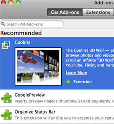
Add-ons are still Firefox’s strength.
Where Firefox truly shines is in its customizability, which can’t be matched by any other browser. Add-ons are still Firefox’s strength, with over 6,000 available for download.
For example, Walter Coots, a Web developer I’ve worked with in the past on site designs, noted that Firefox offers a wide variety of add-ons for Web workers.
“I have one add-on that allows me to switch which version of Flash I have installed,” he said. “The debug (developer) version of Flash player also has support for outputting errors, and there’s an add-on in Firefox that allows me to see that in the sidebar.”
The bottom line
The latest Firefox for Mac offers plenty of compelling new features and improvements, and the attention to detail shows. There’s a reason this browser is grabbing so much attention. If you’re still using Safari, it might be time to see what this fast-growing open-source upstart is like, especially if you like customization.
— Michael DeAgonia
Safari 4 (Mac)
Safari 4 for Macintosh offers quick and reliable browsing framed within a minimal interface, with rendering speeds that rival any modern browser on the Mac platform.
Safari’s integration with the technologies inherent to Mac OS X and Apple hardware — like the gesture support for multitouch trackpads — means that Safari users can expect to enjoy a very Mac-like experience. On a PC running Windows, Safari feels like just another polished browser; on the other hand, on a Mac, the combined package makes it my top pick.
Browser features
Based on the open source WebKit browser engine, Apple’s Safari has for years included features such as a built-in Google search field, private browsing, iTunes-esque bookmark management, auto-fill for Web forms, a consistent pop-up blocker, a built-in RSS feed reader and Snapback (the ability to return to the starting point while browsing nested Web pages or search results).
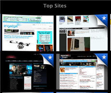
New to Safari 4 is the start page called Top Sites. Top Sites features a Search history field on the lower right and a collection of live Web site previews arranged in a customizable grid array. These previews become populated by sites that are most-visited, and can be easily edited to display thumbnail previews of your favorite Web sites, which are updated dynamically.
Top Sites also displays an indicator — in the form of a star peering from behind a site’s preview — for sites that have been updated since the last visit; it’s handy for tracking multiple sites at a glance. Clicking on any of the site previews zooms the Web site to fill the window.
Clicking in the search field within Top Sites unveils the Cover Flow interface made popular by Apple’s iLineup (iTunes, iPhone and Finder also use this view). Large previews of previously visited sites are displayed in succession and then filtered out with each keystroke in the Search field, allowing you to flick through previews of the remaining search results.
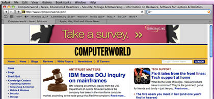
Safari 4 is fast, with an uncluttered interface.
As any good Mac app should, Safari supports the multitouch feature used in Apple’s current laptops: If you own the right equipment, the Cover Flow search results page can be flipped through using two fingers, as can scrolling through Web pages. You can also pinch to enlarge or shrink Web pages using the trackpad, and you can quickly move back and forward between sites using three-finger swipes. Once you grow accustomed to using gestures to navigate Web pages, it’s groan-inducing to use a laptop that lacks these features.
Not all of Safari’s new features are as obvious as the Top Sites and search via Cover Flow examples, but Safari packs in a lot, including location-aware browsing, additional tools for developers, offline Web app support, privacy and security additions, to name a few.
One of Safari’s strengths is its ability to render sites properly and quickly. Safari was one of the first browsers to score 100% on the Acid3 browser test, which measures how compliant a browser is to Web standards. While Apple’s browser parses HTML quickly, JavaScript rendering has also speeded up significantly via Apple’s new Nitro engine.
Like Firefox 3.5, Safari 4 expands support for open technologies by embracing HTML 5, which allows developers to add more dazzle to their sites without using proprietary plug-ins. This is still an issue that is being sorted out, but browsers’ ability to stream media natively is ultimately a good thing for consumers.
Safari’s Top Sites feature includes live previews of your favorite Web sites.
It’s worth noting that Safari runs in 64-bit mode under Mac OS 10.6 (Snow Leopard) — on Intel chipsets that support 64-bit mode, of course.
Another neat trick: Under Snow Leopard, plug-ins such as Flash run in sandboxed mode, which means that Safari doesn’t crash when Flash does.
Interface and extras
The first time Safari 4 is launched, it offers up a quick animation showing off the capabilities of HTML 5 and JavaScript. Apple’s decision to skip an initial wizard-based setup screen means you can jump right into browsing. Rest assured: Common functions such as importing bookmarks can all be completed after the fact.
The default toolbar currently consists of back and forward buttons, the address bar, and a Google search bar with built-in snapback feature. Below that, the bookmarks bar stores shortcuts to sites, as well as icons allowing access to the Top Sites start page and bookmark management. Beneath that is the area for tabs.
While this may sound typical of other browsers, very little space is wasted in Safari’s arrangement; for instance, bookmark addition and reload buttons are integrated into the address bar itself. The lack of superfluous toolbars and buttons increases viewable screen real estate for actual Web content.
The bottom line
Safari 4 may not be right for everyone, as it lacks the support for add-ons available on competing browsers such as Firefox. However, the snappy rendering coupled with an uncluttered interface makes it easy for users to surf the Web with minimal distractions, and because of that, Safari is my browser of choice when navigating the constantly shifting Internet jungle.
— Michael DeAgonia
Conclusions
So which browser do we think is best for Mac and Windows?
If you’re a Windows user, the best browser is Firefox. Sure, Chrome might be faster, Opera may have a fuller suite of capabilities and Internet Explorer may have one-of-a-kind features such as Web Slices. But when it comes to the best combination of speed, usability and features, Firefox is still the champ, especially given the thousands of free add-ons that give it capabilities no other browser can offer.
As for the Mac, Safari is the top choice. Even though it doesn’t support add-ons as Firefox does, it has an elegant, uncluttered interface and it’s as fast as greased lightning, a combination that can’t be beat.
Do you agree or disagree with our picks? Let us know in the article comments.
Preston Gralla is a Computerworld contributing editor specializing in Windows. Michael DeAgonia is a frequent Computerworld contributor specializing in Macs.
Source: Computerworld.com


