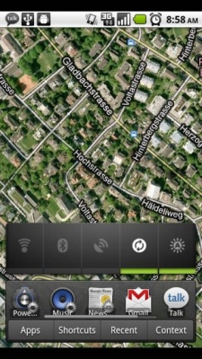
“Power Strip is a dock-like Android 2.1+ compatible home application. Thanks to the multi-tasking in Android, it can start from anywhere in any orientation and keep your current activity on the screen.” That’s from the developer Intuitit’s Website.
It’s an ambitious mission, that’s for sure. Intuitit is also the developer of the popular Home++ replacement home application.
The key difference between Power Strip and other replacement home apps is that Power Strip doesn’t really have its own window. It’s more of an overlay that pops up on top of whatever it was you already had open.
You have two ways to wear Power Strip on your phone. You can choose to use it as your home application, where it essentially replaces your native home screen. Or you can choose to keep your home application as it is, and activate Power Strip by long-pressing your phone’s search button.
Related stories
Awesome ways to customize your Android phone
Android update brings Flash to smartphones
When the app is open it has three panels that take up the bottom three-fifths of your screen. The bottom strip acts as tabs, where you can choose Apps, Shortcuts, Recent, or Context. Just above that is the Widget Strip, where you can add or remove links to any of the widgets that you have installed on your phone (notice I said links to). The top pane (what I’ll call the Viewer Pane) is the biggest, and changes depending on which tab or widget you have selected below. Hitting the Apps tab is the same as opening the default app drawer on your stock Android home screen–it shows all of your apps in the Viewer Pane.
The Widgets Strip is by far the best feature. You can add icons for as many of your widgets as you’d like, and when you click on them, the widget itself pops up in the Viewer Pane; you can interact with it from there, and then get back to what you were doing.

For example, say you are in the middle of watching a YouTube video, and it’s not coming as fast as you would like. You can hit the home key to start up Power Strip, then click your Power Control widget, enable Wi-Fi (or turn the screen brightness up), and go right back to watching the video without having to navigate away from it. Or you can use your music player widget to skip to a good song while you’re in the middle of writing an e-mail message. Very, very handy.
The Shortcut Tab is a place for you to put shortcuts (naturally). Any item you can make a shortcut to on the home screen (an app, a contact, a bookmark, and so on), you can put in there. You click the Shortcut Tab and they show up in the viewer pane. The Recent tab gives you access to reopen the last twelve apps you had open. It works in the same way as Android’s native app switcher, except that it remembers the last twelve instead of the last four; quite an improvement. The Context tab opens up a menu for whatever app is open underneath Power Strip. It gives you such options as Share Market link, go to Market page, Uninstall, App info, and Force stop.
So, now that you know the features, how well does it work? The answer, unfortunately, is “just so-so.” For me, as a replacement home it’s a nonstarter. It’s slower to load up than the stock home screen, and it makes your phone look extremely cluttered. In many cases, it actually ends up taking more clicks to get to the application or widget you want, because in Power Strip you have to scroll through some stuff. Also, only one widget can be displayed at a time. I think an intelligently laid-out stock home screen is far more efficient.
And Power Strip isn’t always totally consistent in the way it behaves. Sometimes it pops up after a single click of the home screen, and sometimes it takes two. Worst of all, like many replacement homes, this one will drain your battery much faster than if you were just using the native home.
That said, for use as an augmented app-switcher (not making it your home, but long-pressing the search button to activate it, instead), it’s not bad. The ability to control some of your widgets without switching away from an app is extremely useful. Frankly, I wish that were all that Power Strip did. It would be faster and much tidier if it simply gave you access to your widgets and wasn’t bogged down by the other “features.” Still, I give props to Intuitit for trying something different.


