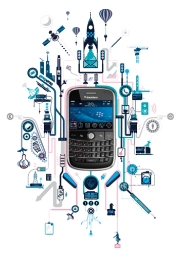
How do you get creative types to look at a smartphone that’s not an iPhone?
The answer for Vodafone was to engage the illustration skills of New York-based design studio Vault49 to remind viewers that Apple’s handset isn’t the only sleek and stylish model on the market – and that it has some strong competition from BlackBerry.
The commission came from agency Inferno that wanted a campaign for Vodafone to promote the latest range of BlackBerry handsets: Bold, Curve, Pearl and Storm.
Related stories
Reader’s revenge: iPhone vs. BlackBerry revisited
BlackBerry Tour combines Bold and Curve features – without the WiFi

The designs were to be used across press and Web ads, and in Vodafone stores.
One potential feature was to be an animation pushing the BlackBerry Storm, which would be used online and in stores.
The campaign was commissioned to be used by Vodafone in the UK, with the option to use it across Europe.
Vault49’s brief was to design pieces for each of the four phones – using styles that highlight the model’s key features and would attract that model’s potential customers.
The studio then had to draw elements from each to create a typographic piece around the words ‘Welcome to Everything’ with a united style.
“Each phone has a unique identity, and Inferno provided us with a list of key characteristics of the products and their target audience,” says Vault49’s co-founder, John Glasgow, who was the creative director on the project.
From these lists, Vault49 developed a concept for the images for the BlackBerry Bold (Director), Curve (Explorer), Pearl (Juggler), and Storm (Inventor).
Beyond having to represent the individual strengths of each phone, Vault49 was given an open brief, with plenty of creative scope to develop its ideas as it saw fit.

*BlackBerryBold (the Director)
“The BlackBerry Bold is for people who like to balance work and play, with a real entrepreneurial spirit,” says John Glasgow.
“We conceived of a pinball machine, where many business icons were interconnected. Because of the overall pinball composition we ensured that the fun features of the phone were clear.”
“We have a great deal of respect for the art direction of [Inferno’s] Paul Nowikowski,” say Glasgow.
“He allowed Vault49 all the time and space we needed to experiment, make mistakes, learn from them, and to ultimately create some of our best work.
He also offered key mood guidance along the way, suggesting where we might be liberal and freehand, and where we might be more structured.”
Glasgow says that the designs show what can be achieved if clients share decisions about the overall concept for a project with designers and illustrators, instead of forcing a design into a preconceived mould.
It allowed Vault49 avoids the eternal problem of studios – and particularly illustrators – who become well-known primarily for one or a few styles: that of being asked to continuously recreate successful previous pieces for new clients.
“We were determined to avoid any clichés within our own portfolio,” says Glasgow. “Certain areas of our portfolio have been repeated once too often by client request, and we made sure that every aspect of this brief was driven by ideas and original concepts.”
Getting inventive
Inventor was the most complex of the pieces, as it brought together different styles of work from across Vault49’s creative team – including vector art, hand-drawn elements, photocopies and cut-outs.
The design had to work in print, and form the basis of an animation, which was to be created by motion-graphics artist Russ Murphy (www.ruffmercy.com). Including hand-drawn elements also threw up some challenges.
The nature of our creations is that we generally require pin-point control over the elements,” says Glasgow, “and we’re constantly tweaking and altering the original content as designs develop.”
He continues “This presented a particularly difficult challenge with the Inventor image because of the large amount of hand-drawn content and the edibility, which we needed as part of the design process.”
The solution Vault49 came up with was to create the initial versions of the designs as line art in Illustrator, and then refine these until the team was happy with where they were positioned.
Then they would print it out and trace over it by hand so that the hand-drawn elements sat in the right place in relation to the rest of the work.
<img src=http://www.itbusiness.ca/images/articles/Nov24/BlackBerryPearl.jpg
*BlackBerryPearl (for Jugglers)
“Inferno advised us that [users of theBlackBerry Pearl] are ‘jugglers’, and from this cue we developed this design as whirling dervish of activity,” says John Glasgow.
Inventor wasn’t the trickiest image to create, though – that was the Welcome to Everything piece, as this had to combine four quite varied styles into a single, coherent artwork.
Glasgow says that even though Vault49 had created all four pieces in the knowledge that elements of each would have to feed into a final design, putting them all together in a way that didn’t seem forced was quite a challenge.
“There were a good few days of experimentation, head-scratching, a little self-doubt, then finally a piece of the design just clicked into place and it came together quickly after that,” he says.
As Digital Arts went to press, it was still not confirmed when the campaign would go live. Glasgow says that the wait for final approval and rollout is the most frustrating part of this brief. “We’ve still no indication of a commercial release,” he says, “but we can at least show the work around and bathe in all our hard work.”
Source: DigitalArts


