Ever since Palm unveiled the Pre and its brand new mobile operating system, webOS, in January at the CES 2009 show, Palm’s smartphone has been the talk of the Web, consuming the tech blogosphere and frequently headlining on such sites as WallStreetJournal.com and CNN.com.
That’s for good reason. Palm, once king of the PDA space with its Pilot and Treo handhelds, has fallen from grace, and the Pre, along with webOS, represents what may prove to be Palm’s final effort at a comeback against those other little smartphone makers, RIM and Apple.
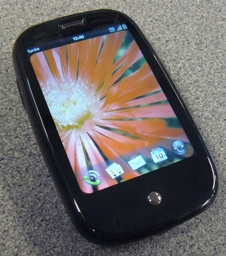
The Palm Pre
If the Pre is a hit, Palm’s down-and-out days could be forgotten as quickly as, say, the Foleo. But if Pre falls flat, further reducing confidence in Palm and its wares, the company may never recover.
I spent some time with the Pre at CES and again at CTIA a few months ago, and I’ve had a review unit for two weeks now. While I do not think the Pre is a true iPhone or BlackBerry competitor–sorry Palm, the webOS certainly caught my attention.
And if anything’s going to save Palm now, it’ll be webOS that does the trick.
It’s like I wrote back in January after the first time I laid thumbs on the Pre: “[I]t’s not Palm’s latest device that has me truly excited; it’s the OS.” After spending some quality time with the Pre, I’m proud to say I was dead on with my early assessment. But don’t just trust me; see for yourself.
First up, the Pre’s strengths….
The Palm Pre and webOS: The Positives
First, my (few) positive impressions of the hardware.
The Palm Pre looks great. I very much like its shiny, curvy form factor. Its tiny size–when closed–makes it perfect for carrying in a pocket sans holster. It’s also relatively light for a slider device; sliders are typically heavier than normal candy-bar-style devices or even flip phones.
It has just one button on its face, the “Center” key, two more keys for volume controls on its right side and another two on top for muting and power, all of which are easy to access and employ.
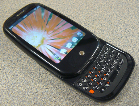
The Palm Pre with Keyboard Open
Love that webOS
The software? webOS is a brand new mobile operating system, built by Palm from the ground up using common Web technologies like Javascript, HTML and CSS. That means experienced developers should be able to jump right in to create Pre apps with relatively little new knowledge. And the faster that great applications become available for webOS, the more attractive it will become to potential users. I look forward to seeing what kind of apps spring up for the Pre.
The Pre’s webOS navigation is based on the idea of shuffling a deck of cards. For example, every new application you launch opens a new “card.”
When using multiple apps, you can minimize the programs, then flip through cards to easily jump between apps. You close them by vertically flicking the cards off screen. To view available cards, or active apps, at any time, you simply click the Pre’s lone front-facing Center button.
If no apps are open, the Center button displays the Pre’s Quick Launcher bar along the bottom of your display. The Quick Launcher houses your four most commonly used applications, as well as a link to the Full Launcher, where all of your apps live.
Touch “gestures” also play a significant role in Pre navigation. The Pre has a small area directly below its display and to the sides of the single Center button, called the Gesture Area. Because there’s only one physical key on the Pre’s face–not counting keyboard keys–there’s no “return” or “escape” button for returning to previous screens.
Instead, a quick gesture from the far right side of the device’s gesture area to the center, just over the Center key, works to return to previous screens.
I appreciate how easy it is to access all of your applications at any point, since you can drag a finger upward from the gesture area to the middle of your display and your Quick Launcher “ribbon” appears on-screen.
You can enable a Gesture Area option that lets you swipe a finger from the far right-side of your Pre all the way to the left, to toggle between active apps. Overall, I was impressed with Pre navigation, as it was mostly easy to use and intuitive. (I did have some issues with the general return gesture, but I’ll get to that in the next section…)
The very best thing about webOS? It’s completely original–and completely unique. webOS doesn’t feel like some weird evolution of Windows Mobile or a cheap BlackBerry OS replica. Nor does it feel like it’s trying to copy the iPhone’s mobile OS, like so many other touch-based iClones. Palm built webOS based on its own ideas and design, and it shows. I give the company credit on that front.
For everything I like about it, the software is still a bit rough around the edges; it’s missing little touches that would make it feel more “finished.” For example, if you type “i’ll” in the middle of a sentence, webOS does not correct it to “I’ll” like the BlackBerry OS and other leading mobile operating systems. This obviously isn’t ideal, but such little imperfections can be expected with a first-generation OS.
Updating webOS is remarkably simple. When OS updates become available, Pre users can manually seek them out and wirelessly download and install the software. Or if you’re not looking for the update yourself, your device will notify you that an update is available on its own (and even automatically download it if you don’t during a certain period of time.)
webOS update 1.0.3 just recently became available, and I was able to quickly locate it via the Pre’s Updates app, then download and install it in less than 10 minutes without ever using a computer. That’s infinitely simpler than the current process for upgrading a BlackBerry OS and even easier than the already-straightforward iPhone OS update, which still requires a computer.
webOS also offers a simple automatic daily backup option, which you can turn on and off at will. When you first setup your Pre, you’re prompted to create a Palm profile for your device.
The profile is used to identify specific users, settings and preferences, but it’s also used to signify which user data is automatically backed up. Palm Profile information is backed up every day, as long as Backup is enabled.
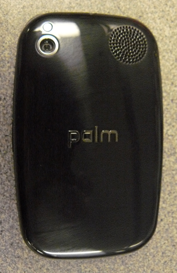
The Palm Pre (Rear View)
Down and Dirty with the Palm Pre
Of all the native Pre apps, I liked the webOS browser best. It’s consistently speedy, intuitive, and though I had a few minor rendering issues in particular seemed to throw the browser through a loop the browser quickly grew on me. Navigation controls are similar to those found in the iPhone’s Safari browser. And the ability to open new browser windows as “cards” makes it simple to hop from one window to the next.
When former Palm CEO Ed Colligan and new Chief Exec Jon Rubinstein announced the Pre earlier this year, the two repeatedly used the term “synergy” in describing webOS. That’s because the various components of webOS constantly work together to fortify and enhance the overall user experience.
For example, the Pre features a cool device-wide search function–not unlike the Spotlight Search feature found in Apple’s new iPhone 3.0 OS – that searches your entire device instead of just an open application or set of apps.
And the Pre pulls various application information together, so contacts from Facebook or LinkedIn appear alongside contact data from your address book when performing a device-wide search. This is a particularly nice touch, since it can save you the time of having to look through contacts lists in various apps.
In my experience, Pre call quality was consistently good, but not great. I have poor coverage where I reside in Massachusetts, so this no doubt had some effect on my call quality.
But I used the device around the state, and definitely noticed better coverage and quality in certain areas. In locations where I did have decent coverage, call quality was average or better than average. Overall, Pre call quality was better than call quality via my BlackBerry Bold 9000, but not quite as good as my iPhone 3G.
Palm’s App Catalog (an iTunes App Store and BlackBerry App World rival) is only in its beginning stages, and as such, pickings are slim at the moment. But some of the apps available via App Catalog are just as good as anything you can find in RIM’s App World or the iTunes App Store.
I’m not particularly impressed with App Catalog right now, but I have confidence that webOS has the potential to run some amazing apps. Now it’s on developers’ shoulders to prove me right.
Palm also built an app, called Palm Music Assistant, which lets you quickly sync music purchased on Amazon MP3 via Pre to your iTunes library–though you need to download the desktop app from Palm’s website.
On the subject of iTunes, the Pre current gets along nicely with Apple’s juke box app–though that relationship may end abruptly in the near future. As is, iTunes sees the Pre as an iPod when plugged into a computer, which means that it works seamlessly with the media application. You can sync non-DRM content to your Pre using iTunes just like you would any other iPod or iPhone. And it works great.
However, Apple recently made some comments that suggest it will put an end to the iTunes/Pre canoodling, so that whole situation may prove too good to be true.
Bell Mobility will be the exclusive carrier for the Palm Pre in Canada. It has not released the pricing or launch date yet, but is expected this Fall.
Now, on to the things I disliked about the Pre…
The Palm Pre: The Negatives
First and foremost, the Pre has serious battery life issues. The day I got the device, I finished fully charging it right around 3 PM EST and its battery was completely drained before 10 PM EST….and I wasn’t even employing it the entire time. I used the Pre non-stop from about 6 PM to 9 PM, but I only placed one short call, and I barely touched the device between 4:30 PM and 6 PM EST.
Also, the Pre banged out only three hours and forty minutes talk-time in my battery life test. That’s the worst talk-time of any smartphone I’ve ever reviewed…and I’ve reviewed quite a few of them. For example, RIM’s new BlackBerry Pearl 8220 Flip gets roughly seven hours of talk time on a single charge, almost double the Pre’s talk time.
These devices utilize entirely different cellular technologies, and it would’ve been ideal to test another similar CDMA device for battery life comparisons, but unfortunately, I didn’t have one available.
The Pre’s battery life would be enough to make me think twice about purchasing the device.
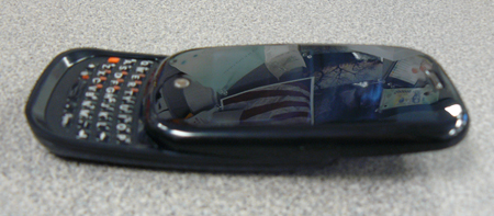
The Palm Pre (Side View)
Durability Issues…
I’m also concerned with the Pre’s build quality. The device just feels flimsy, in general, especially when the slider keyboard is open. It’s made almost entirely of thin black plastic that feels as if it could begin “chipping away” at any moment. Every time I removed the thin cover over the Pre’s micro USB charging port, I expected the plastic around the edges to crack or flake. It never did, but I still think it could very easily.
With the keyboard closed, you can also feel some “give” between the main display section of the Pre and the sliding unit that houses the keyboard. If you hold the bottom section with one hand and the top piece with your other hand, you can twist both sections slightly, which doesn’t bode well for durability over time. In fact, I noticed that the slight shift of the two segments increased during the two weeks that I used the device.
Also, because the Pre is a “vertical slider,” meaning the keyboard slides out from the main unit when it’s held vertically as opposed to horizontally, it’s top heavy when the keyboard is open. It’s not too awkward, and you get used to it quickly, but the design is slightly flawed, and the tendency–thanks to gravity–is to let the top portion of the handheld “fall backward” so you’re holding the device flat instead of holding it upright. This can hinder typing.
All Keyboards are NOT Created Equally
The keyboard itself is far too small from my liking, as well. My thumb literally covers up to four keys at a time, which, you can imagine, makes it rather difficult to type with any degree of precision. The keys are very tiny, but honestly, it’s not even the size that frustrates me the most, it’s the design of the buttons.
The Pre’s keys are small and flat, which makes pressing the desired button even more difficult. The keys are similar to both the Palm Centro and Treo Pro keys, though they’re slightly larger than the former, but smaller than the latter.
The Pre also lacks an on-screen keyboard, which could’ve provided some relief from the device’s tiny physical keyboard. The fact that no on-screen keyboard is available also means that there’s no way to type text into a URL field or text block while surfing the Web in landscape mode or while holding the device horizontally.
Another significant gripe relates to the proximity sensor in the Pre’s capacitive touch screen. I found myself repeatedly tapping the same spot on the Pre’s screen trying to get it to register my commands. Usually, it only took two or three taps for the device to register my “clicks,” but that’s one or two too many. I’m an iPhone user, too, and this was particularly annoying for me because the iPhone does not have any similar issues, which made the problem all the more noticeable.
Despite the Pre’s snappy new processor, the ARM Cortex A8-based OMAP 3, there’s a noticeable lag between when you launch applications and when they actually open. For example, it would often take as long as three seconds for an application to open up after I clicked the corresponding icon.
I’m used to the BlackBerry Bold, which sports a 624Mhz processor and doesn’t often experience such lags, and the small delays were frustrating because they were consistent.
Though I’m a big fan of webOS, I’m not very fond of the Pre’s “Return Gesture” or the role it plays in webOS. Right now, the Pre is the only device to run the new webOS, and as such, the software is very much built for the Pre.
So the only way to return to previous screens within an app or on a Web page is by swiping a digit from the far right side of the Pre Gesture Area halfway across the device to the Center button.
However, I had issues with the device registering this command. I’m not sure if the problems came about due to my large hands, but no matter how hard I tried, I couldn’t get the Pre to respond to every Return Gesture I made. I frequently had to slowly run my finger over the appropriate gesture area, because it didn’t work the first few times I tried.
The Pre is clearly aimed at consumers, and as such, its messaging app wasn’t exactly Palm’s focus; it needs work. It’s relatively simple to setup common e-mail accounts like Gmail or Live.com mail, as well as corporate Microsoft Outlook mail. However, managing and responding to that mail is difficult because the Pre creators were clearly going for form over function.
For example, Pre mail is easy to navigate.
You simply pick an inbox or account and scroll up or down through messages. But reading and responding to mail is more difficult because half of the display is taken up by related message information like Sender’s Name, Subject, etc. whenever a message is open. And a bar with additional mail options takes up another half an inch or so along the bottom of the display.
The 3.0 megapixel camera on the Pre is horrible. I consistently get comparable pictures from both my BlackBerry Bold and iPhone 3G, which have just 2.0 megapixel cameras. I’m not sure why the Pre’s camera proves so weak, but I was honestly shocked at its poor quality.
My BlackBerry Curve 8900’s 3.2 megapixel camera absolutely blows the Pre’s camera out of the water when it comes to image quality, which suggests to me that the Pre ships with a very low quality camera lens.
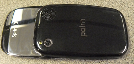
The Palm Pre (Rear View, Open)
The Pre has a removable battery, which is certainly a good thing, especially since its battery life is so poor. But removing the Pre’s battery cover is a task, and every time I did manage to get it off, I was sure I’d broken some piece of the cover pulling and yanking it free.
It would’ve been nice if Palm made the battery cover easier to remove, since Pre users are probably going to be swapping batteries more frequently than they’d like.
The Pre’s built-in speaker can be used for speakerphone calls or to listen to music without headphones. However, it’s near useless: it sounds so “tinny” and hollow to me. And its placement is less-than-ideal, since your hand covers the speaker any time you hold the Pre with the display facing forward.
You can’t expand the Pre’s internal memory. The device ships with 8GBs of storage–only seven of which is available to users, according to Palm–and that’s the total capacity, since there’s no way to increase storage space via microSD or other media cards. The new iPhone 3G S is available with 32GB of storage, and current BlackBerry devices support microSD cards up to 32GB, so both Apple and RIM have a leg up on the Pre when it comes to memory capacity.
Though I connected the Pre to a variety of Bluetooth headsets and even a stereo Bluetooth FM transmitter without issue, I couldn’t find any way to transfer files between the Pre and my computer or between the Pre and other handhelds.
I frequently use my BlackBerrys and my iPhone to send files via Bluetooth. I’m unsure if such transfers are possible via Pre, but if so, I couldn’t figure out how after an exhaustive search.
Finally, the device doesn’t ship with any games at all, which seems strange to me. Also, the Pre’s finish is extremely prone to fingerprints and other smudges, yet it doesn’t come with any cleaning cloth, and its case just doesn’t work that well.
Conclusion: To Pre or Not to Pre…
The Palm Pre is a sexy-looking device, and it’s sure to grab the eyes of a few would-be iPhone or BlackBerry buyers. Whether or not the Pre will ultimately convince those same customers to open their wallets seems less certain.
Palm loyalists and beginner smartphone users are probably the ideal Pre owners, but even the most experienced power users will appreciate some of the unique and original features built into webOS.
The Pre’s Achilles heel is the hardware. While webOS is new, exciting and potentially game-changing, the Pre itself feels poorly made, flimsy and ultimately forgettable. If Palm fails to wow users this time around, it will be because of the Pre hardware not the mobile OS.
I keep coming back to the following statement when thinking about the Pre: Put webOS on a decent piece of hardware and you’ve got a real WINNER. As is, the Pre’s cool, but I won’t miss it much after sending it back. And to me, that’s the real sign of a great device: whether or not it’s painful for me to return it after an evaluation.
Source: CIO.com


