New Coke. Chia pets. Ashton Kutcher. All are bad ideas that should have been snuffed out before they emerged into public consciousness. All are things that make you scratch your head and say, “What in God’s name were they thinking?”
Unfortunately, the tech world is full of such ungainly monstrosities, from wireless displays that cost more than entire computers, to nausea-inducing game systems, and on to singing deer heads.
We’ve dived into the Dumpster of tech history and returned to the surface clutching the worst of the worst–so far.
Join us as we count down 10 pieces of benighted technology that should never have seen the light of day.
Number 10: The Buck Doesn’t Stop Here

Buck, the Animated Singing Trophy Deer (2005)
Pop quiz: What talked to anyone who wandered by, sang the same damned songs all the time (always off-key), did a lousy Elvis impersonation, and had more than a passing resemblance to Bullwinkle J. Moose? No, it wasn’t your Uncle Festus. It was Buck, the Animated Singing Trophy Deer.
This motion-activated life-size deer head–from Gemmy Industries, the same demented folks who brought us Big Mouth Billy Bass, the singing fish–swung its antlers from side to side as it murdered classics like “Rawhide,” “Sweet Home Alabama,” and “On the Road Again.”
Why not Blondie’s “(I’m Always Touched by Your) Presence, Deer” or Jimmy Buffett’s “Door Number Three” (“And Monte, I sure need the doe”)? Answer: a failure of imagination. The kit did include a microphone, however, so you could project your own voice via Buck’s lips, amusing your friends and frightening the children.
Sure, it sounds like fun, but after the third rendition of “Suspicious Minds,” this novelty item’s novelty value began to plummet toward negative numbers. We recommend passing this Buck as quickly as possible–not hard as he has been discontinued.
Good news…perhaps? Big Mouth Billy Bass is now available as an iPhone app. Warning: It’s awful!
Number 9: You Will Not Be Assimilated

Xybernaut Pomo (2002)
What’s the well-dressed geek wearing these days? It isn’t the Xybernaut Pomo (modeled here by former PC World associate editor Sean Captain). This “wearable computer” featured an 11-ounce CPU that hooked to your belt, a mini-keyboard that strapped to your wrist, and a head-mounted display that projected an 800-by-600 image in front of you.
The Pomo inspired inevitable comparisons to The Borg, the malevolent race of half-cyborg/half-human creatures intent on assimilating the human race in Star Trek: The Next Generation.
Though Xybernaut’s strap-on PCs found a home in industrial and military settings, Pomo didn’t fly with consumers, who apparently didn’t relish the thought of going out in public looking as though they were en route to a Trekkie convention dressed as either a Borg Drone or a space pirate. Resistance is not futile.
Number 8: Mira Mira on the Wall
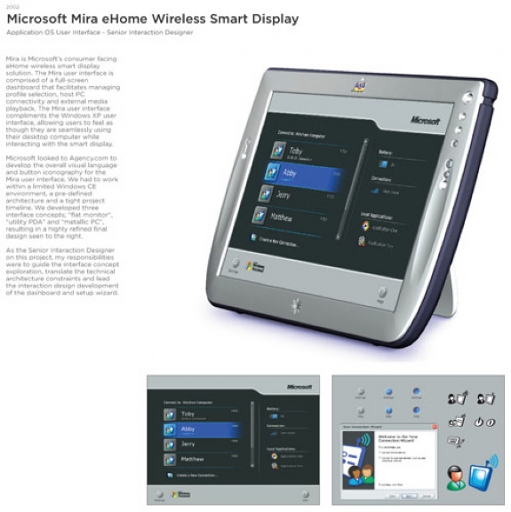
Microsoft Mira (2002)
Who’s the fairest of them all? Not this Mira wireless touchscreen display, which Microsoft unveiled with great fanfare at the 2002 Consumer Electronics Show.
The plan was that consumers would mount these LCDs on the walls of their homes and access their computers remotely. “Mira does for monitors what the cordless handset did for telephones,” said Steve Ballmer at the product’s launch.” Well, not exactly.
At $999 and up, the first Mira displays cost a wee bit more than a cordless phone And that wasn’t the only problem, recalls Rob Enderle, principal of The Enderle Group: “It’s like they said ‘Let’s take a thin client home product, make it so it only works with the business edition of Windows (but only in the home), price it in line with a low end laptop, and wrap it with some really homely plastic.’ Folks actually hid from the product.”
Number 7: Not Virtual Enough
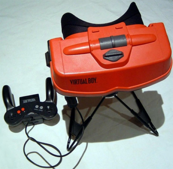
Nintendo Virtual Boy (1995)
This “portable” 3D gaming system may have been the biggest disaster to come out of Japan since Godzilla. (It also holds the distinction of being named one of the ugliest products in tech history by the late, great tech journalist Emru Townsend.
Virtual Boy fans had to press their eyes into the 1.7-pound machine’s goggles to get the 3D effect, while simultaneously holding the unit steady and manipulating the unit’s six-button control pad.
The Virtual Boy chewed through AA batteries like a hungry virtual goat, displayed monochrome images only, and offered a paltry 22 games (14 in the United States) before getting pulled from the market a year later.
And did we mention that using the Virtual Boy made some people ill? Nintendo advised users to take breaks every 15 to 30 minutes to avoid eyestrain, headaches, and nausea. Still those users probably didn’t feel as bad as its creator, Gunpei Yokoi, who quietly left Nintendo shortly after his pet project was euthanized.
Number 6: U Can’t Touch This

USB Finger Dance Mat (2007)
Think Dance Dance Revolution shrunk down to Stuart Little size. With the USB Finger Dance Mat, you could have a party on your desk with everyone invited–though discretion might have counseled you to think twice about demonstrating the digital skills you developed over many painstaking hours of practice to, say, your boss.
To use the device, you just plugged it into your PC, slipped your digits into the cardboard finger character (two choices: Disco dude or Flashdance chick), and tapped your fingers in time to the flashing lights on the 4-by-4-inch dance floor. It was fresh, it was funky, it was totally embarrassing if anyone ever caught you doing it.
Which, apparently, few did, since the Dance Mat was discontinued shortly after it debuted. Still, it was a fun way to take a break between cleaning out your desk and turning in your employee manual.
Number 5: Changes in the Pecking Order

Fast Finger Keyboard (2009)
Keyboard designers pay far too little attention to people who can’t type–that’s the thinking behind the Fast Finger keyboard, which gives timid typists two keyboard layouts: Press the ABC button once, and the keys appear in alphabetical order (as the white labels indicate); press it again to restore the usual QWERTY arrangement (the red labels).
Though Fast Finger still takes a dangerous chance in assuming that users will have memorized their ABCs, it makes no such assumption about their ability to spell essential acronym shortcuts like ASAP (“as soon as possible”), BTW (“by the way”), and CYA (“Canadian Yachting Association”).
To speed things along, the keyboard attaches those letter combos (and 9 others) to function keys–and since there are only 12 of them versus 26 letters, you’re talking about a lot less hunting before the triumphant peck occurs.
Number 4: Slipped Discs
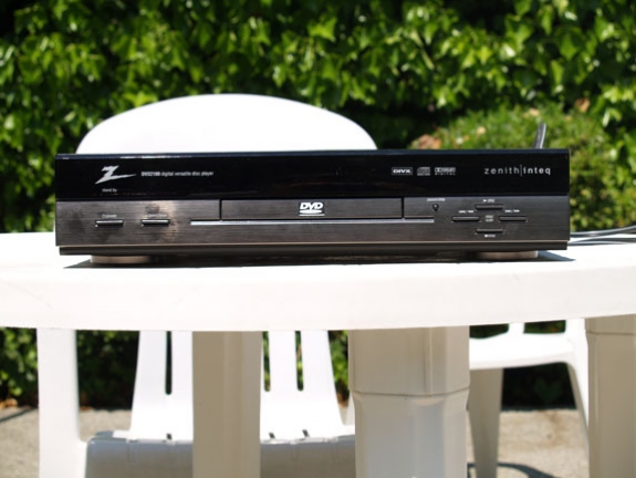
DivX Enhanced DVD Players (1998)
Digital Video Express (DivX) was a train wreck from the moment it left the station.
Circuit City’s attempt to create ‘disposable’ time-limited DVDs went off the rails almost immediately–in part because the devices needed to play these discs (such as the Zenith DVX2100, pictured above) were $100 to $200 more expensive than a standard DVD player and required a telephone hookup to verify rentals.
Consumers worried that faceless corporations could track what they watched and when they watched it; studios and video stores balked at carrying films in yet another format.
Within a year, Circuit City killed DivX, despite its being “a technological tour de force, easy to use and technically bulletproof,” says R.J. Dunnill, who runs the ironically acronymed Divx Owners Association Web site.
The DivX name was later adopted by DivX Inc. for a video codec still in use today. But don’t be misled by competent latter-day naming-rights holders; the original articles were the real stinkers.
Photo: Courtesy of R.J. Dunhill
Number 3: Diss N-Gage
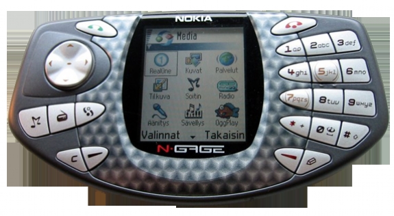
Nokia N-Gage (2003)
Nokia makes fine cell phones. But when it comes to portable gaming devices…Nokia makes fine cell phones.
The N-Gage, an attempt to add cell phone functionality to a hand-held game system, didn’t connect with anybody–and it didn’t help that the device cost $100 more than Nintendo’s ubiquitous Game Boy, that few titles were available for it, and that it looked like a gingham taco. Subsequent price cuts and redesigns didn’t help much.
Rob Enderle, principal of The Enderle Group, comments: “Let’s design a phone so that it looked like a game controller in your hand and a piece of pizza next to your head, doesn’t actually have any compelling games; charge a lot for the device, and watch the money burn.”
He adds that Nokia couldn’t even give the N-Gage away at the big E3 gaming conference that year. “It took a special kind of intelligence to create a product that folks were afraid to get for free.”
Number 2: Honey, We Shrunk the Operating System
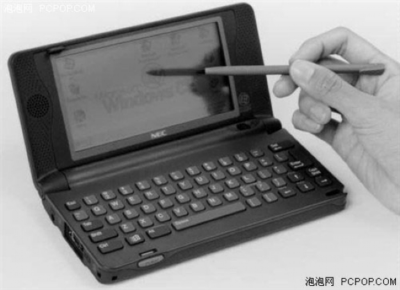
Windows CE 1.0 Devices (1996)
A journey of 1000 miles begins with a single step, but so does a descent into Hell. One such expedition began when Microsoft made its initial attempt to squeeze a Windows interface into a hand-held device.
The NEC Mobile Pro 200 pictured above was one of nearly two dozen such devices–all of them “plagued with interoperability problems,” notes Chris Tilley, author of “The History of Windows CE.”
Not only did the devices not support Microsoft’s newly released Outlook, they didn’t work with any non-Microsoft PIM or e-mail client. Win CE 1.0 handhelds were quickly rendered obsolete by Win CE 2.0 devices, which eventually begat Pocket PCs and Windows Mobile cell phones.
More than 10 years later, Microsoft busily paving the road to mobile hell, and dragging millions of users along for the ride.
Number 1: Get Back, Funky Cat
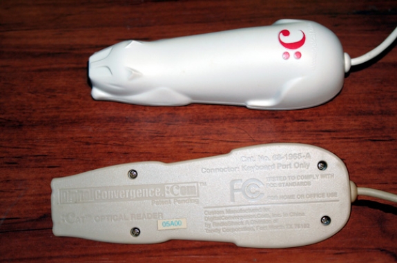
DigitalConvergence CueCat (2000)
What is the single dumbest gadget ever conceived? The Digital Convergence Cue Cat wins paws down. This feline-shaped bar code scanner was supposed to make it easier for magazine and newspaper readers to find advertisers’ Web sites.
The idea was that you’d plug the Cat’s “tail” into your PC, scan the bar code listed in an ad in a newspaper or a magazine, and be magically whisked away to the product’s Web site. If there has ever been a more complicated way to Web surf, we don’t want to know about it.
Fortunately, the CueCat was neutered in 2001 before it could reproduce…
Source: PCworld.com


