Now that you’ve finally filed your 2008 taxes, how about starting out on a new foot and getting your finances organized? Next year when tax time rolls around, you could be sitting pretty while others sort through shoeboxes full of receipts.
There is no shortage of places to go to seek financial wisdom on how best to manage your money, but many people find that the best and least-expensive approach is to manage it themselves.
A number of free, personal financial management sites have popped up to help you do just that. These sites are no substitute for professional advice if your financial situation warrants it, nor are they even a replacement for more robust financial management applications such as Microsoft Money or Quicken. But they do offer a no-cost way to consolidate your financial information – including credit card accounts, investments and loans — into one easy-to-manage place.
These sites can also help you manage your bills, remind you when bills are due, help you set a budget and track where your money is going. Some even offer advice on how to save, get out of debt, lower your bills and save for retirement. A few center around online communities, where the power of social networking is harnessed to offer advice and tips from like-minded individuals.
Access to your information
For these sites to track your financial information, you first need to enable online access for your accounts on the Web sites of your respective financial institutions, such as banks and credit card companies. All of the sites that I looked at claim to work with thousands of major financial institutions, and all were able to successfully access my bank accounts and credit cards. However, not all of them can currently access investments or loans.
You enable access to your accounts by selecting the institution while you’re in the personal financial management site and entering your log-in credentials. Sometimes that’s all you need to do to enable access; other times, you might need to answer a few bank-provided challenge questions on the personal financial management site or enter an access code that your bank e-mails to you.
A natural concern is: How secure are these sites? Can you trust them with your information?
The sites that I looked at claim to use “bank-level” security with Secure Sockets Layer (SSL) and up to 256-bit encryption. Most of the sites assert that even their employees don’t have access to your financial institution log-in information. By default, the sites don’t even show your full account numbers; they simply display information such as “Bank of America — Checking xxx-1234.” Most even let you edit an account name, so you can change it to say something like “joint checking.”
It’s important to note that these sites are only downloading information from your financial institutions — this is a one-way, read-only communication. So if someone did get access to your financial management site account, they could certainly see where your paychecks come from and where you bank and shop, but they can’t make any changes to any of the accounts.
However, this information could potentially be used for phishing attacks or social-engineering scams, so you still want to be sure to keep your log-in credentials secure as possible and use a difficult-to-guess, non-dictionary password.
Efficient organization
Once you’ve given a personal financial management site access to your online accounts and downloaded your financial transaction information, you still have some work to do. The power behind all these sites is the information and advice they can give you about your spending. In order to do this, the sites need to categorize your transactions.
You’ll need to go through of all your downloaded transactions one by one and assign a category to each, such as “groceries,” “car payment” or “rent.” Some of the sites are good at guessing the proper categories, and all recognize repeating transactions, so you should need to make only a few edits that will automatically populate to other transactions.
Once your transactions are categorized, the sites then have the information they need to show you how much you are spending on items such as groceries or entertainment and can help you set up a realistic budget.
I compared five free sites: Geezeo, Mint, Quicken Online, Thrive, and Wesabe. I also checked out two other sites: Green Sherpa (which, when it comes out of private beta, will cost $7.95 per month) and Rudder (which charges a fee if you have over 200 transactions). They all offer the same basic functionality, but each does it in its own way, and some offer more features than others.
If you’re interested in getting your personal economics in shape, one of these is sure to meet your needs.
Geezeo
Each of these personal financial management sites tries to carve out a unique niche for itself. Geezeo’s standout trait is its set of community features, which put you in touch with other users who likely have many of your same financial concerns, questions or goals.
Of the five sites I looked at, I found Geezeo’s user interface to be the least attractive and most confusing. It feels like the designers focused more on functionality than usability — a telltale hallmark of the work of hard-core coders who think like programmers and not users. That said, I found the site’s features were comprehensive and customizable.
After you log in to Geezeo, you land on the Dashboard page, with a Money Stream section running down the middle of the page. This section includes entries for each day that there is activity in your financial accounts or with any of your Geezeo social connections. The most recent day of activity has its details automatically displayed, but you can click on each day’s entry to see the details of its events.
At a Glance
Geezeo
Pros: Social networking, OFX uploads, split transactions, ability to check balances with SMS.
Cons: Confusing interface, doesn’t automatically log out user after inactivity, no e-mail alerts.
If you choose to, you can share any of your financial events (the vendor name and the amount you paid) from the Money Stream section with the Geezeo community — perhaps you’re proud that you just made the final payment on your credit card debt or you’re outraged at how much day care costs.
The right side of the Dashboard includes a summary of your budget, your net worth, a snapshot of your total expenses and a few advertisements (Geezeo was the only site that had prominently displayed ads).
The left side of Geezeo’s pages includes account information and a set of site navigation tools. This section also offers the balances for all of your accounts, icons of Geezeo users you have “friended,” and a Confession Booth, which includes posts such as this recent one from a Geezeo user: “I’ve been trying not to spend any money, but I feel a spending binge coming on.” You can choose to confess anonymously, and you can even send your confession to your personal Twitter feed.
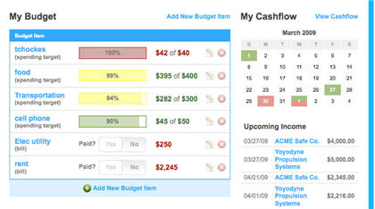
Each of your accounts has its own page, with a list of that account’s transactions. Geezeo can track bank accounts, credit cards, investments and loans. If your financial institution is not supported by Geezeo, you can manually download transaction information from the institution’s site as an OFX file (the format used by most financial institutions), and then upload the file to Geezeo. Geezeo and Wesabe were the only sites I looked at that supported OFX file uploads.
The account transaction lists are where you create categories for your transactions, which Geezeo calls “tags.” Tags are text-based and completely user-created, so you can call your tags whatever you want to. You can even assign multiple tags to an entry in order to split the total cost of an entry across different categories (for example, a $50 purchase at Walgreens could be split between $30 on groceries and $20 on prescriptions). Geezeo will try to guess the appropriate category for some transactions, but I found that more often than not, Geezeo guessed wrong and I had to do a lot of editing.
Once your transactions are tagged, you can set up a budget for each tag on the My Budgets page. I found the My Budget feature to be confusing, and it required a considerable amount of manual entry, including having to enter all expected sources of income. However, once I got used to it, I quickly realized that I had a lot of fine-grained control over what information I could include in my budget and what it could track. The My Budget page also includes a calendar that shows upcoming income and bills.
You can also set goals on Geezeo, which is more of a social-networking feature than a financial one. It allows you to share similar goals with other Geezeo users, such as “buy a home.”
The Community section of Geezeo includes Public Feed, Groups, Goals, Confessions, and Experts. During the time that I used Geezeo, five financial experts had created groups through which they answered questions and gave advice to Geezeo members. While much of the advice appeared sound, I was disappointed to see that a number of the experts hadn’t responded to questions in at least a month.
Geezeo was one of two sites (Wesabe was the other) that did not automatically log me out after a period of inactivity — if you use public computers or share a PC with others, you must make sure to remember to manually log off from the site. Geezeo allows you to check your account balances with a mobile phone via SMS text messaging.
Mint
Of all the sites I looked at, Mint had the cleanest-looking user interface, which translated into a site that was easy to navigate and use. The site heavily uses Web 2.0 technologies, which enables it to dynamically change how information is presented and lets you seamlessly input your information. Mint matches Quicken Online’s extensive features and functionality, making Mint one of the more robust free personal finance management sites I looked at.
The main Overview page provides a lot of information; it might even strike some as information overload, but the page is laid out intelligently and provides a very good overall snapshot of your financial health. The top section of the page provides relevant alerts, such as if you have exceeded any of your budget categories or if you have any bills due soon. You can customize a number of the alerts to trigger, such as when your account balances drop below a specific amount or if any purchases are over a prespecified amount.
At a Glance
Mint Software Inc.
Pros: User-friendly interface, split transactions, ability to check balances with SMS, e-mail and SMS alerts, free iPhone app.
Cons: Busy interface.
The left side of the Overview page lists all of your accounts. Mint can track bank accounts, credit cards, loans and investments. Below the account information is a cash flow chart that compares your cash (the combined balances of all of your bank accounts) with your credit card debt.
Mint also includes a Property section, which lets you manually add less traditional information, such as real estate, money or debt, vehicles, or other property such as appliances, artwork or jewelry. When you input the address of your home, Mint automatically calculates its estimated value, which you can edit if you disagree with the amount.
The Overview page also includes a Portfolio Movers & Shakers section. If you have investment accounts (retirement or otherwise), this section provides a brief summary of which of your securities and holdings have seen the greatest change (up or down) in the last seven days.
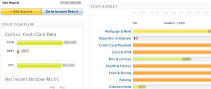
Below that is the Your Budget section. Budget items are presented in a bar graph, which are orange if you are over budget, green if you are under, or gray if no transactions for that category have posted for the month. You can add categories to your budget from any of your categorized transactions. I found that Mint did an acceptable job of guessing the categories to which my expenses should be categorized, but I still had to make a significant number of edits.
When you edit a transaction — you do this on the Transactions page — you can edit its description, assign a category or create a new category, and split the transaction amount between multiple categories (for example, $98 to “groceries” and $10 to “lottery tickets”). For transactions from vendors that repeat, you can set up rules that will automatically change how the name of the vendor appears and assign a category to it whenever transactions from that vendor appear (for example, a rule could be: “Always rename Shprt as ShopRite and categorize as ‘groceries'”).
In addition to categories, you can also assign tags to transactions; the default tags are “Reimbursable,” “Tax Related” and “Vacation,” but you can create new tags as well.
The Trends page displays a pie chart showing how your spending is divvied up among the different categories. If you use the tags feature, you can filter out tagged transactions. For instance, I wanted to see my spending for the current month, not including my home business expenses. The Trends page also includes a SpendSpace bar chart that lets you compare your spending in a particular category with the national average, by state or even by various major U.S. cities.
The Investments page includes Performance, Value, Allocation, and Comparison charts — although it can display only one of these charts at a time. And the Performance and Value charts can track your investments only from the date that you added the accounts to Mint. The Allocation chart shows how your investments are allocated based on either asset type (for example, mutual funds, stocks or money market funds) or trading symbol. The Comparison chart lets you compare over a given period of time the sum of all your investments, your individual investment accounts or even the individual investment vehicles with the Dow Jones, S&P 500 or Nasdaq.
You can send an SMS text message to Mint and receive your account balances back. You can also set up Mint to send you e-mail and SMS alerts when certain events are triggered, such as when the balance of an account drops below a specific amount. Of the sites I looked at, Mint was the only one that also had an iPhone app (free) that provides scaled-down access to your Mint account.
Quicken Online
Of all the personal financial management sites, Quicken Online probably has the most name recognition. Just don’t expect the same level of detail and functionality as you get with the company’s paid applications.
For instance, you can’t pay bills or print checks with Quicken Online. But you can get detailed information about your bank accounts, credit cards, investments and loans, as well as see your spending trends and make a budget.
The level of detail that Quicken Online provides, as well as the control you have over the information, is rivaled only by Mint. The biggest difference between Quicken Online and Mint is primarily how the information is laid out in the user interface. Mint crams as much information as possible onto its Overview page, while Quicken Online takes a more minimalist approach, trying not to overwhelm you with too much information at once.
At a Glance
Intuit Inc.
Pros: Good at guessing transaction categories, can check balances with SMS, e-mail and SMS alerts, mobile version.
Cons: Can’t split transactions.
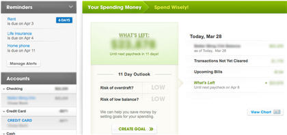
After you log onto Quicken Online, you land on the sparsely populated Home page. The most prominent part of this page is a What’s Left window that tells you how much money you have left until your next paycheck. The What’s Left section can be misleading, however, as the value that is displayed is not the total of all your accounts, but only the amount available in a single account — presumably your primary checking account.
You can manually change which account is referenced in this section, but if you use multiple accounts for your income and bill paying as I do, this section will not be a reliable source of information. If the account has paychecks coming into it, then it will also tell you what the risk of overdraft or low balance is until the next paycheck is due.
On the Home Page, you can also click on a View Chart link, which pops up a Window that displays a graphical representation of your spending outlook through your next two pay periods. The left side of the Home page also includes reminders for which bills are due soon and when; below that is a summary of all your accounts and their respective balances.
The Accounts page is where you add and manage your accounts. Once you’ve set up all your accounts in Quicken Online, you’ll seldom need to come back to this page.
The Transactions page’s default view includes transactions for all of your accounts for the past 30 days.
You can choose to show transactions for virtually any time period that has available data. You can sort the transactions (ascending or descending) by Date, Account, Check #, Payee, Category, Note, or Amount, and you can also edit the contents of most of these fields.
The left side of the Transactions page includes a summary of all of your accounts — similar to the left column on the Home page. If you select one of the accounts, the Transactions view changes to show transactions for only that account.
When you display the transactions for an individual account, the top of the screen shows your current balance, as well as your RealBalance, which includes upcoming transactions such as paychecks or bills.
Quicken Online also detects repeated transactions and automatically adds them to an Upcoming Transactions section. I found that the site made a few wrong guesses, but editing these entries was easy, and it’s also possible to manually add repeat transactions.
Below that are the Cleared Transactions details that have been downloaded from your financial institution. I found that Quicken Online did a noticeably better job than any of the other sites in accurately guessing the appropriate categories for my transactions, and I spent less time making edits to categories in Quicken Online than any of the other sites. Unlike some of the other sites, however, you cannot split transactions in Quicken Online between multiple categories.
The Trends page shows you where your money is being spent, based on the transaction categories — you can choose to see the data broken down by category or payee. The Goals page is actually Quicken Online’s version of a monthly budget. It auto-populates the Goals based on the average spending for some categories, but you can add more categories for it to track and edit what the amount of the monthly goals should be.
Alerts can be automatically sent to your e-mail or mobile phone via SMS text messages, and you can check balances with an SMS text request. Quicken Online does not have an iPhone app, like Mint does, but there is a scaled-down mobile version of the Quicken Online site from which you can access your account balances and transactions from any mobile phone with a Web browser.
Thrive
As with the majority of the personal financial management sites I looked at, Thrive tracks your bank accounts, credit cards, investments, and loans and mortgages. But the way that Thrive presents this information and the automated advice it generates is all about how to save more, spend less and get out of debt.
If you are financially comfortable with no debt and have no financially draining expenses planned for the near future, then many of Thrive’s features will probably be of little use to you.
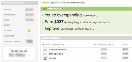
After you sign into Thrive, you land on the Home page. The main section of the page (and the part that is most prominently displayed) is Thrive Advice. Thrive Advice will warn you if you’re overspending and offer advice about whether you can benefit by getting a better savings account or a better credit card.
Clicking on Thrive Advice’s overspending advice takes you to the Spending Health section; selecting Thrive Advice’s savings and credit cards advice takes you to pages that refer you to banks that can potentially supply you with better interest rates on your accounts. Thrive also assigns you a Financial Health score, which is based on how well you are spending, saving and paying off debt.
At a Glance
LendingTree LLC
Pros: Automated and personalized financial advice.
Cons: No traditional budgets, occasional site glitches, can’t split transactions, only alerts are weekly e-mail updates.
The Home page also includes Stats, which provides a quick overview of the current month’s income, purchases and bills paid, as well as whether your debts, savings and investments are trending up or down. Stats also includes a window that randomly displays one of the Savings Plans you set up, such as what price home you can afford to purchase.
Another feature found on the Home page is the Spending Goals section, which flags any repeating expenses that Thrive’s algorithms automatically calculate you might be able to cut back on; clicking on any of these entries also takes you to the Spending Health section. As with the other personal financial management sites, Thrive includes balances for all your accounts on the Home page.
The Spending page displays one of three sets of information, depending on which tab you select in the left column. The first set is a Spending Summary, which shows all of your purchases, bills, income, or exclusions by category for the current or previous two months (exclusions are typically items like transfers or credit card payments). The Spending Summary also displays a bar graph that compares the current month’s purchases, bills, or income against the last two months and tells you by how much they have gone up or down.
The second set of information is your Spending Health, which displays your Purchase Rate and Checking Accounts. The Purchase Rate shows you what percentage of your income is going to purchases and what your target spending should be.
This also shows the aforementioned advice on where you can possibly reduce your spending. Thrive advised me that I could spend less on day care, parking and cash spending. (I wholeheartedly agree that I should reduce my cash spending, but there’s not a whole lot I can do about day care or parking.)
The Spending Health’s Checking Account section gives you an assessment of the health of your checking account. This is not to be confused with the third section of the Spending page, Checking Accounts, which give you information about your checking accounts and provides access to your checking accounts’ transactions. Thrive does not let you split your transactions across multiple categories.
The Debt page shows you what bills are due in the next 15 days, what bills have been paid in the last 15 days, and if your debt is increasing or decreasing. The Debt Health section tells you your debt-to-income ratio, provides an estimated credit rating, and delivers a verdict on the quality of the interest rates of your current credit cards. The Debt page also gives you access to the transactions for your credit cards, loans and mortgages.
The Saving page is where you set up Savings Plans, which lets you pick from shopping, travel, gifts or project categories.
Unlike most of the other sites, you cannot set up a traditional budget on Thrive. Also, Thrive was OK at guessing the categories for purchases, but I still had to make a lot of manual edits. I also experienced a number of glitches from time to time, where a feature or page I clicked on instead landed me on a page that explained that Thrive was experiencing technical problems.
You can set up to receive weekly summary statement e-mails; account alerts and updates to e-mail will be added soon. I could not find a reference on the site for a mobile Web version.
Wesabe
Wesabe is a personal financial management site that features a strong community-based aspect, much like Geezeo. But don’t be fooled into thinking that Wesabe’s social-networking feature makes it a one-trick pony. Wesabe also offers some innovative and powerful features for keeping track of your finances — although it comes with a few caveats.
Despite the fact that the site has been around for over two years, it shows some signs of growing pains. For instance, Wesabe can currently track only your bank accounts and credit cards. If you want to track investments, you’ll have to request access to this beta feature from Wesabe Labs; tracking loans and mortgages are earmarked for some point in Wesabe’s future.
I ran into a momentary showstopping bug when Wesabe mysteriously lost the ability to update my checking account and credit card transactions. I was, however, able to manually upload my account information via an OFX file upload — only Wesabe and Geezeo support OFX uploads.
At a Glance
Wesabe Inc.
Pros: Social networking, OFX uploads, split transactions, mobile version.
Cons: Doesn’t track loans or mortgages, doesn’t automatically log out user after inactivity, no SMS or e-mail alerts.
Eventually, I fixed the problem by deleting my bank log-in credentials and then re-entering them. Thankfully, this did not impact any of the transaction information that had already been downloaded for my accounts.
Wesabe features four tabbed pages: Accounts, Tips, Goals and Groups. Like Mint, Wesabe puts virtually all of your relevant financial information on the page you first land on after you log in; for Wesabe, this is the Accounts page. Despite having a lot of information in one place, it doesn’t feel crowded or overwhelming.
Below the account information is a Spending Targets chart for the current month. Spending Targets is Wesabe’s version of a monthly budget. You manually add targets for each of your transaction categories, which Wesabe refers to as “tags.” For each tag you want to track, you simply enter what you want your monthly spending limit to be.
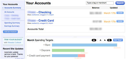
Under the Spending Targets is a Spending vs. Earnings chart, which displays your spending in blue and earnings in green. Below that is yet another set of pie charts, which breaks out Spending and Earnings into separate charts, so you can see which tags your money is going to and where your earnings are coming from.
At the bottom of the page is an Add a chart button.
This allows you to add custom charts; however, in order to do so, you need to enter some code that corresponds to Wesabe’s “valid API method.” Some examples are provided, and it’s actually not that difficult to figure out – I was able to create a custom chart that displayed my tagged grocery expenses from the beginning of the year onward. The Accounts page also includes links that take you to an in-depth graphical representation of your Spending Summary and your Earnings Summary.
Each of your accounts is listed on the Accounts page; clicking an account name takes you to that account’s transactions. It is here that you enter the tags for each of your transactions in order to categorize them. The tags are entirely text-based, and you can enter virtually any text you like.
It took me a little while to figure out, however, that multiword tags needed to be put in quotes; otherwise, Wesabe interpreted each word as a unique tag. It also took a while before I could figure out how to split transactions across multiple tags. I had to tag nearly every transaction — consequently, it took me longer to set up Wesabe than any of the other sites.
The Tips page allows you to get a sense of how your fellow Wesabe users utilize particular merchants or tags. For instance, I used “entertainment” as a search term, which scraped data from other Wesabe users’ tagged transactions.
The resulting screen displayed the most-common “entertainment” merchants (which happened to be Netflix, iTunes, Amazon and Blockbuster), and the average amount users spent with these merchants, as well as how often they visited and what percentage of them recommends the merchant. Below that are related advice nuggets provided by other Wesabe users.
The Goals page provides a different view and way to edit your Spending Targets, and it also allows you to create a specific goal and link it to your tags. Your goals are public and linked to other Wesabe users who have the same goals. The Groups page is essentially a set of community forums where users can trade tips and advice — there was a healthy amount of recent activity in the Wesabe groups.
As with Geezeo, Wesabe never automatically logged me out after a period of inactivity. Wesabe also doesn’t offer e-mail or SMS text alerts, such as for low account balances or bill reminders. Wesabe does, however, have an iPhone-specific version of the site as well a more generic mobile version that can be accessed from mobile phones with Web browsers.
Can’t decide? Here are two alternatives
Two personal financial management sites I wanted to include in this roundup were Green Sherpa and Rudder. Because neither is free, I couldn’t make any direct comparisons between them and the other sites in this roundup. However, I did take a good look at what they offered.
Green Sherpa
Green Sherpa was still in private beta as I wrote this but was scheduled to launch soon. They were still ironing out some bugs, as my own experience showed, but the folks at Green Sherpa were kind enough to set me up with a dummy test account. Once it goes live, Green Sherpa will cost $7.95 per month, with a 14-day free trial.
In terms of its features, I would put Green Sherpa in the same category as Mint and Quicken Online, except that, unlike these other sites, Green Sherpa tracks only bank accounts and credit cards – it does not track loans or mortgages; investment tracking is planned for a future release.
The Dashboard page provides a brief summary of account balances, pending transactions, cash flow and any goals you have set up. On the Account page, transactions can be split between multiple categories, and you can upload QIF/QFX (but not OFX) files. Green Sherpa’s transactions include two unique features: You can reconcile an account to confirm that the account is balanced with all transactions accounted for, and you can give access to another user (such as a spouse), so that you can leave messages to each other about specific transactions.
The Categorize page lets you create and edit transaction categories, as well as match up payees with categories. The Cash Flow page lets you set up budgets for each category and monitor how much you’re spending on each category.
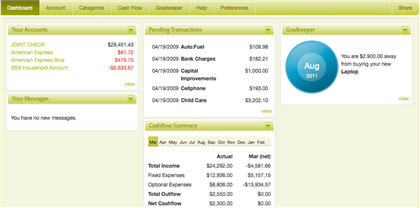
At the bottom of the Cash Flow page are a group of automatically generated “Recommend Budgets,” which are based on an analysis of your spending habits. You can add additional budgets and edit existing ones. This page also lets you leave messages for another user about specific budget items.
The Goalkeeper page is a simple tool that allows you to track items or events you are saving for and how much you plan to put away toward them each month. You can leave messages here as well. You can set up e-mail alert notifications for events such as low-balance warnings, when you go over budget, or when a user leaves you message.
Rudder
You can use Rudder at no cost, but you’re limited to keeping no more than 200 transactions. Once you’ve hit your quota, you need to delete older transactions in order to make room for new ones.
You can make one-time purchases of $2.99 for an additional 200 transactions, $5.99 for another 400 or $8.99 for 600 more transactions. Rudder also offers a $14.99 per year subscription that gives you an unlimited number of transactions.
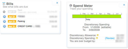
Rudder’s Dashboard page is made up of a group of widgets; you can choose which of them should appear on the Dashboard and even how they are arranged. The widgets include Account Balance, Recent Activity, Bills (which shows what bills are due soon), What’s Left (after bills are paid), Savings Widget (which tracks your savings accounts), and Spend Meter (which tracks your spending).
The Transactions page lists the transaction for all of your accounts. Rudder supports only bank accounts and credit cards; it does not track loans or investments. You set the transaction categories on this page, but Rudder does not let you split transactions into multiple categories.
The Trends page gives you a detailed look at which categories your spending is going toward. Rudder has a Goals page, but it is currently populated with a Coming Soon message and sample images of what this section will look like.
The Settings page is where you set up recurring income and bills, which feed the Bills, What’s Left, and Spend Meter widgets on the Dashboard page. Unfortunately, I found that the recurring income and bills had to be manually entered, as they were not automatically detected from my categorized transactions. You can set Rudder to send you e-mail updates on a daily basis.
Note: At first, I was unable to get my primary checking and credit card accounts linked in Rudder. I filled out a support ticket from the Help page explaining the problem and received an automated e-mail confirmation, but no follow-up. Then, miraculously, after 10 days, it suddenly worked and I was able to add my accounts. I don’t know if this was a result of my help ticket submission or some other coincidental bug fix.
Conclusions
These Web sites are just a sampling of the free personal financial management sites available. Other sites that offer similar free personal financial management features include Buxfer,BudgetPulse, Expensr and Yodlee .
If you’re looking for a site that provides simple access to banking and credit card information, any of these sites will meet your needs — it becomes more of an issue of personal preference than anything else.
If you’re really excited about the social-networking potential of rubbing virtual shoulders with other penny-pinchers, then you’ll want to check out either Geezeo or Wesabe. Both sites have similar features, but I felt that Wesabe offered a slightly more robust social-networking presence, while Geezeo offered more money management tools. Wesabe was the only site I looked at that couldn’t track loans or mortgages.
For more full-featured applications that can also track your investments and loans, you can choose between Mint, Quicken Online, and Thrive. All three are chock-full of useful and easy-to-handle tools that can help you better manage your finances.
If you need a lot of hand-holding, then Thrive might be your best choice. But it was the only site to lack a traditional budgeting tool.
The main difference between Mint and Quicken Online is how the information is presented — they both offer similar features that are very strong on detail. But the fact that Quicken Online doesn’t let you split transactions and Mint does had me leaning just a bit more toward Mint.
For me, the clincher was the Mint iPhone app — being able to access all of my account information (including investments) in one slick-looking, easy-to-use app on my iPod Touch via a Wi-Fi connection was a big plus.
Online Financial Managers – Features
|
|
Geezeo |
Mint |
Quicken |
Thrive |
Wesabe |
|
Checking & savings accounts |
X |
X |
X |
X |
X |
|
Credit card accounts |
X |
X |
X |
X |
X |
|
Investment accounts |
X |
X |
X |
X |
X |
|
Loans/mortgages |
X |
X |
X |
X |
|
|
Budgets |
X |
X |
X |
|
X |
|
Split transactions |
X |
X |
|
|
X |
|
OFX uploads |
X |
|
|
|
X |
|
Auto log-out |
|
X |
X |
X |
|
|
Social networking |
X |
|
|
|
X |
|
E-mail alerts |
|
X |
X |
X (1) |
|
|
SMS alerts |
X (2) |
X |
X |
|
|
|
Check balances via SMS |
X |
X |
X |
|
X |
|
Mobile version |
|
|
X |
|
X |
|
iPhone app |
|
X |
|
|
|
(1) Weekly updates (2) Auto-updates daily
Daniel A. Begun has been writing about technology for nearly two decades for publications and sites such as PC Magazine, CNET, Computer Shopper magazine, Laptop Magazine and HotHardware.com. He can be found on his Web site.
Source: Computerworld.com


