The retro aesthetic of the 1950s and 1960s is currently back in vogue and it’s set to be a great trend for 2010. It’s not hard to see why retro design is so enduringly popular: the bold, blocky colours, simple imagery and vivid typography make this a striking era of design.
Related Story: Photoshop timesavers and hidden tips

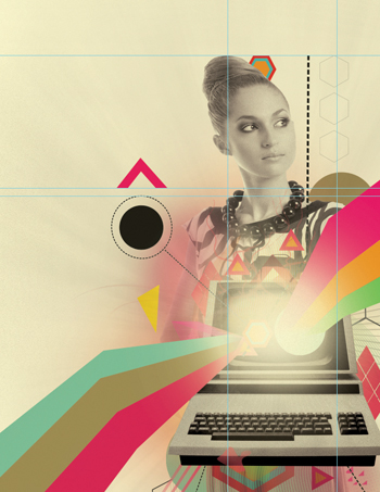
In this tutorial, Gordon Reid – who works under the creative handle Middle Boop – shows how he blended retro imagery and colour schemes with digital technology to create this month’s stunning cover image.
He walks you step-by-step through the process of preparing stock images for compositing, lighting, colouring and texturing the design – as well as providing a few sneaky keyboard shortcuts to speed things up.
The stock images that Reid has used are all available from iStock. You can buy them from bit.ly/4V2JvR, bit.ly/7rdMRZ, and bit.ly/4P2kj9 – or if you prefer, you can substitute similar images of your own.

Step 1
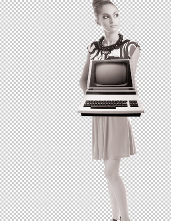
To start off, download the images mentioned in the introduction, or find suitable ones of your own. Then cut out the images – there are many ways of doing this but the cleanest and most efficient by far is the Pen tool (P). Once they’re cut out, add a more aged effect by holding down Shift + Cmd/Ctrl + U and desaturating the images.
Step 2
Now let’s merge the two images of the women together giving the impression that one is presenting the computer. Hit Cmd/Ctrl + L to match the levels of the images, go to Image > Adjustments > Brightness/Contrast, adjust these, and add a warming photo filter with a density of around 15% (Image > Adjustments > Photo Filter).
Step 3
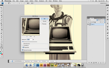
Let’s take the aged effect further by adding a slight texture to the three images. In the computer layer, go to Filter > Noise > Add Noise, set the amount to anywhere between 6 and 8 for the computer and set the distribution to Gaussian. Do the same process for both of the other layers but use the filter a lot more lightly.
Step 4
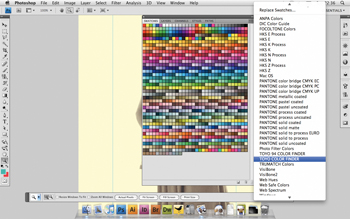
Now that we have the focal point to work from, it’s time to work out some vibrant colours to make the design really eye-catching. I want to use colours that emphasise the old-school feel but can also be combined to look contemporary. Put a cream coloured layer such as #fdf9d1 over the top of the image and set the blending mode to Multiply, then play about with colour swatches to find some great colour combinations.
Step 5
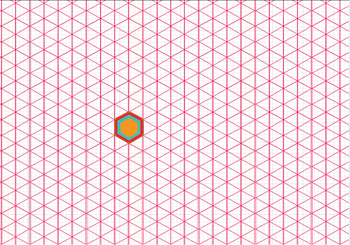
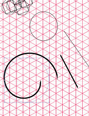
Next, create some solid geometric shapes. A great way to get interesting results from shapes is to create your own custom grid. Open Illustrator and line up some diagonal lines with some vertical, and while holding down Alt/Opt, drag the cursor across. Continue until you have a grid.
Step 6
One way of achieving interesting effects is by creating your own brushes in Illustrator. Play about with some ideas that might work well as a brush – such as a dotted line – then go to Brushes > New Brush > New Art Brush.

Step 7
Back in Photoshop, we want to give the impression that light is exploding from the computer screen. Take a large soft-edged brush with the hardness set at 0, then using a bright white colour click over the screen. Double-click on the layer in the Layer Palette to open up the blending options and select Outer Glow, setting the size to 51%, range to 55% and opacity to 61%. Repeat this on a new layer, changing the contour’s preset to Cove – Deep and the opacity to 70%. Add some vibrant shapes underneath the blurred layers.
Step 8
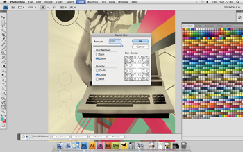
To further intensify the look of something exploding from the computer screen, take a textured stock image such as the one I downloaded from Photos To Go at bit.ly/6571Ec. Press Shift + Cmd/Ctrl + U to desaturate the image. Next, select Filter > Blur > Radial Blur, setting the method to Zoom, the amount to 100 and the quality to Best. Erase the edges with a large soft brush, set the opacity to 47% and set the image in the centre of the screen.
Step 9
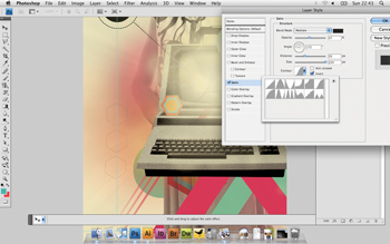
Let’s add some depth to the image. Grab a large, soft-edged brush, pick one of the colours, and in a new layer behind the main image, click a few times to create some coloured patches. Take the opacity down to 40% and set the layer’s blending mode to Pin Light. In a new layer, select another colour and paint some more blotches, this time setting the layer’s blending mode to Satin, the distance to 33, size to 250, and the contour to Gaussian. Set the opacity to 63%.
Step 10
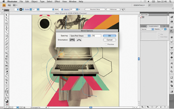
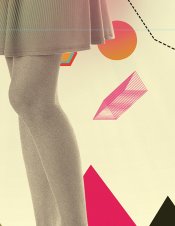
One tool that can be really useful if used well is the Blend tool. Return to Illustrator and import your image from Photoshop to use as a guide. On a new layer use the Pen tool and create two separate wavy lines, then go to Object > Blend > Blend Options, select the specified steps and select around 70, hold Cmd/Ctrl + Alt/Opt + B and see the results.
Step 11
This technique can be also be applied to shapes as well, such as the triangles. You use the same process but play about with the amount to get the desired effect. Don’t be afraid to experiment; if you need to alter anything hold Shift > Cmd/Ctrl + Alt/Opt + B to release the blend.
Step 12
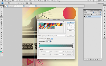
The illustration at this point still looks a little empty and could do with a spruce-up. Choose a few more vibrant colours from your swatches and bring a few simple shapes to life using techniques such as gradient overlays. Select the Gradient tool and customise your gradient by clicking the Gradient editor in the top left hand corner.
Step 13
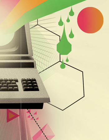
Tweaking simple geometric shapes can really bring the design out. To create these green shapes, for example, I’ve simply used the Pen tool to create a teardrop effect and merged the two layers. Then while holding Alt/Opt I’ve duplicated the image a number of times and lined them up.
Step 14
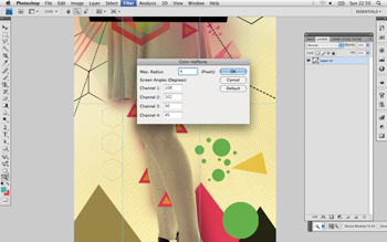
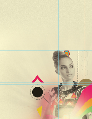
Now it’s time to add some more texture to the background. Use a yellow soft-edged brush at 500-600 pixels and go nuts! Once you’re happy go to Filter > Pixelate > Colour Halftone, and set the maximum radius to four. Set the opacity to 32% and the fill to 71%. Place this layer over the top of the image.
Step 15
Now use a black brush to add some shading around the top and sides of the image. Go to Filter > Noise > Add Noise, setting the distribution to Uniform and the amount anywhere from 50% to 60%. As this is only for background texture, set the opacity and fill right down to 20-35%. As with step 14, set this layer over the top of the image.
Step 16
For the final addition of texture set a new layer on top of the rest. Change the background and foreground colours to the cream and yellow already used, go to Filter > Render > Clouds, then Filter > Blur > Gaussian Blur and set the radius to 20 pixels. Change the opacity to 9% and the fill to 70%.
Source: Digital Arts


