What do Similac baby formula maker Abbott Labs, gardening and lawn care products’ vendor Scott’s Miracle-Gro, luxury car manufacturer Lexus, and teenage girls clothing retailer Charlotte Ruse — all have in common?
Though their businesses are vastly dissimilar, they all have a unique online presence that engages visitors, entices them to revisit their site, and ultimately leads them to take desired business actions.
The best part is all of this is accomplished without any brash, in-your-face promotion.
Follow Joaquim P. Menezes on Twitter
Unfortunately such winning Web sites are more the exception than the rule, laments Ron Rogowski, principal analyst at Forrester Research.
SEE VIDEO: How to successfully market anything online
“Instead most of today’s Web experiences leave audiences experiencing an emotional void.” The Forrester analyst was speaking at the recently concluded Advertising Week conference in Toronto.
Rogowski, who works out of the Forrester offices in San Francisco, has spent several years studying how brands can succeed online through their customer-facing Web sites. “We evaluate sites, scrutinizing them to see if they have what it takes to engage target audiences, getting them to take specific actions,” he said.
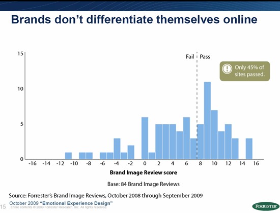
Most sites fail the test.
And they don’t even pass muster in something as basic as usability.
In a Forrester study of 1,300 Web sites conducted between 1999 and 2009, a mere three per cent cleared the “usability” test. The rest had unwittingly set up a myriad user experience roadblocks.
Read related articles
Top tips on creating deeply engaging ad experiences
New Google marketing hubs help you sell anything … even a Pet Stick!
5 expert tips for a spectacular marketing campaign
A couple of common issues were:
- Disjointed experiences – Sometimes totally incongruous material was placed side by side on the same Web page. Or else the user experience across different media channels was inconsistent. “You get one experience through the brand’s print ads or TV commercials, but that isn’t carried through to the Web site,” Rogowski noted.
- Anaemic brands – Most brands (55 per cent) didn’t adequately differentiate themselves online. “Across the Web, shopping experiences are starting to look generic,” Rogowski rued. The brand experience is getting tepid.
By contrast, he said, the few sites that do powerfully engage their audience do very specific things that fuels their spectacular success.
1. Breast practices — StrongMoms campaign
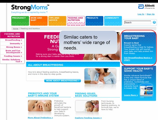
Why on earth would a company that makes baby formula promote breast feeding on its Web site?
But by doing that Saint-Laurent, Québec-based Abbott Labs proved a core marketing principle: gain a customer’s trust and you’ll very likely gain their business.
Rogowski recalled how the firm’s StrongMom’s online campaign exemplified this principle.
“They did have a products section and a store shelf online, if you wanted to check that out. But most of the site was focused on issues — such as feeding problems, general nutrition, help for mom and baby. They even had a special section about the benefits of breast feeding.”
He said the StrongMom’s campaign established a powerful rapport with Similac’s target customers – new moms – by responding to their need for quality information about the care of their infants.
From a business standpoint this strategy probably leads to better results than brashly promoting products without understanding and responding to your potential customers’ real needs, Rogowski noted.
2. How does your garden ‘Gro’
Getting people all excited about fertilizer isn’t easy.
That’s why Scott’s Miracle-Gro’s Web site didn’t even attempt to do that.
The Marysville, Ohio-based company manufactures a range of consumer products for lawn and garden care, and professional horticulture.
But visit the firm’s Web site and you won’t be assaulted by a laundry list of their products.
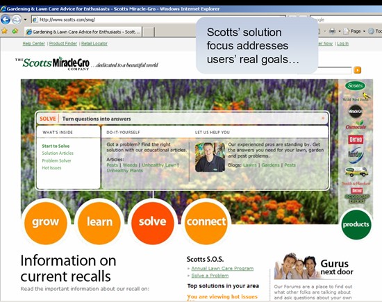
Instead, as Rogowski noted, Scotts has successfully positioned itself online as an expert provider of lawn care and gardening advice.
To that end, their site is replete with valuable information on everything from healthy grass growing tips — through smart mowing, feeding and watering, to flower gardening best practices, to hints on how to attract songbirds, butterflies and other friendly critters to your yard.
“It’s a clever and effective approach,” says Rogowski. “They show you how to take care of your grass and solve problems, and quietly infuse information about their products into the solutions they provide.”
This positioning strategy is apparent from the section tabs at the head of Scotts’ Web site: Grow, Learn, Solve and Connect.
The site is a mine of horticultural information, features a “learning library”, as well as a bunch of videos covering everything from on how to keep up your garden to very handly video tutorials on specific projects such as: growing tomatoes in a pot, planting bulbs, and repairing bare spots.
Rogowski said the approach works well because it addresses a pervasive home owner’s need — to create a beautiful lawn. “This is emphatically not a site where they just push products at you.” But by educating you about all the wonderful things you can do to beautify your lawn, you are enticed to check out their offerings, which can make it all happen for you.
3. Your Facebook (shopping) friend
Rogowski cited the Web site of Charlotte Russe – a U.S. clothing retail chain – as a great example of effectively integrating social networking into the shopping experience.
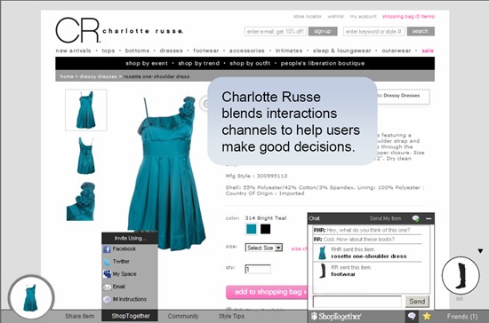
Products of San Diego-based Charlotte Russe are targeted mostly at teenage girls and women in their twenties. A feature called “Shop together” enables online shoppers on this site to invite friends via Facebook, Twitter and MySpace to be their shopping companions.
“So if you’re an insecure 14-year old girl and want to know if this is the outfit you should wear to the prom, you may want some help,” said Rogowski. “No problem. You can go to Facebook, invite a friend, and the two of you can shop together, check out what each other is interested in, and help one another to accessorize and create an outfit.”
4. Tasting luxury – with Lexus
The Forrester analyst cited the Lexus site as one of the most successful in “creating a luxury feel.”
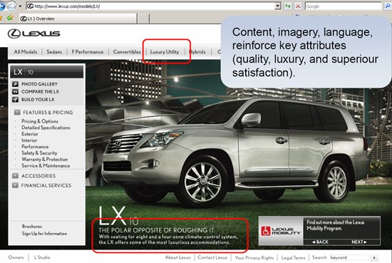
The site, he said, accomplishes this both through the powerful copy as well as the high quality visuals and videos.
“They use language like: The Polar Opposite of Roughing It. As you go through the site, and review the interior descriptions and images, you get the feeling you’re melting into the buttery leather seats.
That — along with the high-quality Lexus “quick guide” and “how to” videos” — effectively communicate their brand attributes of quality, luxury, superior satisfaction, he said.
5. Earth – the final frontier
Discovery Earth Live, an online project of Discovery Channel, is yet another example of a site that engages visitors through a purposeful, tactile experience, Rogowski said.
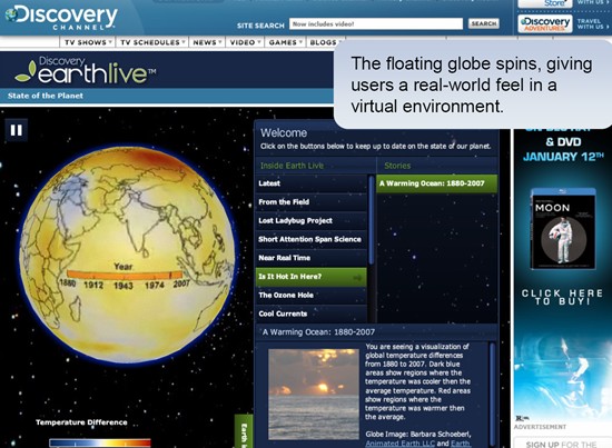
“The idea is to show the earth as a living, breathing organism and to allow people to see and understand climate change and recent breakthrough research in that area.”
Clicking on various buttons within “Earth Live” gives you a visual flavour of things like the “ozone hole” at various periods of time from 1979 to 2008.
One really cool feature of the site, he said, is the ability of visitors to place their cursor over an image of the earth and get it to spin around at the speed they want it to.
“That’s not necessarily what gets people to the site, nor what keeps them coming back for more. But it’s part of that powerful overall experience.”
He said the folks at Discovery were ready to shelve the project if they couldn’t get this functionality into their site. “That’s because their brand is all about the capabilities, production values, and high-quality material they have on their site.”


