When Hewlett-Packard’s TouchPad tablet based on webOS 3.0 hits stores July 1, it will face the same fate as every other tablet being released to market – a comparison to Apple’s iPad. But at least HP seems to know it.
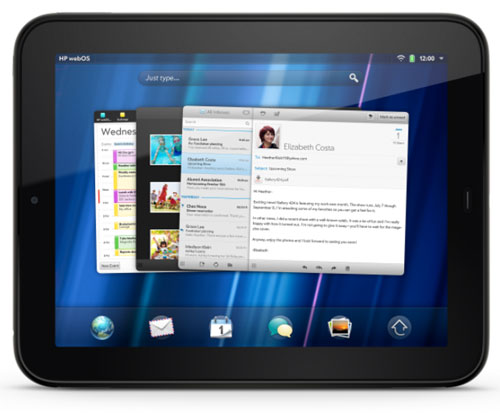
The TouchPad imitates the iPad in appearance with a 9.7-inch touch screen and a slender profile (though noticeably thicker than the iPad 2), with a sleek look offering just one hardware button on the face of the device and a small front-facing 1.3-megapixel Web cam. It is also priced to compete with the iPad, at $499 for a 16 GB model and $599 for 32 GB of internal storage.
The tablet’s solid black plastic shell gives the device an elegant look and is comfortable to grip. At 740 grams, it feels light to grip, though it is a bit heavier than the iPad 2‘s 601 grams.
The TouchPad is powered by a Qualcom Snapdragon dual-core 1.2 Ghz processor that edges out the speed of Apple’s 1 Ghz dual-core A5 chip, and makes the tablet feel incredibly responsive and ready for multi-tasking. HP has balanced the tablet’s capability to be a good fit for business and still attractive to consumers, though an app shortage will be its biggest challenge in the short term – and the lack of a rear-facing camera to take photos and video may also deter some tablet shoppers.
webOS 3.0 interface
Powered by Palm Inc’s webOS gesture-based interface that HP acquired last year, the TouchPad is the first tablet to sport the mobile OS that has been popular amongst fans of Palm’s more recent smartphones such as the Pre. While some of the gestures have been pared back for the larger tablet version of the OS, the interface still offers a fun and intuitive way to navigate the device.

The TouchPad offers a strong multi-tasking experience that is similar to BlackBerry Playbook’s QNX-based OS (though webOS used this method first, on smartphones). Apps currently running on the device can be displayed in a “card view” by pressing the Center button or swiping upwards from off the bottom of the screen. The cards display an active screen in the app, and you can maximize the card to full screen view with a tap.
Swiping from side to side will scroll through your open apps. By tapping and holding, you can drag cards on top of each other to group them together in one screen. Once you’re finished with an app, you simply throw it out the top of the screen to close it.
webOS 3.0 has a thin status bar along the top of the interface that gives quick access to key device settings. Tapping the top-right hand corner of the screen shows remaining battery life, Wi-Fi networks, Bluetooth, screen brightness level, and offers a mute and rotation lock switch.
The bottom strip on the home screen offers short cuts to key apps, and an app launcher to view everything installed on your tablet.

App selection falls short
The biggest dent in the TouchPad experience may come when loading webOS apps designed for smaller smartphone screens. The device comes loaded with some of these apps, such as the New York Times news app. These apps load to fill just a small section in the middle of the screen, surrounded by a black, Pre-like border. So you’re stuck reading news in about 3.5-inches of screen real estate while the rest goes unused.
Apple addressed this problem with its iOS apps by offering the option to magnify iPhone apps to twice their size on the iPad. But Palm offers no such option. Though Apple’s solution does cause some pixilated looking text and graphics, it at least makes use of the larger screen space.
Palm’s lack of TouchPad apps at launch compounds this problem. Though when browing HP’s App Catalog, apps are tagged as “For TouchPad,” to help you avoid squinting at tiny screens.
The device does come loaded with Quickoffice, a mobile app that allows viewing of Microsoft Office-compatible documents. It can integrate with cloud-based services such as Dropbox and Google Documents and allow you to download those files to your tablet. This is great for business users, but adding in document editing and creation would have been even better.
Another strong app is the Messaging centre that comes installed on the device. This allows users to group together several instant messaging services including Skype, Google, Yahoo!, and AIM into one convenient view. All of your contacts from the various services are listed together and their presence information conveyed. You can also conduct Skype voice and video calls through the app.
HP also announced HP webOS Pivot June 23, a tablet magazine published monthly that will showcase apps for the TouchPad.
Accessories enhance TouchPad experience
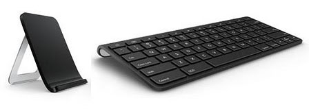
The HP Touchstone dock offers a wireless charging experience for the tablet. Simply plug in the dock, then place the tablet in the cradle to start charging. The tablet can also be used while it’s on the dock, or can display a clock or photo slideshow while charging.

Used together with HP’s Bluetooth keyboard, the dock makes for a nice tablet experience when using it at a desk. The keyboard connects automatically when turned on after you’ve paired it. It offers some webOS-specific buttons, such as one that toggles between the apps screen and the home screen, and a button that displays notifications.
Overall, HP’s TouchPad offers a great user experience on hardware that’s top of the line. It makes an appealing tablet choice to those who want to work it into their workflow. But the drawback of a more limited app selection and lack of a rear-facing camera will see some consumers passing on it for the iPad 2.
Brian Jackson is Associate Editor at ITBusiness.ca. Follow him on Twitter, read his blog, and check out the IT Business Facebook Page.


