Two and a half years ago, Steve Jobs unveiled the first iPhone and said that its software was five years ahead of the competition; since then, the rest of the industry has been busy playing catch-up.
The past few weeks have seen the release of Palm’s impressive Pre (with its WebOS operating system) and Google’s first major Android update. Older operating systems such as Symbian S60 are showing up on increasingly iPhone-esque phones, too, such as the Nokia N97.
But Apple has been busy, too. Recently, it released its third major version, iPhone OS 3.0, which ships on the iPhone 3GS and is available as a free upgrade for owners of previous iPhones (and as a $10 upgrade for iPod Touch owners). It remains the next-generation mobile OS to beat.
The new iPhone OS 3.0 boasts more than a hundred new features — some of them subtle and whimsical, others more overt and useful. Version 3.0 represents an evolutionary, not revolutionary advance.
Its stiffest competition comes from two operating systems that didn’t exist when the iPhone was first announced and that seem to have drawn plenty of inspiration from Apple’s phone: Android and WebOS. Except for its lack of mutitasking for third-party apps, however, iPhone OS 3.0 feels richer and more mature than either of those two OSs.
Read on for a look at how the latest iPhone OS compares with Google’s Android, Microsoft’s Windows Mobile, Nokia’s Symbian S60 5th Edition, Palm’s WebOS, and RIM’s BlackBerry OS. I judged the five operating systems on their capabilities, ease of use, and visual panache, and I assessed both their standard applications and associated third-party programs.
Apple iPhone OS 3.0
What it is: iPhone OS 3.0 is a pocket-size version of Mac OS X, shrunk down and redesigned to power the iPhone 3GS.
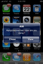
The Apple iPhone 3GS, loaded with Apple iPhone OS 3.0
How it works: As you zip around the iPhone 3GS’s multitouch interface with your fingertips, hardware and software blur into one pleasing experience. With other operating systems, it’s all too easy to get lost in menus or to forget how to accomplish simple tasks; iPhone apps, however, are remarkably sleek and consistent.
Version 3.0 fills in most of the holes that remained in version 2.2 by adding cut, copy, and paste, excellent OS-wide search, and better support for using landscape mode.
It also gives third-party developers new features to tap into — for example, subscription services within apps, peer-to-peer networking over Bluetooth, and the ability to alert a user even when an app isn’t running. (The OS still lacks true multitasking for third-party programs, however, which is probably its most serious omission at this point.)
How it looks: Terrific. Everything from the sophisticated typography to the smooth animation effects contributes to the richest, most attractive environment ever put on a handheld device.

The iPhone’s Safari browser
Built-in applications: What’s good is great — especially the Safari browser, which does a remarkable job of simplifying navigation through sites that weren’t designed for viewing on a smartphone. The OS’s music and video programs are of iPod calibre, too. But as a productivity tool, the iPhone still lacks depth in some areas.
For instance, you get no apps for editing documents or managing a to-do list. (Both are available from multiple third-party developers, however.)
Apple could stand to learn a trick or two about Web integration from WebOS (which tightly integrates its apps with Facebook and other Web services) and Android (which logically works extremely well with Google services such as Gmail).
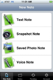
The Evernote app on the iPhone
Third-party stuff: Thanks to Apple’s hugely influential App Store, the iPhone has gone from having no third-party apps to having more than 50,000 (most of them inexpensive or even free) in less than a year. The best ones, such as Facebook and the Evernote note-taker, are outstanding.
But the limitations that Apple imposes on third-party apps — they can’t run in the background or access data other than their own — put major obstacles in the way of everything from instant messengers to office suites. And as the sole distributor of iPhone software, Apple has declined to make available some useful applications that developers have submitted.
Bottom line: Despite the strides made by Android and WebOS, iPhone OS 3.0 stands as the most enjoyable and intuitive phone operating system available today.
Google Android 1.5
What it is: The Android phone OS is an ambitious open-source platform that Google invites companies to customize to their liking for an array of handsets. Around 18 Android phones are expected by year’s end, and expectations for its long-term success remain high.
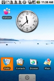
Google Android Desktop.
How it works: On the G1 and on its follow-up, the MyTouch 3G (due in August), Android’s interface feels like an iPhone/BlackBerry mashup: It relies heavily on the touchscreen, but you get a trackball plus Menu, Home, and Back buttons, too.
The highly customizable desktop is a plus, and T-Mobile says that the MyTouch will introduce additional features for tweaking the OS’s look and feel. Overall, it compares well to older platforms but isn’t as effortless as iPhone OS 3.0.
How it looks: Android isn’t an aesthetic masterpiece like iPhone OS 3.0, but it’s clean and appealing, and it makes good use of the high-resolution screens on the G1 and its successor.
Built-in applications: They’re tightly integrated with Google services such as Gmail and Google Calendar — and when you turn on the phone for the first time, the first thing you do is give it your Google account info. (The MyTouch adds support for Microsoft Exchange, a notable omission from the G1.)
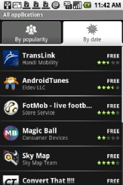
Google Android Market for apps
Android’s browser lacks the iPhone’s multitouch navigation but closely rivals it in most other respects. Its best music feature is its ability to download DRM-free songs from Amazon. The only videos it can play are YouTube clips, alas.
Third-party stuff: Android hasn’t taken off as an app platfom as quickly as the iPhone OS did, but its iPhone-like Market store is rapidly filling up with good stuff, including intriguing apps (such as the Glympse location-sharing service) that aren’t yet available on the iPhone. As more Android phones appear, more developers are likely to get excited about writing iPhone-style apps for it.
Bottom line: Android 1.5 remains a promising work in progress, but its current incarnation is less inventive and elegant than either iPhone OS 3.0 or WebOS.
Microsoft Windows Mobile
What it is: Microsoft’s mobile edition of Windows, of course. Version 6.1 ships on phones from manufacturers such as HTC (with its Touch Diamond2 and Touch Pro2), Motorola, Palm, and Samsung.
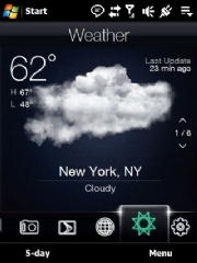
HTC Diamond’s tweak of Windows Mobile.
How it works: Windows Mobile mimics full-strength Windows, complete with a Start menu and a system tray. This is not a virtue: Who wants to squint at tiny icons on devices meant for on-the-go use?
Manufacturers such as HTC and Samsung supplement Windows Mobile with their own software layer or with tweaks to the underlying Windows Mobile OS. For instance, several HTC devices cover up part of Microsoft’s stylus-oriented interface with a fingertip-driven system called TouchFLO; it’s nowhere near as elegant and intuitive as the iPhone interface, however.
How it looks: It’s workmanlike, but it falls far short of iPhone OS 3.0’s surface gloss.
Built-in applications: The version of Internet Explorer on current phones is so profoundly archaic that HTC provides Opera Mobile on some of its models. On the other hand, the productivity apps — basic versions of Word, Excel, Outlook, and PowerPoint — are useful.
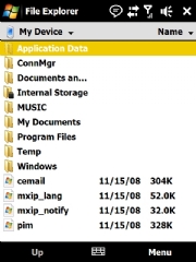
Windows Mobile version of File Explorer
Third-party stuff: The best thing about this OS is the range of available applications in every category. Utilities such as Lakeridge Software’s WisBar Advance let you tweak the interface’s look, feel, and functionality, thereby compensating for some of its deficiencies. But Windows 6.1 still has no built-in application store.
Bottom line: Windows Mobile has fallen way behind the times on multiple fronts. Windows Mobile 6.5 — which delivers a more modern, touch-driven interface, a better browser, and a download store — is unlikely to show up on phones until September, and in any case it doesn’t close the slickness gap between Windows Mobile and iPhone OS 3.0, Android 1.5, and WebOS.
Nokia Symbian S60 5th Edition
What it is: The newest version of the venerable Symbian mobile OS, with more entertainment features and a new interface that permits iPhone-like touch input, as seen on phones such as the Nokia N97.
How it works: Like an aging platform that’s been updated to reflect the iPhone era. For instance, it still has applications that make you navigate with tiny scroll bars — logical enough for an OS driven by a keyboard and a stylus, but tough to accomplish with your fingertip.
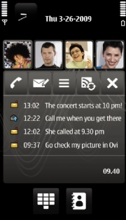
The Symbian S60 contacts app
How it looks: Decent enough, but icons, typography, and other interface details lack the refinement of the ones in Android, iPhone OS, and WebOS. It’s serviceable, not beautiful.
Built-in applications: Time was when Symbian had some of the most sophisticated mobile software around, and it’s still impressive in some ways — such as the support for multitasking and cut-and-paste. But Symbian needs a more thorough update. For instance, its browser pales next to iPhone OS’s Safari and other newer entrants, and its e-mail handles plain text only.
Third-party stuff: The Symbian OS has been around for so long that a wealth of useful software supports it, but most of these applications haven’t been updated to take advantage of 5th Edition’s touch-centric approach.
Nokia’s on-device software store, Ovi Store, launched in May, but reviews have been lackluster. Symbian software remains available from other app purveyors, such as Handango.
Bottom line: 5th Edition advances Symbian part of the way to where it needs to be to compete successfully with the young whippersnappers among mobile operating systems. But this OS requires more than a fresh coat of paint to stay relevant in 2009 and beyond.
Palm WebOS
What it is: The all-new Palm operating system that debuted on the much ballyhooed Palm Pre. Palm says that WebOS will appear on other phones in the future.
How it works: Overall, really well — it’s responsive and fun. In some respects — such as in the way it uses multitouch input to let you resize Web pages and photos — it feels like the iPhone OS. But it also introduces features and concepts not found on the iPhone; most notable among these is the ability to multitask with various applications and manage them using “cards” that appear on your desktop.
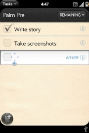
The WebOS Synergy feature
How it looks: Lovely. This is the first mobile OS to compete with iPhone OS for sheer aesthetic splendour, and it appears crisp and elegant on the Pre’s relatively small screen. Ultimately, I’d give iPhone OS 3.0 the edge because it’s less cluttered and more consistent. But WebOS finishes a close second.
Built-in applications: WebOS’s standard productivity apps for e-mail, calendar, task manager, and the like are straightforward and useful. The most striking thing about them is WebOS’s Synergy feature, which melds information from disparate sources. For instance, it can merge your Gmail and Facebook contacts into a unified address book, and it enables the e-mail application to indicate whether a contact is online at the moment for a chat via instant messaging.
On the other hand, the Universal Search feature — which actually searches only the names of your contacts and applications, plus Web services such as Google, Twitter, and Wikipedia — doesn’t live up to its lofty name. (I was expecting it to search my e-mail, calendar, and documents, too.)
Though WebOS is much less media-centric than iPhone OS, its music app is surprisingly good: You can buy MP3 files from Amazon and sync directly with iTunes. But WebOS provides no mechanism for buying or renting commercial movies or TV shows for its video player.
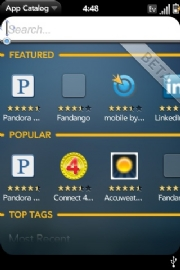
The WebOS app store
Third-party stuff: Palm’s store for downloadable apps launched with a mere handful of programs, including ones for Pandora’s music service, LinkedIn’s business network, and the Fandango movie-ticket store; since then, app availability has proceeded at a trickle, not a deluge.
(Motion App’s Classic app emulates the old Palm OS and lets some programs run, but not every app works, and those that do work can’t hide the fact that they were written for an OS dating to the mid-1990s.)
Bottom line: WebOS boasts more fresh ideas than any new operating system since iPhone OS; and once you’ve used cards to leap between multiple running apps, it’s hard to go back to anything less. Let’s hope that WebOS helps propel Palm back to robust health — and that the company puts the OS on a range of phones aimed at different kinds of folks.
RIM BlackBerry OS
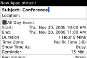
The BlackBerry OS still depends heavily on text
What it is: This software powers RIM’s BlackBerry smart phones, including stalwarts such as the Curve, the Pearl, and the 8800, as well as the newer Bold and Storm, and the upcoming Tour.
How it works: The basic concepts behind the BlackBerry interface have changed remarkably little in a decade. And why should they?
In its own way, the BlackBerry interface is as logical and consistent as the iPhone’s: On most models you perform virtually every function in every application with a trackball, a Menu button, and a button that lets you back out to the previous screen. Master those three actions, and you can whip around the OS with extreme speed.
(The Storm replaces the standard BlackBerry controls with an iPhone-style touch interface that has garnered lukewarm critical response.)
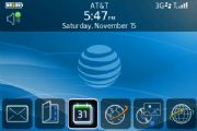
The BlackBerry Bold’s interface
How it looks: The BlackBerry OS is fairly mundane and text-centric, though recent models such as the Bold dress it up with crisper fonts and slicker icons.
Built-in applications: The BlackBerry’s e-mail and calendaring applications continue to set the standard for efficient design and reliable real-time connectivity with widely used messaging systems such as Microsoft Exchange.

The BlackBerry Bold’s new browser
The Bold has a much-improved browser that rivals those associated with iPhone OS, Android, and WebOS in its ability to display sites as their designers intended; BlackBerry music and video apps are serviceable enough but still secondary to the productivity tools.
Third-party stuff: Once upon a time, users didn’t have many BlackBerry programs to choose from, but recently the market has boomed. Thousands of options — from productivity apps to games — are available now. Many, but not all, are available via RIM’s new App World software service. Windows Mobile and Symbian S60 selections are even more bountiful, though.
Bottom line: The BlackBerry OS is an old dog, but a smart one — and one that is proving itself capable of learning new tricks. It will be interesting to see whether the upcoming Storm 2 does a better job of bringing a touch interface to the BlackBerry experience than the first Storm did.
Source: PCWorld.com


