Twitter decided to change its look for the first time in four years in an attempt to keep ad dollars away from Google and Facebook, but is the new interface good or bad for companies trying to expand their social media presence?
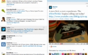
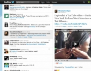
The changes are drastic, creating a split screen and a new detailed pane for sharing videos and photos. The new revamp is a little Facebook-like (not a surprise, since Facebook is now probably the most popular site on the Internet) and could make tweeting safer and more valuable.

A look at how the newly revamped Twitter feed will look on Twitter.com. Twitter has made deals with 16 media providers–including YouTube, TwitPic, and Flickr–to host images and videos seen by its users. Now, instead of being sent to a possibly shady third-party site to view a picture or video, users will get the video and picture integrated on Twitter’s Web interface. This would mean fewer clicks on URL-shorteners or unknown sites that could infect users with viruses or other malware.
It also gives businesses the chance to really market their company on Twitter. Now instead of repeatedly tweeting, “Buy ABC’s widgets!” a company can share a video of its new widgets or other new development, and know there’s a good chance that anyone might see it in Twitter’s detailed pane.
Related Video: Twitter in the age of persuasion
Of course, some of the features, such as the mini-profile available by clicking on a single tweet, have been available on Tweetdeck for a while, causing speculation that start-ups creating third-party apps such as Tweetdeck, Brizzly and Seesmic. are doomed now that Twitter has made its Website much more usable.
Sure, the vast majority of Twitter’s 160 million users still use the Website, but with an easier, more enjoyable interface, it will make those users a lot more loyal and could draw away the few that use third-party apps to organize tweets.

The new Twitter Website will give users a split screen and a new detailed pane that can show images, videos or mini-profiles. However, the new interface still has problems. Although more user-friendly, Twitter still doesn’t provide analytics to users, often a big concern in social media. It’s also unknown how the new interface will affect URL shorteners like Bit.ly that do track traffic from tweets, or if they may be edged out by a preferred Twitter partner.
The interface also still doesn’t provide conversation threads, or nestings of tweets between users, for quick reference–something seen on most social networks.
In short, the new Twitter is definitely easier to use and could mean a better business-related experience, but it still has a way to go before it can out-compete third-party Twitter applications.
Reach or follow Barbara E. Hernandez on Twitter @bhern.
Source: PCworld.com


