For many smart phone users, searching on a mobile device is akin to snacking, according to a Yahoo! Canada executive.
They aren’t looking for “a meal of information or delving deep into search results,” noted Nick Patsiopoulos, director of mobile and digital services at Yahoo Canada.
Instead, users engaging in a mobile search nibble on specific nuggets of information, he said. “It’s really a very different kind of experience … people are looking for something quickly and then moving on.”
SEE VIDEO – SECRETS OF SUCCESSFUL MOBILE SEARCH
Patsiopoulos was speaking at Mobile Media World 09 in Toronto recently. Presenters and panellists at the event included global industry experts, C-level business executives and well-known thought leaders in the mobile marketplace.
Read related stories
Free or cheap tools for Search marketing success
Complete guide to search engine marketing – key to your online success
Many aspects of mobile search experience make it very different from search on a PC, the Yahoo Canada exec said.
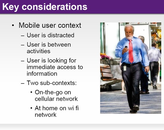
One of these is the user’s state of mind.

Mobile users, he said, are likely to be distracted when doing a search and wouldn’t be giving their full attention to the task at hand. (It’s a different story when they send or receive e-mail on their smart phone – their level of concentration is likely to be much higher).
“However, when doing a mobile search, they may be walking around, or taking a quick break, or between activities. Typically, they’re moving from one thing to another with mobile as a bridge.”
It these kinds of situations, he said, mobile search isn’t a browsing experience. “Users want immediate results.”
But this immediacy, he said,is still sadly lacking in mobile search today, which still very closely mirrors the desktop search model.
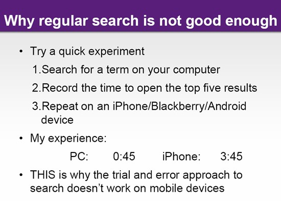
To reinforce the point, Patsiopoulos cited a “search” experiment he did recently.

Using the search terms “toys” and “Toronto”, he first did a desktop search, and then mobile searches using three different devices – the Google Android phone, a BlackBerry and the iPhone.
Patsiopoulos said this “unscientific” test still provided certain insights. He recorded the time it took to do the Search and open up the top five results.
It took him 45 seconds to do that on the PC. But with the iPhone, the process was fully five times longer – three minutes and 45 seconds. “You’re talking about the very best mobile device, on a good network, a good browser … and it’s still five times as long.”
This is why a trial-and-error approach to search – common on the desktop – just wouldn’t work on mobile, the Yahoo Canada exec said.
“The 10 blue links that we see today … that we’ve got used to from all the search providers … just isn’t a good mobile experience.”
Another key factor affecting the mobile search experience, he said, is the nature of the device itself.
“Remember it’s a tiny-to-small screen – depending on your device; it’s connectivity is unreliable, until you have WiFi; the browser is slow, text entry capabilities are poor to adequate; processing power is poor to adequate – and so it goes.”
All these considerations needed to be factored in, he said, when designing search services for mobile.
Yahoo’s approach to mobile search
And Yahoo, he said, is trying to do just that – and has created a mobile search model based on the following:
- Direct display of information – search results are “answers not just links”
- Intelligent grouping of information
- Heavy emphasis on query intent
- “Ten blue links” are lowest-common-denominator result
“Collectively this describes the notion of federated search – and most search providers are going this route.”
The focus on query intent, he said, involves looking at what the search query is, and distilling from that what exactly the person wants.
He cited several examples of searching on Yahoo (mobile) to illustrate how this works.
For instance, he said, typing in “mexican food toronto” in the Yahoo search bar on your mobile phone would get you a list and links to local Mexican restaurants – as that’s probably what the user is looking for.
You could scroll down to get the 10 blue links of Web sites – they’re still there, as a back up if all else fails.
He said at the very bottom of the results page is the kind of information you wouldn’t necessarily associate with your search query – but is nonetheless useful.
“We call it “closed clusters.” In this case, specifically, they are photos and images of Mexican food, and Wikipedia entries relevant to the search terms – all grouped under the heading “More Results.”
He said when presenting Search results on mobile Yahoo would also take into account the user’s location. “This would be detected either through the cellular network itself or from the user entry.”
So a user may be presented with different information when typing the same search query – depending on where they are located.
“If you type in “events” – as we’ve already identified where you are, the first cluster of information presented
Another example he cited was of a search for a flight – AC (Air Canada) 719. He said chances are when someone who types in that query is actually looking for the status of this flight (from New York to Toronto).
“So the first thing you’ll see it that … whether the flight has arrived, or when it’s scheduled to depart/arrive.”
He said you’re able to drill deeper and get terminals information and much more. The results, Patsiopoulos said, also exemplify “intelligent grouping of information” – as just below the flight data are details about the weather – both at the departure and arrival city.
“Then you’ll see local news, and again there’s that local context, which people talk about as being so critical when it come to mobile.”
Finally, he cited a financial example.
Typically, he said, when a smart phone user types in a company name or a stock ticker symbol – they’re looking for financial data relating to that firm.
“So what you’ll see [in Yahoo] is firstly, the latest stock results, and then news relating to that company.”
And this tailoring of search results to the user’s context is where mobile search is going, the Yahoo exec said. “It’s all about providing relevant information immediately, rather than having the user go through a trial and error process … opening up links, seeing what’s on the Web site, checking whether it’s relevant, and backing out if it’s not and so on.”
But while we’re moving in the right direction, there’s still a long ways to go Patsiopoulos suggested.
He said there still aren’t many sites “pure play” mobile sites. “What we see instead are big brands transferring [their PC content] over to the mobile screen.”
So it isn’t surprising, he said that eight of the top 10 mobile sites are also among the top 10 on the desktop side.
“The two exceptions are sprintpcs.com which is a carrier site and so doesn’t count anyway and go.com which is the Disney site – which is on the top 25 on the desktop as well.”


