Now that Microsoft’s Windows 7 has reached the release to manufacturing (RTM) stage, it’s time to take a close look at all the features of the upcoming operating system.
You might think that, because there are so many similarities between Windows 7 and Windows Vista, Windows 7 is essentially just a big Windows Vista service pack. But in reality, Windows 7 is a solid, well-performing operating system, free of many of the glitches that bedeviled the launch of Windows Vista. Speed improvements, interface enhancements and easier ways to manage your documents make this a new operating system in its own right, and one that’s well worth the upgrade.
Installation and performance
In order to examine all the pros and cons of the new OS, I installed Windows 7 RTM on a Dell Inspiron E1505 notebook with 1GB of RAM and a 1.83 GHz Core Duo processor.
I performed a fresh install, rather than an upgrade, which took approximately 45 minutes (including the usual restarts one has come to expect from Windows installations).
The install was largely uneventful, with two minor anomalies. After Windows 7 installed, it did not recognize my video card and used a generic VGA driver. This was problematic on my laptop, because the display cannot use the full 1280 by 800 resolution. However, Windows 7 soon resolved the problem itself: It automatically downloaded the proper driver via Windows Updates. After a reboot, all was well.
I’ve found similar problems with every prerelease version of Windows 7 I’ve tried, including RC1. RTM is a slight improvement over RC1 in this respect, because with RC1 I had to manually find and update the driver myself. In RTM, Windows 7 did it by itself. Still, clearly it would have been better if the initial Windows 7 installation used the proper driver. We’ll have to wait and see when Windows 7 hits retail shelves whether this becomes a common issue.
More problematic was a blip that I also had with several prerelease versions of Windows 7. I was unable to get Windows Aero to work, even after the new driver downloaded. So I turned to the Control Panel Troubleshooting applet and clicked “Display Aero desktop effects,” and Windows discovered the problem — the Desktop Windows Manager was disabled. The troubleshooter enabled it, and the problem was permanently fixed.
On the earlier versions, the problem was back each time I rebooted, and I had to run the troubleshooter each time. Although RTM is an improvement, this is not how an operating system should run on installation.
On the plus side, performance, even on my aging Dell, was surprisingly zippy and certainly superior to that of Windows Vista on the same machine. Aero worked like a charm, windows and dialog boxes appeared quickly, and I experienced no slowdowns. The Control Panel and its applets opened nearly immediately, without the delays common in Windows Vista.
Checking out the new taskbar
At first glance, Windows 7 doesn’t look much different from Windows Vista — but spend a few minutes with it, and you’ll find some significant changes.
The most noticeable is the new taskbar, which replaces both the old Quick Launch bar (for launching applications) and the old taskbar (for switching among running windows). The new taskbar combines the two features, doing double-duty as a task launcher and task switcher, similar to the Mac OS X Dock. In general, it succeeds admirably.
Large icons on the taskbar are used to launch applications, as well as to switch to different windows running in those applications. As with the old Quick Launch toolbar, you click an icon to launch the associated program. If you’ve already launched the program and have more than one window open in the taskbar, the application’s icon changes to show multiple icons stacked against one another.
For example, if you’re running Microsoft Word with three open windows, you’ll see a stack of three Word icons. Hover your mouse over the stacked icons, and thumbnails of all the open windows appear above the taskbar.
Hover your mouse over any one of those thumbnails, and it displays at its full window size. To go straight to any window, click any of the thumbnails or windows. You can also close any window directly from its thumbnail by clicking a small red X that appears on the upper-right portion of the thumbnail.
Internet Explorer, Windows Explorer and Windows Media Player all have icons permanently pinned to the taskbar by default. You can pin any other application to the taskbar by dragging its icon to the taskbar.
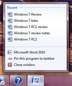
What happens if you’ve got an application with too many open windows to fit as thumbnails across the taskbar? That’s when “taskbar thumbnail overflow” takes over. When you hover your mouse over the application’s taskbar icon, a list of files appears rather than individual thumbnails. The list still works like the thumbnail view — highlight any file on the list, and it appears at its normal size, just as it would in a thumbnail view. You can also close any window by clicking a small X, just as in thumbnail view.
It may take longtime Windows users some time to get used to the new taskbar, but when they do, they’ll find it a significant productivity boost, particularly when multiple applications with multiple windows are open. When this happens in Windows Vista, the taskbar soon gets cluttered with too many icons, and it is quite difficult to find the window to which you want to switch. In Windows 7, you can find the right window almost immediately by hovering your mouse over the proper application’s icon.
In fact, it’s superior to the Mac OS X Dock, from which it takes its inspiration, because in the Dock, you don’t get a thumbnail view of all your open windows in an application. Of course, the Dock and Mac OS X Exposé have plenty of nifty tricks that the new taskbar doesn’t, such as a quick way to see all of your open windows arrayed nicely against the desktop. In the next version of Windows, Microsoft would do well to steal some ideas from Exposé.
Putting the Jump List through its hoops
The taskbar has an associated feature called Jump Lists that makes it even more useful. When you right-click an application’s icon in the taskbar, a menu appears of actions associated with that application — and the list varies according to the application. For example, when you right-click Microsoft Word, you’ll see a list of recently opened files, but when you click Internet Explorer, you’ll see a list of your most frequently visited sites.
In addition to lists of files, you’ll see tasks you can perform. For example, if you right-click on Windows Media Player, a task will let you play music. You’ll also be able to close all open windows or pin the program to the taskbar if it’s not already pinned there. (When you run a program that is not permanently pinned to the taskbar, the program’s icon shows up in the taskbar for as long as the program runs. Once you stop running a nonpinned program, it vanishes from the taskbar.)
Similarly, recently used programs that appear on the Start menu each offer a list of recently opened files, the same as the one that shows up for applications on the Jump List. An arrow appears next to applications that use this feature. Click the arrow to see the list, then click any file to re-open it.
The new taskbar and Jump List have some hidden features. For example, you can manually pin files to a Jump List for a program that normally doesn’t handle that file type by simply dragging the file onto the program’s icon on the taskbar. You can then open the file using the program to which it has been pinned. It’s a simple way to open a file using an application that normally doesn’t handle that file type, without being forced to permanently change the file association.
Remote Desktop Connection users will be pleased to see that when you pin the Remote Desktop Connection icon to your taskbar, it includes all of the remote desktop connections you’ve saved in the Jump List. That makes it much easier to take control of remote PCs on your network.
A deep look at Aero Peek
No doubt the niftiest addition to the Windows 7 interface is Aero Peek, a tweak to the Aero interface that lets you “peek” behind any open window. It puts the Show Desktop icon on Vista’s Quick Launch bar to shame.
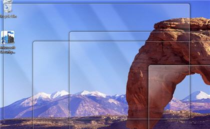
Aero Peek takes up residence as a small, just-visible vertical button at the right edge of the taskbar. Mouse over it and all of your open windows disappear — you can see straight through to your desktop. However, your open windows don’t entirely disappear — you also see the outlines of each.
For example, if you have four open windows, you see the outlines of each of those screens, even if they overlap. To see the desktop with no outlined windows, click the Aero Peek rectangle instead of hovering your mouse over it. In that case, it works just like Vista’s Show Desktop feature.
This does more than just offer a bit of eye candy — although the eye candy is certainly nice. If you use gadgets and they are hidden by open windows, Aero Peek lets you peek through all open windows at the gadgets underneath, because Windows 7 considers gadgets part of the desktop. In addition, if you regularly keep many windows open, it’s a quick way to see at a glance which windows you have open.
Switching among windows using Alt-Tab has been improved by combining it with Aero Peek. When you use Alt-Tab to cycle through your open windows, you still display the window that you’ve tabbed to, but you also peek through to the desktop to see the underlying desktop, along with outlines of any other open windows, just as you can with Aero Peek.
Aero Peek is directly tied to the taskbar’s thumbnail feature. Turn off Aero Peek, and you won’t see thumbnails when you hover your mouse over the icon of a running application in the taskbar; you’ll see a stacked list instead. You turn Aero Peek on and off by right-clicking the Aero Peek rectangle, and by checking or unchecking the box next to “Peek at desktop.”
Other interface tweaks
There are interface tweaks throughout Windows 7. One of my favorites is the way windows are minimized, maximized and moved. Drag the title bar of a window to the top of the screen, and it maximizes the window. When you drag the title down from the top of the screen, it returns to its previous, non-maximized size. Drag any window to the right or left edge of the screen, and it takes up that half of the screen.
There are plenty of other improvements. You can now turn the preview pane in Windows Explorer on and off by clicking a button, a task that in Vista takes multiple clicks. The Control Panel also has some new tricks — when you’re on the main Control Panel screen and click any category, the category’s main screen slides into place on the right and displays a list of relevant actions on the left.
It’s also easy to clean the Notification Area (the area on the right side of the taskbar that shows the time and date, icons of programs running, etc.) and keep it free of icons via a new dialog box. And when you want to customize your desktop, you can choose and customize themes more easily by right-clicking the Desktop and choosing Personalize.
Several Windows 7 applets, including Paint and WordPad, now sport a Ribbon interface, like the one that debuted in Microsoft Office 2007 and is being carried over into the prerelease of Office 2010. In addition, Vista’s Windows Sidebar, which let you use a number of desktop gadgets, has been dispensed with; gadgets can now live anywhere on the desktop.
The Start button no longer protrudes across the top of the taskbar, and it glows with a more noticeable light than in Vista. The associated Windows Shut Down button has been improved: Click an arrow to the button’s right, and you get a list of shutdown options, including switching to a different user.
There are similar changes sprinkled throughout every level of the operating system, giving it a more polished feel than Vista.
Finally, in Windows 7, Microsoft seems to have found its inner bizarre artistic self, because in addition to the usual high-resolution photographs and nature scenes that the company includes for use as desktop backgrounds, there are oddly compelling images that are a mix of psychedelia, Hieronymus Bosch, Disney characters, Japanese anime and flat-out weirdness.
Surprise! UAC is usable
Quick, what is the most reviled feature of Windows Vista? As far as I can tell, it’s User Account Control (UAC), Microsoft’s method for keeping your computer safe. Unfortunately, many users felt that UAC was so inconvenient that they turned it off entirely.
In Windows 7, UAC finally gets out of your way and strikes the right balance between security and usability. Far fewer prompts appear, and the ones that do appear pop up only for good reason. Want to do something really weird and wild, like, say, change the date and time on your PC? With Vista, you’ll get a UAC prompt. In Windows 7, you can make the change without the prompt.
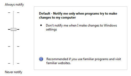
Also, UAC is now customizable. In Vista, UAC was either on or off. With Windows 7, you have some control over how it works by using a slider to change to one of four settings:
Always notify me when: This is in essence UAC Classic, and it works like Vista’s UAC. When you make changes to your system, or when software is installed or when a program tries to make a change to your system, a prompt appears.
Default — Notify me only when programs try to make changes to my computer. As the setting says, this is the Windows 7 default. You get a UAC prompt only when a program tries to make a change. As part of that prompt, your desktop goes dark, just like it does in Vista.
Notify me only when programs try to make changes to my computer (do not dim my desktop).
This is identical to the default, with one change: When a UAC prompt appears, your desktop doesn’t go dark. You’d use this setting if it takes a long time for your desktop to recover from going dark and you don’t want that delay.
Never notify me when: In this one, UAC is completely turned off.
Windows Vista users will find one aspect of the new UAC confusing. Windows 7, as with Vista, displays a small, multicolored shield icon next to any selection or setting that spurs a UAC prompt under the most restrictive UAC settings. In Windows 7, that shield stays there no matter what your UAC setting is.
So if you keep the Windows 7 default UAC setting, you’ll still see the shield next to many settings, such as the one for changing your system time or date. But when you click, no prompt appears. This takes some getting used to. It would be better if Windows 7 grayed out the shield when the UAC will not generate a prompt.
Networking: A mixed bag
Networking has long been Windows’ Achilles’ heel — the networking features have always felt bolted on rather than an integral part of the operating system. I can’t say that Windows 7 finally gets networking right, but at least it’s made some moves in the right direction.
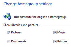
The biggest addition is HomeGroup, a feature for home networks designed to make it easier to share files, folders and devices such as printers.
As the name implies, HomeGroup works if you designate your network as Home; if your network is labeled as a work or a public network, you can’t use it. Your HomeGroup is protected by a password. It lets you specify which files, folders and devices you want to share, and also lets you keep certain files and folders private.
Those who use a laptop in multiple locations — at work and home, for example — may find it useful because it lets you keep your work files private when you’re at home. Also, when you come home from work, you won’t need to change your default printer; when you join your HomeGroup, you’ll automatically use your home printer. HomeGroup also has a feature missing from Windows networking up until now: the ability to easily stream media to other devices connected to the network.
Unfortunately, HomeGroup only partially succeeds, because the HomeGroup feature works only with other Windows 7 PCs, not with Vista- or XP-based PCs, Linux-based PCs or Macs.
So it’s not a feature most people will use, since most people with more than one PC at home will have XP or Vista on at least one of them — and they might actually have a Mac or Linux-based PC as well. Microsoft is clearly hoping that people will eventually run Windows 7 on all their home PCs — but that’s a bet I wouldn’t make.
In addition to HomeGroup, Windows 7 also includes the networking capabilities built into Windows Vista — with some of the same problems. On my home network, Windows 7 initially had problems finding PCs that weren’t running Windows 7 or Vista. It could not find several XP PCs connected to my network or a Mac connected to the network. Several hours later, the problem resolved itself, with no explanation, although not all of the Macs and XP PCs appeared on the Network Map; some showed up only in Windows Explorer. When I rebooted, it still took some time for non-Windows 7 or non-Vista PCs to show up anywhere.
After a while, this resolved itself, and all of the PCs showed up immediately in Windows Explorer. This exact thing happened to me with Vista — at first I experienced the problems, and then over time they seemed to disappear (although in Vista they still reappear from time to time). The same pattern seems to be happening with Windows 7.
The Network and Internet Control Panel applet has been put on a much-needed diet, with a more streamlined interface and fewer confusing sharing options. There is a better-organized set of links for accomplishing network-related tasks, and simpler ways to immediately see the most important information about your network, such as its type, its name, the state of its connection and so on.
Categories such as Offline Files seem to have been eliminated. (The People Near Me feature, thankfully, was also put out to pasture, doing away with one of the more pointless features of Vista.)
The downside of this diet, though, is that some features don’t seem to be accessible from the Control Panel, even though they still exist somewhere in the bowels of Windows. The Sync Center, for example, which lets you synchronize offline files with other computers on your network, is still available, but not from the Network and Internet Control Panel applet. Instead, you’ll have to first list all of the applets on the Control Panel alphabetically (by changing the view to either large icons or small icons) and then choose Sync Center from that alphabetical list.
Document sharing has been improved. Right-click a folder or file and select “Share with” from the menu that appears. You’ll get another menu that offers options such as sharing with a HomeGroup, disallowing sharing, or sharing with specific people. This is different from Vista and XP, where you have to go through menus and option screens to customize file sharing, often forcing you to figure out how to configure permissions — a place even angels fear to tread.
Wireless networking has been tweaked to let you connect to a network with fewer clicks. The wireless networking icon in the system tray displays a small star on it when wireless networks are available. Click it, and a list of available networks appears. Click on a network name, and a small Connect button appears. Click it to connect to the network.
Sleeper features: Libraries and Search
No one runs an operating system just for the pleasure of the interface; the point is to get work done. And that means getting to your files quickly. But file-handling and search rarely get headlines.
With the release of Windows 7, perhaps they should. Windows 7 makes it much easier to organize and find files and folders; this will most likely save you far more time than you might imagine. In past versions of Windows, the operating system practically forced you to use the default Documents folder to store all your files. Even hard-core holdouts, including me, have given up fighting it; it’s easier to switch than fight.
With the new Libraries folder structure, Windows’ folder organization finally makes sense. It can greatly improve your productivity by letting you assemble a virtual library of all of your work folders and files, even if they’re on multiple computers and drives. There’s now a very good reason to use this default.
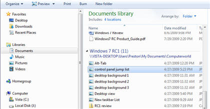
In Windows 7, the Documents folder has been replaced by Libraries, under which can be found separate Documents, Music, Pictures, and Videos areas. That by itself is nothing new. What’s new is that you can now add virtual locations to the Library.
Say you’ve got three networked PCs, and you’d like access to some of their folders on your Windows 7 PC. You can simply add the folders to your Library. They’ll still live in their original location, but you’ll be able to access their files over your network by simply opening them from within Libraries. Better still, when you do a search on your own PC, you search those folders as well. That means you can do networkwide searching from your PC, a big timesaver for those who work with multiple computers.
Be aware, though, that when you use your applications, the virtual folder feature can be somewhat confusing. Let’s say you have a folder on a second drive in your PC. You include it as a virtual folder in Libraries. You can open up the file by going to Libraries and then navigating to the virtual location in Libraries, but you can’t save the file by going to Libraries and then navigating to the virtual location in Libraries.
To save a file, you instead have to go to the physical location, for example, on another drive or PC. Microsoft would do well to find a way to allow you to save to your virtual folders.
Search has also been much improved. When you search from Windows Explorer, it’s easier to customize and filter your searches using file name, author, file type and file size. You can also add tags from in Windows Explorer to individual files, and sort by them. And search now displays long snippets for each result, so that you can easily locate the file you want among many search results.
Multimedia: Incremental improvements
Windows 7 is certainly not a multimedia powerhouse, but it does include some incremental improvements over Vista.
In previous versions of Windows, you could use a stripped-down version of the bloated Windows Media Player that was accessible from the player itself. Now there’s a stripped-down version available from Windows Explorer’s Preview pane as well. Just select the file you want to play, click the Play button, and the small media player operates within the pane. You don’t get all of Windows Media Player’s other capabilities, of course, but it’s a great way to sample music or video.
The biggest change is that you can stream media among networked Windows 7 PCs via Windows Media Player. Again, though, that requires you to have only Windows 7 PCs in your network; it would be better if you could stream to and from earlier versions of Windows. And Windows Media Player can now handle a wider variety of formats, including the AAC audio format used by Apple’s iTunes.
Windows Media Center now has a feature called Internet TV that at first sounds like a very big deal. I was hoping that there would be a way to tune in to all the various TV shows that are now available online from inside Windows Media Center, without having to jump from site to site.
I was hoping you would be able to do that using the very nice interface, searching capabilities, etc., of Windows Media Center — things that a site like Hulu.com doesn’t have. I was also hoping that Microsoft might make deals with various networks, cable outlets, etc., to provide content for Internet TV.
Alas, that is not the case. Instead, you’ll find canned TV segments, each of which is several minutes long, many of them quite old. Looking for the latest sports news? You may be shocked to discover via Internet TV that the New York Jets have fired head coach Eric Mangini (which happened back in December 2008). Clearly, this feature needs some work.
Windows Media Center also has something called Internet TV Beta 2, which one would expect to be a more advanced version of the default version of Internet TV, especially because it requires a download. But it’s basically the same content in a nicer-looking interface.
Hardware support
Microsoft does not want to relive the many hardware problems that plagued the launch of Windows Vista. This time around, the company says, Windows 7 will be able to use the same drivers as Vista, which means that it should work with most hardware purchased in the past several years. But it also means that some older hardware won’t work with Windows 7.
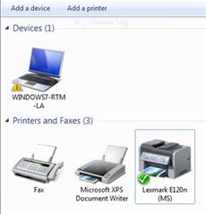
In my testing, Windows 7 worked with several printers (including a network-attached printer), a DVD burner, and my older Dell laptop (although as I pointed out in the installation section, it had to download a driver before the video display worked properly). There’s a new Devices and Printers folder that has the potential for finally making hardware easier to manage — although at this point, it is only a platform-in-waiting (waiting for peripheral makers to provide the appropriate software).
The folder will hold icons representing each device; the icons can be created by the manufacturer to make the icon look like the device itself. A new technology called Device Stage will let hardware makers create an interface for managing the devices using features specific to that device. This interface will replace Windows’ usual near-incomprehensible menus and boxes for managing hardware. It will only be useful, though, if the manufacturers actually create those interfaces.
Extras — and missing features
You’ll find plenty of nifty extras sprinkled throughout Windows 7, many so small that it may take weeks or months before you find them. For example, when you right-click a computer on your network, a new item appears on the menu — the ability to make a remote desktop connection to that network, so that you can take it over via remote control. Anyone who has had to struggle with the difficulties of finding another computer via a remote desktop connection will welcome this change.
More important, Windows finally has a usable backup program. Windows Vista’s backup was one of the worst applets ever built into an operating system, but the one in Windows 7 has enough features that you might actually use it. You can now customize your backups by choosing to include or exclude specific drives and folders. You can also easily make entire system images. And when you plug in a device that can be used for backup, such as a USB hard drive, a wizard can be launched that walks you through creating a backup — just choose the “Use this drive for backup” option that appears when you plug in the device.
Windows 7 now has a series of built-in troubleshooters that can diagnose and solve common Windows problems. I can vouch that at least one of them works, because that’s how I managed to turn on Aero — the troubleshooter found and resolved the problem.
Not all of the new extras, though, are nifty. There’s a new Sticky Note applet, for example, which at first sounds nice to have. But it is so lacking in even the most basic features, such as the ability to search through your notes, that it’s unlikely you’ll ever use it. Don’t be surprised if this one gets dropped from Windows 8, or at least beefed up.
Also notable is what’s missing. Microsoft has removed a number of applets and features from Windows 7, which is both good news and bad. On the good-news side is that a number of features, such as People Near Me, have thankfully been taken out and shot.
On the bad-news side is that some very nice applications have been removed as well, such as Windows Mail and Windows Movie Maker. They can be downloaded for free, though.
For the enterprise
Windows 7 includes a variety of features designed for enterprises and for small to midsize businesses as well.
AppLocker lets IT staff control what is run on individual users’ PCs, banning or allowing specific applications.
The BitLocker encryption tool has been improved and now includes BitLocker to Go, which can encrypt data on USB drives.
Windows 7 also includes “federated search,” which Microsoft says will allow people to use the Windows 7 search capabilities to search through remote document repositories set up by IT.
When Windows 7 is used in concert with Windows Server 2008 R2, Microsoft says, enterprises can take advantage of what it calls DirectAccess, which allows remote workers to securely access a corporate network without having to use a VPN. DirectAccess is also designed to make it easier for IT to manage remote machines.
BranchCache is aimed at branch offices — when used with Windows Server 2008 R2, it speeds up the responsiveness of network applications, Microsoft says.
Finally, the new Windows XP Mode allows businesses to run Windows XP applications inside Windows 7 so that they look as if they are running on Windows 7 natively although they in fact are running in a virtual XP window. (Consumers can run this as well, but because of hardware limitations and a less-than-simple setup, it is better for businesses.)
The bottom line
It’s become the received wisdom to say that Windows 7 is what Windows Vista should have been, implying that Windows 7 is essentially a supercharged Vista service pack. In fact, even though Windows 7 looks much like Vista on the surface, it’s actually a substantial rework.
It sports improved speed, far better task switching and task launching, and productivity improvements. And it’s just plain more fun than Vista or XP — you’ll most likely enjoy your life at the keyboard more.
That being said, there’s plenty to work on. Networking, long Microsoft’s bugaboo, still needs to be improved, notably by figuring out a way to extend HomeGroup to previous versions of Windows and other operating systems as well. In addition, Windows 7 is still far behind the curve when it comes to watching TV over the Internet.
Still, if you’re a Vista user, you’ll do well to upgrade to Windows 7; it’s a superior operating system. What if you use XP? First, check if your hardware can handle it. If it can, and if you’re not wedded to XP for the remainder of your time on Earth, it’s finally time to upgrade.
Source: Computerworld.com


