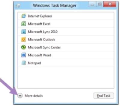
Design simplicity is the key for Windows 8, and Microsoft recently discussed on its blog yet another popular Windows feature getting streamlined in Windows 8: the task manager.
The new task manager echoes the design simplicity Microsoft was showing off earlier with the new copy file dialog.
Microsoft says three goals guided development of the new task manager, which is intended to appeal to non-techies and power users alike. The company says it wants to create a task manager that is optimized for common tasks (killing apps and processes), using a modern and functional interface, but without cutting out the favourite functions of power users.
Related Stories
– Windows 8 unveiled: Five ways you’ll use it differently
– Slideshow: Windows 8 – Tour of Microsoft’s new look
– 8 questions about Windows 8
…
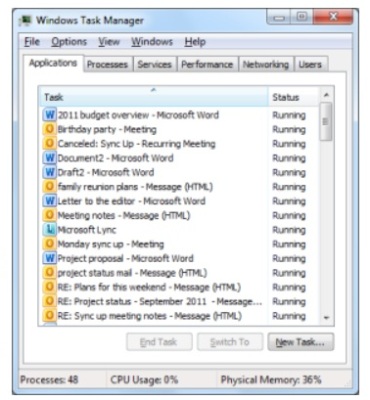
For most users, the result is that Windows 8 won’t inundate you with a long list of unfriendly-looking processes like the task managers in Vista and Windows 7. Instead, the new OS shows a simplified list of programs that you can expand if you need to go beyond simply killing an app.
A simpler task manager
After studying user habits in Windows 7, Microsoft found that 85 per cent of all task manager usage centres around the Applications and Processes tabs. This discovery isn’t that surprising since most people use the task manager to simply kill off an application or process that isn’t responding.
So instead of seeing a long list of information you don’t need, all you’ll see when you open the Windows 8 task manager for the first time is a simple list of apps. You’ll see no tabs, no menu bar, no statistics — just apps. If a program is having a problem, a “Not Responding” note will appear next to the application name. This approach is similar to Apple’s interface for killing applications in OS X.
Microsoft has simplified the basic task manager so much that you won’t get a double prompt asking you if you’re certain you want to kill a process. If you select the “End Task” button in Windows 8, the operating system will kill the process and the program will be told to shut down. Microsoft warns you to be careful with the new task manager, because Windows 8 won’t prompt you to save your work before shutting something down.
Details, detail
Power users looking for a more information on what’s going on in their system can still get it by clicking the “More details” button. This will open up a more familiar tabbed view for the task manager, but Microsoft has also made some important tweaks to this view as well.
First, all processes are grouped by type, such as which application they belong to, all background processes, or operating system processes. As with other Windows groupings, you can click on the left side of each app or process to expand the list and drill deeper into what your system is running. This will let you see, for example, how many Outlook windows are open or how many processes a specific service is running in the background.
Microsoft is also highlighting right at the top of the detail view percentages for CPU, memory, disk, and network usage. The top indicator for each category shows your overall usage, and then breaks it down by groups.
A heat map is also supplied to help you identify which applications are sucking up your system resources. The more CPU or memory an app uses, for example, the darker its statistics appear in the detail view.
Process names are also friendlier, by using common names for processes instead of cryptic terms such as “splwow64.exe.” Did you know that means “Printer driver host for applications”? I sure didn’t, but I will in Windows 8.
If adding friendlier names still doesn’t help you understand why your printer driver host is causing problems, Microsoft is adding a “Search the Web” option when you right-click on a process. Clicking the search option will open your default browser to a search results page with information about the mystery process.
Microsoft has made some nice-looking improvements to the task manager and simplified its view for those who don’t need it. But here’s another interesting change: in the process of simplifying the task manager, Microsoft adds an extra tab in the detail view compared to Windows 7. How’s that for simplification?
Connect with Ian Paul (@ianpaul) and Today@PCWorld on Twitter for the latest tech news and analysis.


